
The likes of Strawberry & Lime Kopparberg and Old Mout Cider (pronounced, either ‘moot’, or ‘mowt’, few know, few care coz that cute little kiwi bird is so distracting) are both, let’s face it, the semi-grown up, pretty acceptable face of alcopops: people order them at very normal (even gastro!) pubs and no one bats an eyelid – the same cannot be said for, say, the recently returned Hooch, or a Bacardi Breezer.
Arguably, Limoncello is similar: the classy version of drinking something like Apple Sourz – sweet, viscous, nuclear in colouration but all the better for that luminous touch. However, unlike Apple Sourz or Cherry Sourz or a shot of thick, syrupy, miscellaneous blue booze – blue being the undisputed king of all the flavours that don’t exist in real life/nature (see also Slush Puppies, Blue WDK, the list is endless), Limoncello and its peers are rarely sold on sticky trays in a suburban Flares club in FIVE-4-A-FIVER type deals.
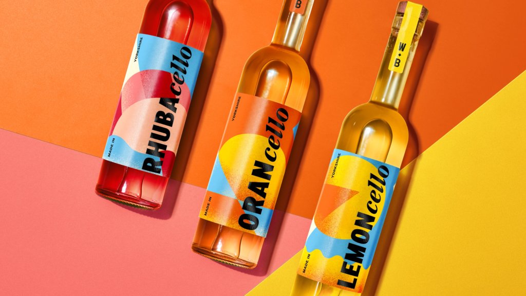
Indeed, in artisanal parlance, Limoncello is in fact a ‘fruit liqueur’ (which honestly doesn’t sound wholly unlike the sort of descriptor you’d find on a nice bottle of Reef, but we’ll go with it). And so are the others in the ‘cello’ family, three of which have been brought together by Wolfe Bros, a Leeds-based company formerly known for its range of gins.
Those gins launched in 2023 with some rather lovely branding from fellow Leeds dwelling OurCreative, which also has a studio in Hull. Now, OurCreative has unveiled these gorgeously striking designs for Cello, a range of the aforementioned fruit liqueurs that currently comprises lemon, orange, and rhubarb variants.
Following its work for Wolfe Bros a couple of years ago, the booze brand’s parent company Double Six approached OurCreative with ‘ambitious plans’ to grow the portfolio, ‘introducing a new range of fruit liqueurs – or “Cellos” – that would extend their commitment to no-waste production and seasonal flavour’. OurCreative went on to work on Wolfe Bros Cellos’ tone of voice, brand identity, packaging design and illustration, which is used across all the usuals – bottles, merch, online, and in campaign materials.

While Wolfe Bros already had a Lemoncello, with the addition of Orancello and ‘a distinctly Yorkshire Rhubacello’, the brand needed to evolve. OurCreative explains: ‘Visually and verbally, the Cellos needed to stand proud alongside Wolfe Bros iconic gins, and feel just as at home on the back bar or in a summer spritz.’
The word ‘Lemoncello’ alone feels thoroughly Italian, but in what must have been a pretty tricky balancing act, in the case of the Wolfe Bros range, this wasn’t about Italy, but Yorkshire. It can’t be easy to whip up a look and feel that’s both resolutely rooted in a Northern England county known for, variously, its breathtaking Dales landscape, sheepdogs, a popular tea brand, David Hockney, and, er, Peter Sutcliffe; but which is also somehow sort of sunny and tropical – but tropical in a way that leans more toward Mediterranean than Barbadian.
But somehow OurCreative has married the two in the visual branding here. The colours are divine, going hard on holiday vibes – it’s all bright sky blues; warm orange and yellow; vibrant pinkish red and so on.
Where the bottle design really comes into its own is in its material choices: the labels are gorgeously tactile, with shiny gloss black lettering and a stipple-like texture that makes them as compelling to touch as to drink.
The type is decent too. Every man and his dog lately seems to have been doing the ‘one minute, it’s all caps, the next minute, it’s all lowercase’ thing. But Cello has gone one step further: yes, there’s blocky caps delineating the flavour variant; and yes, this is followed by an all-lowercase ‘cello’. But get this: not just lowercase, but lowercase italics.
Somehow, though, the often slightly hacky combination of blocky sans serif and scripty italics on its serif looks pretty decent here. It doesn’t feel cheesy, nor does it feel clichéd, nor does it feel like it’s borrowing from anything else. It feels beautifully on brand and namely, that’s because its form does indeed follow its function: the ‘cello’ is a separate, unifying entity from the ‘lemon’ or ‘orange’ or ‘rhuba’ (we’re guessing they shortened ‘rhubarb’ for brevity and space-saving on an already limited canvas, but ‘rhuba’ does also simply sound pretty fun).
The texture echoes that of the original Wolfe Bros line of gins, and these links work well to make the Cellos distinctly part of that same universe, all the while bringing them firmly into an unmistakably summery vibe, but one that evokes a sort of nostalgia – even if we’ve never been to Italy, or Yorkshire – thanks to the slightly faded-posterish aesthetic created by the combination of the type, textural labelling and most of all, by that colour palette.
![]()

As for the illustration, this is less about descriptive imagery that indicates contents, and more about abstraction, geometry and graphical shapes – it’s a refreshing counterpoint to the more oldy-worldy, Italiano-heavy look of the majority of the category in its freshness and modernism. The shapes on each variant nod to things like those found in coastal landscapes and cocktail silhouettes, as well as subtly referencing the Wolfe Bros’ diamond brand device, aiming to fuse ‘products, place and brand into a cohesive graphic system’, says OurCreative.


My only criticism is that the labels are rather fussy – that copywriting feels totally unnecessary on the back of the bottle, and it would look a lot stronger if there weren’t two paragraphs of barely legible text. The art direction, however, like so many projects we’ve covered recently – and that’s no bad thing – leans heavily on that Maurizio Cattelan Toilet Paper Magazine editorial feel – all bold and brash to the point of teetering into the surreal; everything hyper-lit to within a millimetre of its life; fruit glistening as though it’s covered in glue. Perhaps it’s AI; if it is, who cares? It still looks nice, especially that mad, huge rhubarb leaf, nonchalantly leaning against the almost day-glo red of the Rhubacello liquid.
To be totally honest, I was also quite into the previous designs. I’m a real sucker for that sort of mad, unhinged approach to lettering – so nuts that it’s barely legible, with each letter picked out like a late Matisse work. The curvy incongruous cut-outs and a palette limited to just blue and yellow felt very strong to me. But as OurCreative has stated, it was about evolving the brand to usher in new variants. The designs had to make these Cellos into a range, not a couple of standalones, all the while ‘building on Wolfe Bros’ heritage while creating a modern twist on a Mediterranean staple – an Italian classic, reimagined in Yorkshire’. Safe to say, these designs fit the brief perfectly. Or, ‘ee by gum, bellissimo!’