• About Us
  • Disclaimer
  • Contact Us
  • Privacy Policy
Monday, August 24, 2026
mGrowTech
No Result
View All Result
  • Technology And Software
    • Account Based Marketing
    • Channel Marketing
    • Marketing Automation
      • Al, Analytics and Automation
      • Ad Management
  • Digital Marketing
    • Social Media Management
    • Google Marketing
  • Direct Marketing
    • Brand Management
    • Marketing Attribution and Consulting
  • Mobile Marketing
  • Event Management
  • PR Solutions
  • Technology And Software
    • Account Based Marketing
    • Channel Marketing
    • Marketing Automation
      • Al, Analytics and Automation
      • Ad Management
  • Digital Marketing
    • Social Media Management
    • Google Marketing
  • Direct Marketing
    • Brand Management
    • Marketing Attribution and Consulting
  • Mobile Marketing
  • Event Management
  • PR Solutions
No Result
View All Result
mGrowTech
No Result
View All Result
Home Brand Management

Amazon Logo Evolution Explained: From 1995 to 2025

Josh by Josh
February 20, 2026
in Brand Management
0
Amazon Logo Evolution Explained: From 1995 to 2025


The Amazon logo is one of the most recognisable symbols in the world today, but its journey began with humble, experimental designs long before the iconic smile existed. Over three decades, the logo has transformed alongside the company: from online bookstore to global tech giant. Here’s a deep look at how Amazon’s logo evolved.

1. 1995–1997: The “River A” Logo

Image source: Amazon
Image source Amazon

Amazon’s first official logo, created in 1995 by Turner Duckworth, featured a stylised letter “A” with a curving white line representing the Amazon River running through it. Beneath it sat the text Amazon.com. This design directly reflected Jeff Bezos’s vision of using the world’s largest river as a metaphor for scale and ambition.

The logo successfully introduced the brand’s name and symbolism, but it was visually literal and not yet optimised for the emerging digital environment.

2. 1997–1998: The Zebra-Pattern Experiment

Image source: Amazon
Image source Amazon

In 1997, Amazon debuted a brief redesign featuring a pattern on the “A” symbol, known as topographic lines, branches, or zebra stripes. Despite its boldness, this branding exploration lacked the clarity required for a rapidly expanding internet business and was visually confusing. It was withdrawn after a little over a year.

Amazon also changed the typography, making it stronger and more contemporary, but it still lacked the brand identity that would help it go forward into the next stage of its development.

3. 1998: The Move Toward Simplicity

Image source: Amazon
Image source Amazon

In 1998, Amazon abandoned the “A” symbol altogether and introduced a clean wordmark, “Amazon.com,” paired with the tagline “Earth’s Biggest Bookstore.” The logo shifted toward simplicity and clarity, reflecting Amazon’s growing authority in online retail.

Amazon made another experiment later that year, using a black-and-yellow colour scheme with a bright yellow circle to represent the letter “O.” These versions helped prepare the groundwork for Amazon’s transition beyond books.

4. 1998–2000: The Underline Era

Image source: Amazon
Image source Amazon

Between 1998 and 2000, Amazon refined its logo into a lowercase wordmark with a minimal underline beneath “Amazon.com.” This underline suggested speed, motion, and delivery—foreshadowing what would become central to the brand’s identity.

By this time, Amazon was expanding rapidly in product categories and geographies, and the logo needed a cleaner, more scalable presentation.

5. 2000: The Birth of the Iconic Smile

Image source: Amazon
Image source Amazon

In 2000, Turner Duckworth unveiled the design that would shape Amazon for the next quarter century: the curved arrow stretching from “A” to “Z.” 

This mark had three meanings: a smile representing consumer joy, a hint of speedy delivery, and a promise to provide “everything from A to Z”.

This revamp became Amazon’s defining global symbol. Amazon’s logo, featuring a pleasant curve and modern Officina Sans typography, embodies the company’s straightforward, innovative, and customer-centric culture.

6. 2000–2025: Stability and Global Recognition

Image source: Turner Duckworth/Amazon
Image source Turner DuckworthAmazon

Amazon’s logo remained the same for nearly two decades. The design has proven quite versatile across international markets, packaging tape, websites, and applications. Few businesses stick with one identity for this long, proving the power and clarity of the logo.

7. 2025: The First Major Update in 20 Years

Image source: Amazon
Image source Amazon

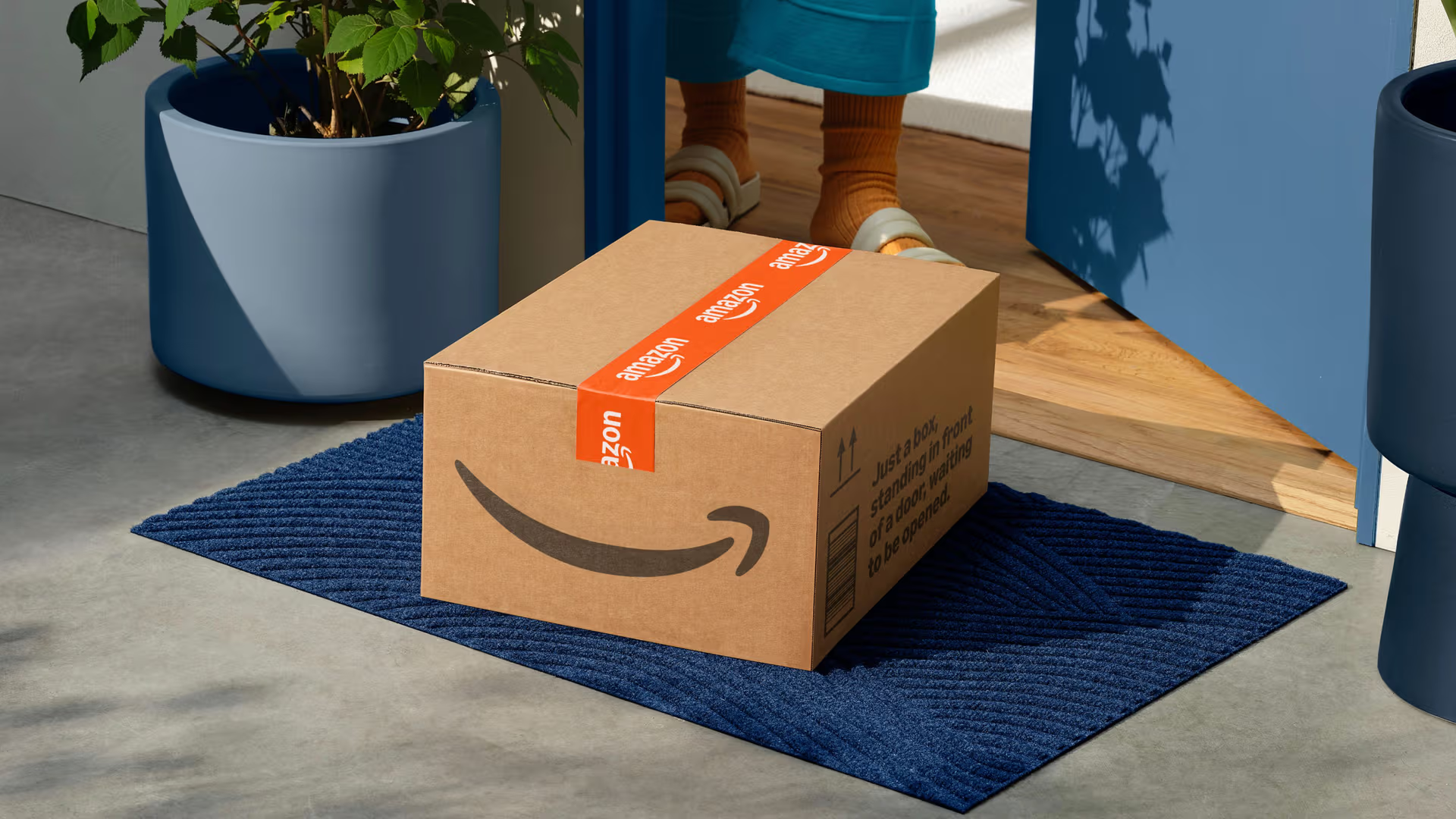
In 2025, Amazon revealed its first major logo update since 2000. The redesign by Koto expanded the smile arrow and refreshed it with a more vibrant orange, giving the logo a fuller, more expressive curve. The change aimed to emphasise a “deeper and more emphatic smile,” reflecting Amazon’s mission to delight customers.

” Our focus was on restoring clarity and confidence. A shared system linking every sub-brand back to the parent. One system, strong enough to carry across 50+ lines of business, flexible enough to stretch across global markets, audiences and teams. The goal was to make Amazon feel unified again, and recapture the magic of finding exactly what you need, exactly when you need it.”

Image source KotoAmazon

The redesign aligned with broader industry trends toward warmer, friendlier giant corporation identities. Sharper shapes and a brighter orange make the logo easier to read at any size, ensuring it stays clear on phones, apps, devices, and in all lighting conditions. This change is indicative of a larger trend in the industry toward logos that are more adaptive, expressive, and responsive in modern digital contexts.

Image source: Koto/Amazon
Image source KotoAmazon

A Logo That Grew with the Brand

The evolution of Amazon’s logo mirrors the company’s rise from niche online bookstore to one of the world’s most powerful tech ecosystems. Each redesign reflected Amazon’s growth stage, from establishing trust to simplifying its identity to communicating scale, speed, and customer happiness.




Source_link

READ ALSO

COSRX is the First K-Beauty Patron of the British Beauty Council

Time Is The New Battleground For Brands

Related Posts

COSRX is the First K-Beauty Patron of the British Beauty Council
Brand Management

COSRX is the First K-Beauty Patron of the British Beauty Council

August 21, 2026
Time Is The New Battleground For Brands
Brand Management

Time Is The New Battleground For Brands

August 21, 2026
Studio Blackburn’s new identity for folding bike icon Brompton cements the brand’s place in British engineering heritage
Brand Management

Studio Blackburn’s new identity for folding bike icon Brompton cements the brand’s place in British engineering heritage

August 20, 2026
Anthropologie Home Unveils Fall 2026 Collection
Brand Management

Anthropologie Home Unveils Fall 2026 Collection

August 20, 2026
Design Scoop — BP&O
Brand Management

Design Scoop — BP&O

August 20, 2026
A&W Restaurants Unveils New Restaurant Design for Future Growth
Brand Management

A&W Restaurants Unveils New Restaurant Design for Future Growth

August 19, 2026
Next Post

How to Design a Swiss Army Knife Research Agent with Tool-Using AI, Web Search, PDF Analysis, Vision, and Automated Reporting

POPULAR NEWS

Trump ends trade talks with Canada over a digital services tax

Trump ends trade talks with Canada over a digital services tax

June 28, 2025
15 Trending Songs on TikTok in 2025 (+ How to Use Them)

15 Trending Songs on TikTok in 2025 (+ How to Use Them)

June 18, 2025
Communication Effectiveness Skills For Business Leaders

Communication Effectiveness Skills For Business Leaders

June 10, 2025
Comparing the Top 7 Large Language Models LLMs/Systems for Coding in 2025

Comparing the Top 7 Large Language Models LLMs/Systems for Coding in 2025

November 4, 2025
App Development Cost in Singapore: Pricing Breakdown & Insights

App Development Cost in Singapore: Pricing Breakdown & Insights

June 22, 2025

EDITOR'S PICK

Honor says its ‘Robot phone’ with moving camera can dance to music

Honor says its ‘Robot phone’ with moving camera can dance to music

March 1, 2026

How Comcast’s Level X ambassador program drives business outcomes

September 16, 2025
New Logo & Bradnign for Teller by Werklig — BP&O

New Logo & Bradnign for Teller by Werklig — BP&O

June 5, 2025
The “TikTokification” of Search: Why the Creator Model Is Replacing the Ranking Model

The “TikTokification” of Search: Why the Creator Model Is Replacing the Ranking Model

July 24, 2026

About

We bring you the best Premium WordPress Themes that perfect for news, magazine, personal blog, etc. Check our landing page for details.

Follow us

Categories

  • Account Based Marketing
  • Ad Management
  • Al, Analytics and Automation
  • Brand Management
  • Channel Marketing
  • Digital Marketing
  • Direct Marketing
  • Event Management
  • Google Marketing
  • Marketing Attribution and Consulting
  • Marketing Automation
  • Mobile Marketing
  • PR Solutions
  • Social Media Management
  • Technology And Software
  • Uncategorized

Recent Posts

  • The Only GameCube That Could Play CDs And DVDs Is Rarely Found Below $1,000 Today
  • Generating scenarios for extreme events, without extreme data | MIT News
  • How to Automate Financial Reporting in 4 Steps (2026)
  • Experiential Marketing Trend of the Week: Eye Contact
  • About Us
  • Disclaimer
  • Contact Us
  • Privacy Policy
No Result
View All Result
  • Technology And Software
    • Account Based Marketing
    • Channel Marketing
    • Marketing Automation
      • Al, Analytics and Automation
      • Ad Management
  • Digital Marketing
    • Social Media Management
    • Google Marketing
  • Direct Marketing
    • Brand Management
    • Marketing Attribution and Consulting
  • Mobile Marketing
  • Event Management
  • PR Solutions