![]()
Another day, another soft drink with a wild new angle: in the last year or so we’ve undoubtedly seen some impressive entrances to the category, from the shouty Yaté yerba maté to ‘braincare beverage’ Rolus to London-brewed water kefir brand Agua de Madre, to the unhinged Y2K lunacy of Fhirst.
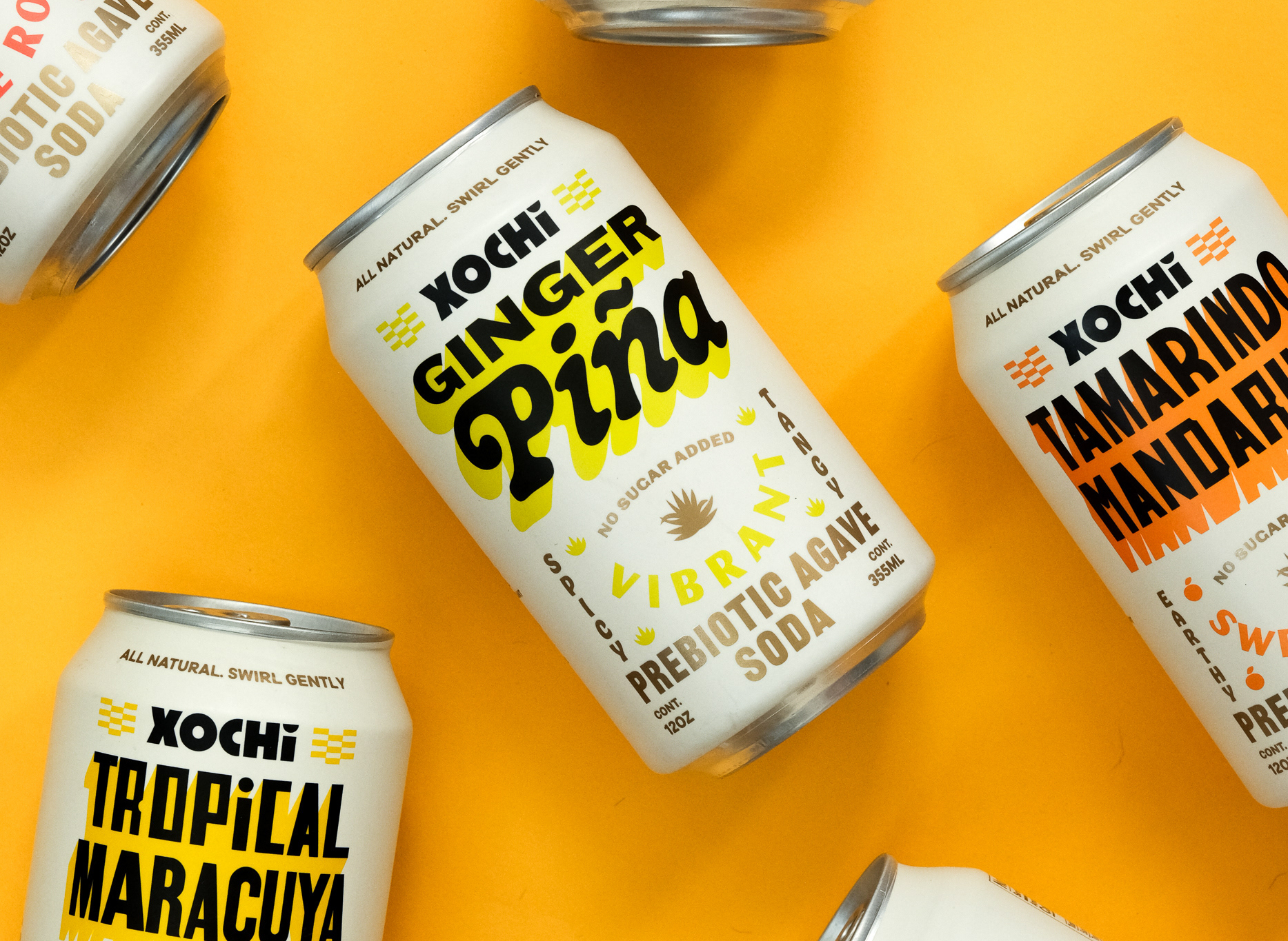
Now, meet Xochi, a prebiotic agave soda made with 100% natural ingredients according to Kinoto Studio, which is responsible for its graphic design and packaging.
Commissioned by agency Caveat, Kinoto worked alongside Essence Creative Studio (which helmed the photography here) and 3D designer Luciano Florio on the project. Kinoto (Parkette), which is based in Uruguay, is responsible for the identity, branding, packaging across cans and other structural packs, and more.
![]()
According to Kinoto, its designs are based around a concept that looks resolutely to Mexican culture for its reference points and inspiration, while paying “homage to its vibrant heritage from a contemporary point of view”. This meant looking largely and things like the Mexican streets, local signage, festive traditional costumes, decorations, flowers, and “everyday graphic expressions.”
Kinoto Studio continues, “We wanted the cans to feel like a celebration of Mexican culture from a pop perspective, where colours are vibrant and typography is bold, oversized, and playful.”
The really interesting stuff here however is in the brand’s USP of sorts: Xochi is all about “respecting the traditions surrounding Aguamiel,” according to Kinoto: for the uninitiated, Aguamiel literally translates as “water honey” from the Spanish. Aguamiel is the sap of the Mexican maguey plant – believed to have therapeutic qualities, according to Native American histories.
It’s said that the process of obtaining aguamiel from maguey was first discovered during the reign of Tecpancaltzin at the turn of the tenth century by a Toltec noble named Papantzin. It was Papantzin’s daughter, Xochitl, who was sent to the king with an offering of aguamiel – so we could probably safely surmise this is where Xochi as a soda brand name comes from.
![]()
I like the name: it’s different, unique, stands out, and all that good stuff. Unfortunately, it’s just a lot of the other elements of the branding I’m not too sure about.
There’s a hell of a lot going on here – for better and for worse, but little to unify the brand into something with an overarching, powerful, strong identity.
It’s not exactly a unique challenge that a food or beverage brand has to flex across multiple different flavours or variants – sodas do it, crisps and other snacks, sweets, and so on. But there’s really, I’d argue, no need to make every single variant so different from the next – it dilutes and complicates and makes everything look just a wee bit more shit when not executed as well as perhaps it could be.
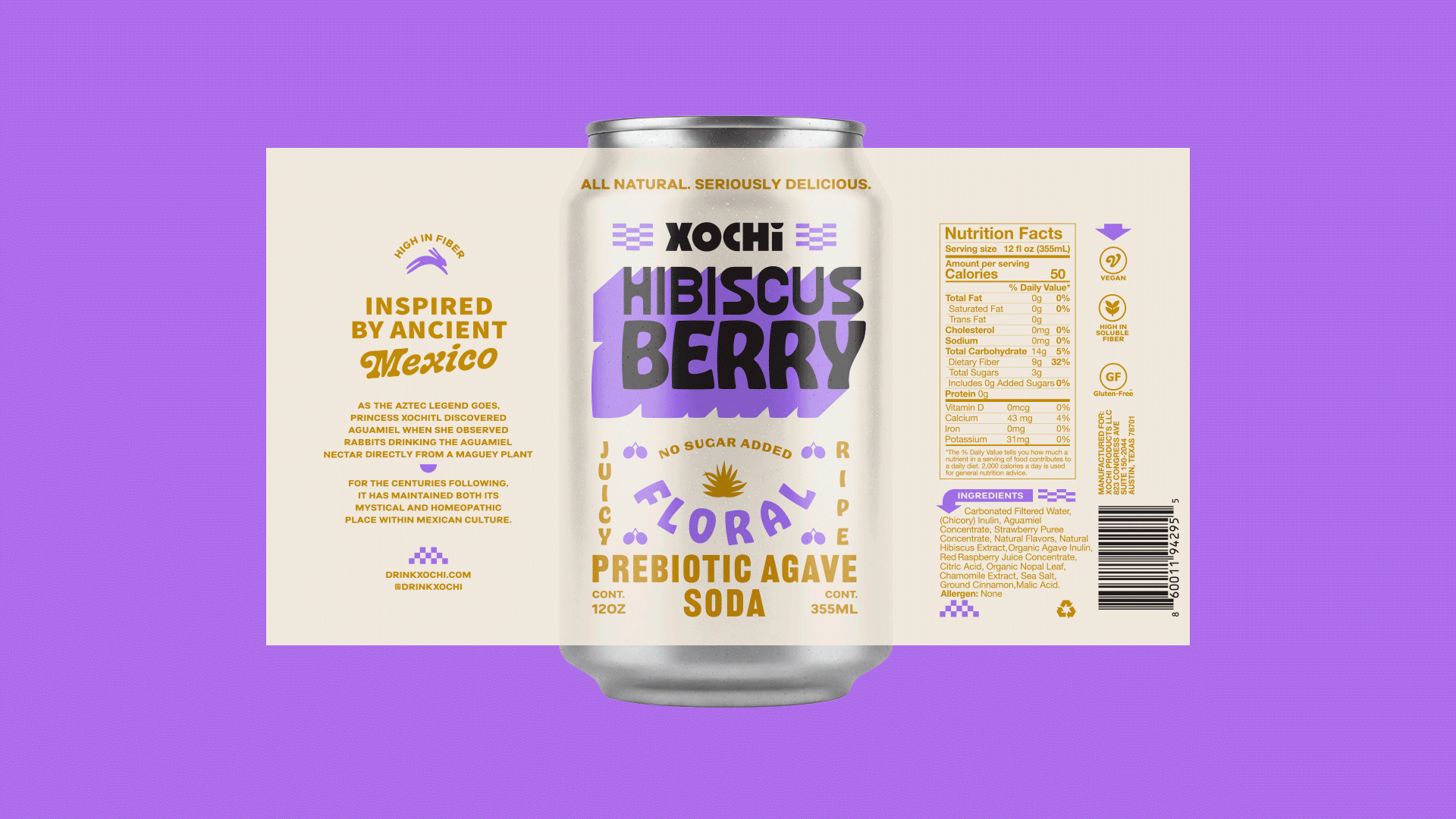
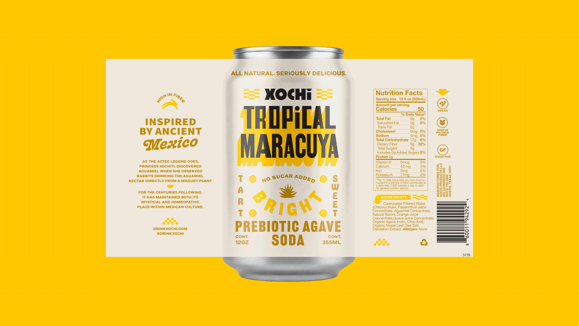
The cans employ a highly saturated and contrasting palette likely intended to create immediate impact, but while each individual can is fine, together there’s little in the way of visual or information hierarchy – honestly it’s hard sometimes to tell what the brand is, which bit of text references the flavor, which is the descriptor, and so on. Dominant colours include turquoise, fuchsia, sunflower yellow, coral orange, and lime green, applied across full-bleed backgrounds and layered motifs. Secondary colours are used sparingly for text, graphic accents, and decorative flourishes, further complicating already-complex compositions.
The arrangement of these colours is deliberately asymmetrical, likely aiming to evoke the improvisational quality of street signage and festival decoration while preserving a structured reading experience for brand name, flavour descriptor, and legal text. Patterns are inspired by local signage, floral arrangements, and textile motifs, appearing either as repeating structures or singular illustrations depending on the flavour variant.
While this approach allows each SKU to be visually distinct, it makes it very hard to maintain a coherent Xochi family identity.
Another key element used to differentiate each variant is typography – and this, like the name, is something I really do like about the designs for Xochi. There’s some very cool choices here typographically, and they’re usually applied well.
![]()
![]()
I’m not 100% sure what the main Xochi wordmark uses as its typeface – the letterforms are nice though, if not amazing – woodcarving like forms which are very much in keeping with the whole Mexican thing, if a little Disney-ish in their unsubtlety.
But it’s the choices used in most of the flavour names for the variants that I reckon are the strongest, and interestingly, many of these are from Tré Seals at foundry Vocal Type: there’s Martin, named after Dr. Martin Luther King Jr., a sans‑serif display with a bold, protest sign–inspired look with hand‑drawn character shapes recalling activist posters (especially the “I AM A MAN” signs); there’s Marsha, another sans‑serif display amed after Black transgender activist Marsha P. Johnson, with lettering inspired by a historic vertical sign outside the Stonewall Inn.
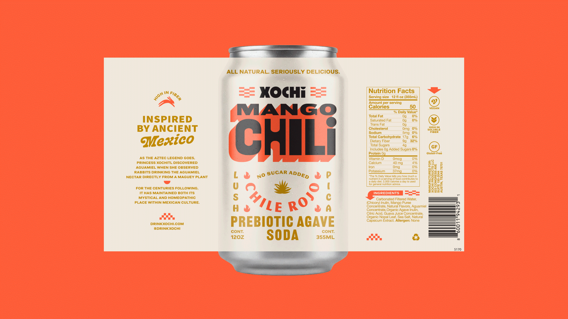
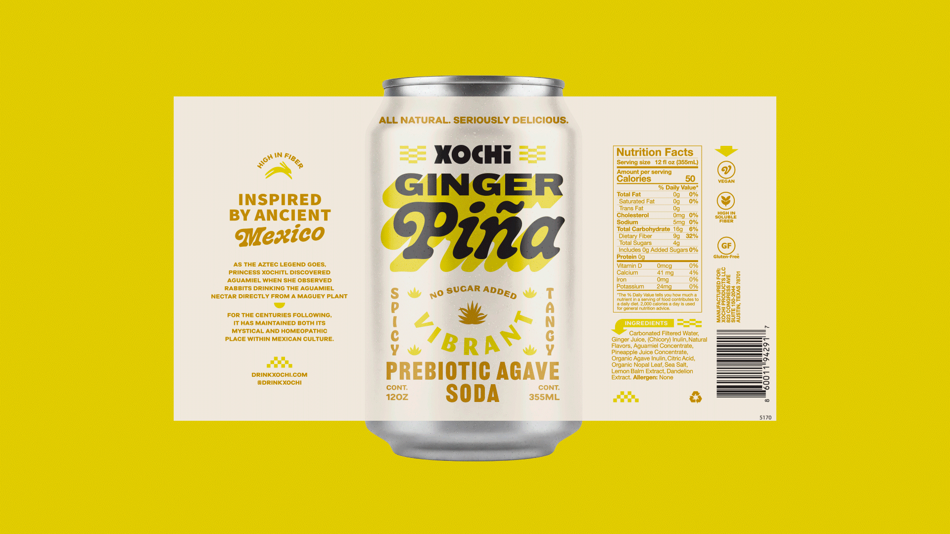
The identity also uses Vocal Type’s Bayard (yes, a sans‑serif display), which bears bold letterforms rooted in 1960s civil‑rights march signage and is named after Bayard Rustin, a key organiser and advisor in the U.S. Civil Rights Movement; and finally a fourth Vocal Type sans serif display, Ruben, which uses expressive, protest‑style letterforms inspired by historic demonstrations and journalistic signage and is named for journalist and activist Rubén Salazar.
As well as these four typefaces, elsewhere the designs for Xochi use Music Nouveau JNL designed by Miami-based Jeff Levine Fonts, a hand-lettered Art Nouveau display font discovered on vintage sheet music; the VERY Spanish-inspired El Grosa designed by Indonesia-based Fateh.Lab; Hobeaux by OH no Type Company, a playful if slightly dated looking sans‑serif display with thick, rounded strokes and a quirky vibe; MVB Magnesium by Mark van Bronkhorst at San Francisco Bay Area’s MVB Fonts, a warm-looking sans‑serif display in all caps with thick‑thin strokes inspired by early 20th‑century hand‑painted signage; and finally West Cooper Nouveau swash by House Industries, a serif display with a playful, energetic retro feel originating from Cooper Black designs. This is the one that, for me, works best here: it has the most distinctive contrast on-pack from the brand wordmark and the body cop[y, and has the most clarity in terms of what we’re actually looking at here.
![]()
Within the context of contemporary craft beverage design, Xochi certainly represents a shift from restrained minimalism towards expressive layering that communicates heritage, functionality, and playfulness simultaneously.
It’s just a shame that it relies so heavily on swathes and swathes of copy to communicate things like the drink’s prebiotic qualities: the sheer amount of stuff on every can means that anything that’s good immediately gets a bit lost. Not to say there’s nothing to like here – far from it – but (and I say this as a resolute maximalist), sometimes less really is more.
![]()
![]()