
Our old homepage hero technically showed all the platforms we support — but it felt overly corporate. Like a feature list wearing a trench coat.
So in early 2025, we redesigned our homepage as part of an overall website redesign.
The previous homepage hero featured an animated headline that rotated through the various supported social media platforms.
The previous hero featured an animated headline that rotated through Buffer’s supported social media platforms. While it did the job, it didn’t feel very “Buffer-y.” We wanted to make a stronger first impression — something with more liveliness and delight.
So, we got to work on designing and engineering a new homepage hero that we would validate with a simple A/B test.
Developing the design concept
The primary design goal with the new hero section was to still demonstrate how many social media platforms Buffer supports, but with some added fun and interest.
Kate Baldrey, our incredibly talented marketing UX designer, came up with the idea of floating tiles arranged on a grid (a subtle nod to social grids) at various depths.
These tiles would feature various social media platform icons, as well as emoji to evoke the experience of social media engagement.

With early design ideas in place, we immediately began engineering the real thing.
Building the design
We heavily rely on designer-engineering pairing for all Buffer.com projects.
This means that instead of formally creating high-fidelity designs in Figma, then handing them off to engineering to be built, we spend our time together on calls talking through design ideas, exploring approaches, working through challenges, and making refinements.
This practice reduces temporary design artifacts and handoff, which saves a lot of time and results in higher quality work.
To facilitate pairing, we have a live preview of the local development environment running from the start of the project. This gives us a shared, realtime URL of the work that updates on every code change and treats the final medium (the webpage) as the single source of truth.
Breaking down the design
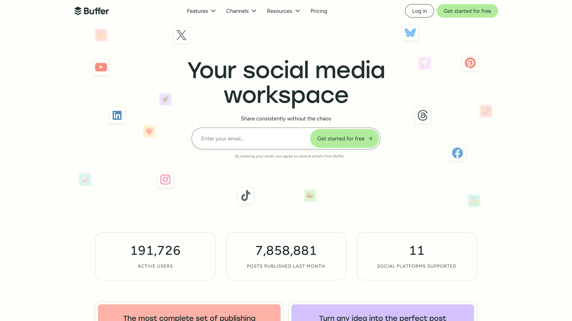
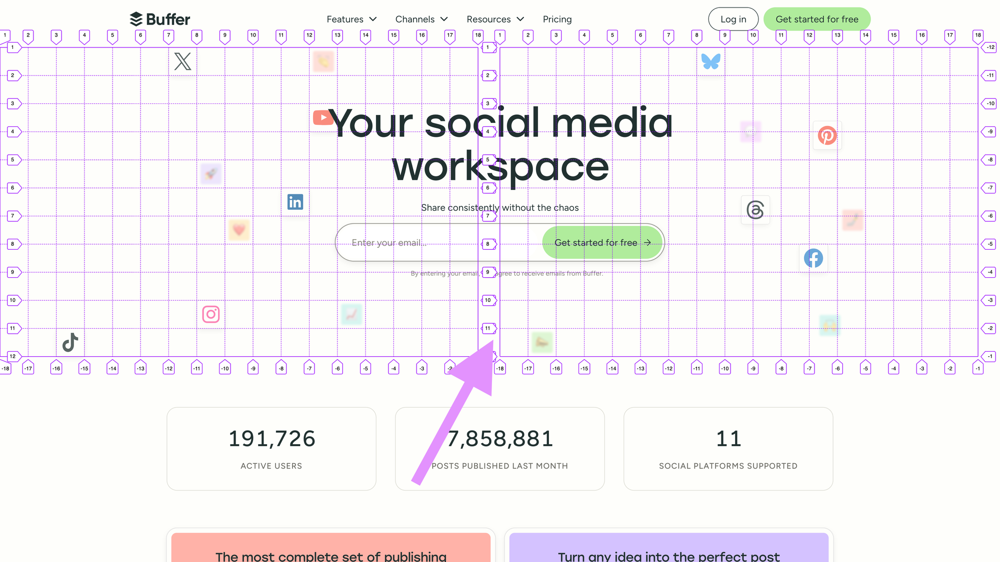
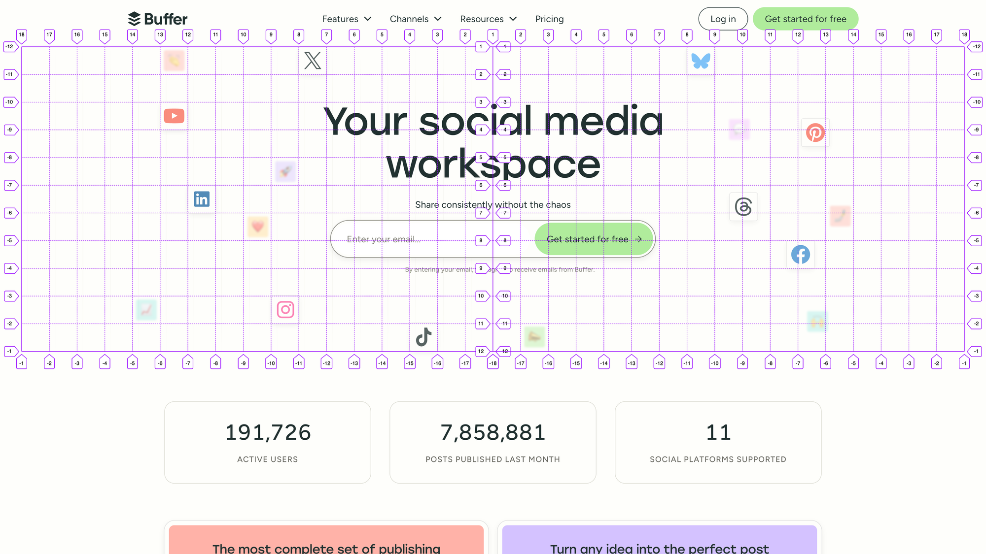
The hero section design features a number of “tiles” positioned on a grid behind the hero section content.
Some of these tiles have emoji and add depth to the design by being smaller, less opaque, and slightly blurred to give the impression that they’re further away or underneath the other content.
The remaining tiles have the icons of the various social media channels Buffer supports, including Bluesky, Facebook, Google Business Profile, Instagram, LinkedIn, Mastodon, Pinterest, Threads, TikTok, X (Twitter), and YouTube. These tiles are larger, more opaque, and have no blur to appear closer to the viewer.
The visual grid establishes “cells” that are the size of the channel tiles, and is centered within the hero section.
Accessibility-first design and engineering
I follow a process I call accessibility-first design and engineering. This means our work begins with an accessible foundation that we preserve throughout the design and build process.
For this hero section, the visual grid and tiles are decorative, so we hide them from assistive technology to avoid them from being announced to people who are trying to discover and interact with important content and features. This is achieved by wrapping the decorative design with aria-hidden=”true”.
Next, this design features animation and interaction, which can cause discomfort for people with vestibular disorders or motion sensitivity. To avoid this, all animation is off by default, and we enable it only if we detect prefers-reduced-motion: no-preference in CSS and JavaScript.
With this approach in place, we’re ready to start on the layout and animation.
Achieving the grid layout
Achieving this layout proved to be an interesting challenge, as the grid needs to be responsive to all screen sizes by allowing us to position the tiles based on the available space. It also needs to have horizontal symmetry reflected from the center of the hero section.
To pull this off, we actually create two separate CSS Grid containers, one for each horizontal half of the hero section, which we’ll refer to as the “leading” and “trailing” containers.
Each of these containers will have auto columns and rows set to the size of the tiles. To make this easy to manage, we create a CSS custom property (variable): --_tile-size: 3rem; (the underscore prefix is a convention we use to indicate that this variable is private to this class and not a global variable/design token). This variable also allows us to change the tile size across breakpoints for responsive design. We can then use this variable in our CSS Grid:
.decorationGrid {
  display: grid;
  grid-template-columns: repeat(auto-fill, var(--_tile-size));
  grid-template-rows: repeat(auto-fill, var(--_tile-size));
}
The repeat(auto-fill, var(--_tile-size)); declaration will create as many columns/rows as possible of a set size (in this case, our tile size).
With these two CSS Grid containers, we have an issue: CSS Grid respects the page’s text direction. For English, the writing mode is “ltr” (left-to-right), but this varies by language and culture.
This means that our “leading” grid has empty space on the right if it can’t perfectly fit additional columns. This empty space ends up in the middle of the hero section and makes the layout asymmetrical.
To solve this, we can use the direction property in CSS. Because we’re using aria-hidden=”true” for this decorative visual content, it’s safe to change the direction without affecting actual text content. First, we’ll set direction: ltr; on the .decorationGrid to prevent the direction from changing if the page is translated. Next, we’ll set direction: rtl; on our leading grid, which allows the grid to start from the right edge and place empty space on the left. This creates the mirrored horizontal symmetry we need.
Placing the tiles
With our symmetrical, auto-growing grid in place, we can place our tiles into dedicated cells.
Since our grids are mirrored, this causes grid-column to be mirrored as well. With our leading grid, grid-column: 2; would place an item in the second column from the center of the hero section.
To avoid confusion, we can create a --_column-from-center variable to use with our tiles:
.tile {
  grid-column: var(--_column-from-center, 0);
}
This variable makes it easy to specify the desired column for each tile, and we can use grid-row as expected for the row position.
Responsive design
We start mobile-first with our responsive design, and begin placing the tiles based on the available space. We hide many of the tiles by default, prioritizing the social media icons, and then carefully place the visible tiles to avoid interfering with the text content and email form in the hero.
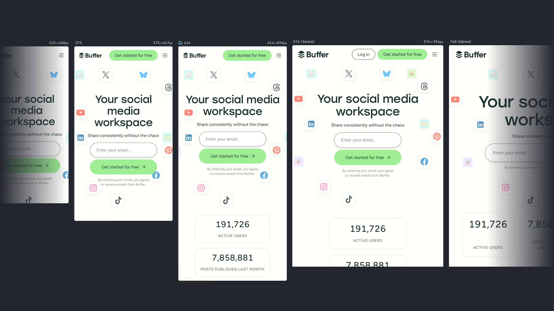
As the screen size increases, we simply add a new media query breakpoint in CSS, make more tiles visible, and rearrange them as space allows.
Once we arrive at our largest breakpoint around 1344 pixels, all the tiles are visible and have a dedicated position that won’t change for larger screens.
Animation and interaction
As we paired on the design and build, we discussed possible animations for the hero section and tiles. We arrived at the idea that the tiles would react to the cursor by being pulled towards it as the cursor moved across the hero section.
To validate this idea and the technical approach, we first prototyped the animation and interaction for a single tile.
The interactive prototype for a single cell demonstrates the cursor following behavior and animation properties.
To achieve this, we defined an “activation zone”, or how close the cursor needs to be to a tile for the tile to start moving towards the cursor.
When the cursor is within the activation zone, we then animate the tile towards the cursor using a spring animation. A spring animation mimics a physical spring in real life, which allows us to define parameters for how stiff or loose the animation feels, a max distance for the tile to travel, and how quickly the tile returns to its original position if the cursor leaves the activation zone.
Prototyping this with a single tile allowed us to visualize and quickly tune these parameters until things felt right and we were confident the technical approach would work.
With a single tile working, we componentized this functionality to apply it to the other tiles. With everything in place, we could enjoy the full animation across the hero section with everything moving and reacting gracefully.
All tiles follow the cursor as it moves around the hero section, before reaching a maximum distance and returning to their original position.
Considering non-cursor interaction
Because the animation relies on a cursor, it depends on a mouse, stylus, or similar input device. Luckily, the activation zone also works on click events, meaning taps on a touch screen will also activate the animation.
For touch-screen devices, this allows people to discover the interaction when they tap on the email input or get started button. It’s also a fun, hidden detail that people might accidentally find at first.
Creating the visual grid lines
The final detail we incorporated was grid lines that visually anchor the arrangement of the tiles. We needed the grid lines to match the tile size and scale gracefully with the responsive grid used for the tile layout.
To achieve this, we created a repeating linear gradient background with some clever sizing tricks. The linear gradient creates a 1px line along the bottom and a single side of the background, which creates a square grid when repeated. It also makes use of the –_tile-size variable to ensure it’s the same dimension as the tiles:
.decorationGridLinesLeading {
  /* 1px side and bottom grid lines */
  background-image:
    linear-gradient(to left, var(--grid-color) 0.0625rem, transparent 0.0625rem),
    linear-gradient(to bottom, var(--grid-color) 0.0625rem, transparent 0.0625rem);
  /* Match the repeating background to the tile size */
  background-size:
    var(--_tile-size) var(--_tile-size),
    var(--_tile-size) var(--_tile-size);
  /* Position the background in the top right (center of the hero section) */
  background-position:,
   right top,
   right top;
}
The other half of the grid is mirrored, so we simply swap the left and right keywords.
To finish things off, we wanted to fade the edges of the hero section grid to blend with the rest of the page. We can achieve this with additional linear gradients that go from transparent to the page’s background color:
.decorationGridLinesLeading {
  /* Add top, side, and bottom fades */
  background-image:
    linear-gradient(to top,var(--background-color) 0%, transparent 20%, transparent 80%, var(--background-color) 100%),
    linear-gradient(to right, var(--background-color) 0%, transparent 20%),
    linear-gradient(to left, var(--grid-color) 0.0625rem, transparent 0.0625rem),
    linear-gradient(to bottom, var(--grid-color) 0.0625rem, transparent 0.0625rem);
  /* Stretch the fades to 100% of the element's size */
  background-size:
    100% 100%,
    100% 100%,
    var(--_tile-size) var(--_tile-size),
    var(--_tile-size) var(--_tile-size);
  background-position:
    initial,
    initial,
    right top,
    right top;
}
And with that in place, we have our completed hero section:
The final homepage hero section with interactive tiles gracefully following the cursor.
Results
As mentioned at the start of this article, we rolled out this new hero section design as part of an A/B test to validate the impact of the new design and interaction.
After running the experiment for 2 weeks, we were thrilled to find the new design resulted in increased signups and even some celebrations on social media. Confident in our new direction, we rolled out the new homepage hero section to 100% of traffic.
This project was a joy to work on in close collaboration with Kate, and pushed my design engineering skills further with many interesting layout, animation, and interaction challenges.
This design remains in place today, but we always have new ideas cooking and will keep iterating from here.


