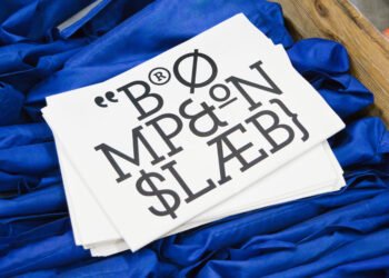
Every brand faces the same question: build for right now, or build for always? For Creative Director Simrit Brar, it’s rarely one or the other. It’s a constant negotiation between a client’s appetite for risk and the story that will actually outlast a trend cycle.
Here, Simrit unpacks what timeless design really looks like, why a brand system that’s too matched can age faster than one with room to breathe, and how a data company found its story in a flock of starlings.
What does timeless design look like to you?
One brand that has done it successfully is IBM. Their design system and logo have essentially never changed. NASA is another example. And of course, everyone says Apple, but I think Apple also knows how to be timely in the right way. A lot of their work still has a timeless aspiration to it.
Every designer faces the pull between what’s resonant right now and what will endure. How do you navigate that tension?
Because of the types of clients we work with at Siegel+Gale, we tend to lean toward timeless design. But navigating that tension between what will resonate at the moment and what will endure really depends on your clients and their industries. Sometimes a client says they want to be cool and innovative, even though they aren’t ready for that, so gauging their appetite is part of our creative process.
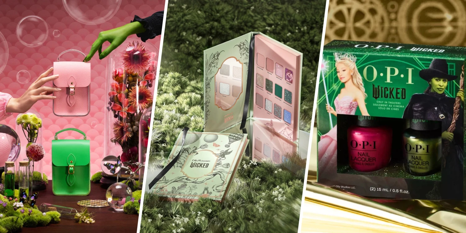
Remember, a brand isn’t just a logo; it’s a full system. And when you’re creating a system, it shouldn’t look like a set of matching luggage. If everything matches, it gets dated fast. Interestingly, I find that color can be a brand. I think about Wicked—from the massive brand partnerships with Starbucks, Lego, and Target to fans showing up to theaters wearing pink or green. Across apparel, toys, and in-person experiences, everything was held together by that core.
When does leaning into a trend serve a brand, and when does it date them?
You never want a client to appear so trendy that, in a year, they need to rebrand again, but you also don’t want them to look so safe that they seem outdated. In general, clients approach us because they have a new story to tell. And the visual expression is how they announce that new story. If it doesn’t feel fresh, they’re not telling the story. But become too trendy, especially with B2B clients, and you alienate audiences.
I was recently listening to a podcast with a design leader who talked about the importance of distinctiveness and of always returning to a brand’s core. I think that’s where timelessness really comes from: finding exactly what about this brand will endure and building from there.
How do you counsel a client who’s drawn to something trendy that you sense won’t hold?
Rather than rejecting a client’s idea, sometimes you just need to try it and show them. Clients, especially founders, have instincts, and I don’t easily dismiss what they say. Sometimes you mock it up, and it proves your point. Other times, you unlock a lovely, unexpected surprise, and it works.
Branding is really just another word for differentiating. You’re creating something that has to stand out. Whether it’s a name, a color palette, or a design system, if you don’t stand out, you will get lost in a sea of sameness, no matter your category.
I always look outside a client’s industry for inspiration because that’s often where interesting ideas come from. For example, when our team was working with Cotality, a technology company in the real estate mortgage space, we explored the idea of a murmuration (a natural phenomenon in which hundreds or thousands of starlings fly together in highly coordinated, shifting, and fluid patterns in the sky). Cotality wanted to be seen as innovative, and when we presented early concepts, what resonated most were the ones with timeless stories, like references to nature. The way the starlings fly together, there’s a parallel to how insights and data merge. Timelessness came from the depth of the story, not just the visual expression.
How does cultural specificity factor into how you think about longevity?
Many of the logos that have emerged over the last few years have become bland and neutral, unlike older logos. You used to see a symbol that stood for something: a bird, an object, something rich. Now you see abstractions: letter forms, geometric shapes. It’s very modern but lacks the same storytelling depth. And I think part of the reason is that brands are becoming more global, so designers are trying to create marks that work across cultures. But in doing so, the context of a symbol can vary widely across cultures. Something that signifies good luck in one place means something entirely different elsewhere.
Years ago, I worked with a phone provider brand called Magpie. We made the entire identity black-and-white to match the bird. Then a British colleague pointed out that in some cultures, the magpie is seen as a winged thief. The challenge is: how do you create something that spans cultures and remains universal without becoming generic? I grew up in India, in a maximalist culture, and worked there for 10 years before moving to the West, which is far more minimalist. I’ve been straddling those two worlds ever since, and it really is a cultural question at its core.
Is simplicity itself timeless, or does what “simple” means shift over time?
I’d argue simplicity is the most timeless principle there is, but it’s also the most misunderstood. People assume simple means stripped-down, minimal, and safe. It doesn’t. Simplicity is about clarity of story, not absence of detail. It’s the discipline to know exactly what a brand stands for, so everything else (color, form, tone, etc.) can build outward from that one true thing.
That’s actually the thread running through everything we’ve talked about. IBM and NASA didn’t last because they were plain; they lasted because they never lost the plot. Cotality worked because it distilled a complex idea into something instantly graspable.
So can simplicity become a trend? Maybe the aesthetic of it can. But real simplicity—knowing your core and refusing to dilute it—never goes out of style.
Simrit Brar is Creative Director at global brand consultancy Siegel+Gale
The post Timelessness vs. timeliness appeared first on Siegel+Gale.