Choosing a logo isn’t just about what looks good. It’s about selecting a structure and style that aligns with your brand’s strategy, personality, and long-term growth.
Logo designs can be evaluated through two main considerations:
- How the logo is constructed
- How the icon communicates meaning
Understanding both helps you make informed decisions about your brand identity.
Logo Design Types (How It’s Built)
These categories describe the structural foundation of a logo.
Wordmark
A wordmark is the full company name styled in custom typography. There is no separate icon. The design focuses entirely on the lettering.
Wordmarks are often used when the full company name needs to remain intact and recognizable across all applications.
Examples include: Google, Coca-Cola, Visa, Netflix, Disney
![]()
![]()
![]()
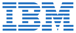
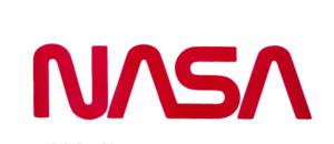
Lettermark (Monogram)
A lettermark uses initials or an acronym to simplify longer company names. The focus remains on typography, but in abbreviated form.
This approach works well for companies with long or multi-word names.
Examples include: HBO MAX, CNN, IBM, NASA
![]()
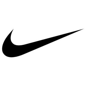
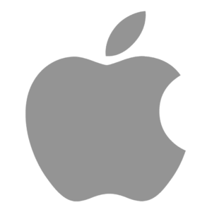
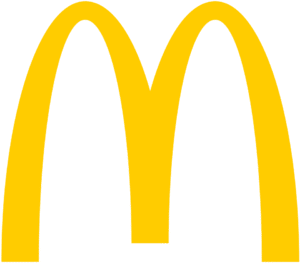
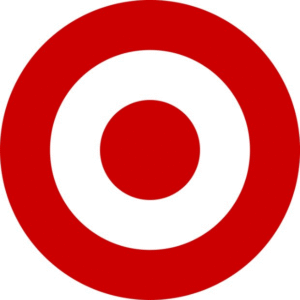
Pictorial (Icon only)
A pictorial mark is a recognizable symbol that can eventually stand alone without the company name once brand recognition is established.
An icon-only logo only works when recognition is already strong enough that the symbol alone carries meaning.
Examples include: Target (bullseye), Nike (swoosh), Apple (apple), McDonald’s (golden arches)

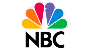
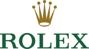
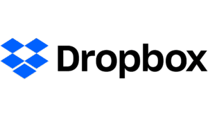
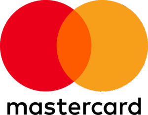
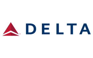
Combination
A combination mark includes both the company name and a symbol. These elements can be used together or separated depending on context.
This is often the most flexible option, especially for new or growing companies.
Examples include: NBC (peacock), Rolex (crown), Dropbox (box icon), Mastercard (interlocking circles), Delta (triangular symbol)
Icon or Logo Mark Styles
When a logo includes a symbol, that icon generally falls into one of two main categories: abstract or literal. These categories describe how the symbol visually represents the brand.
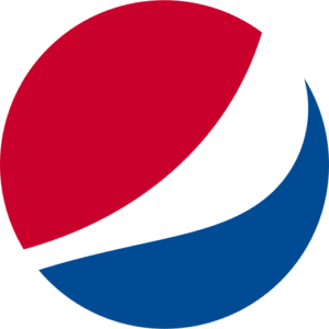
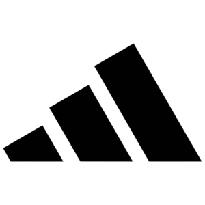
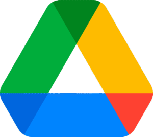
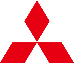
Abstract
An abstract icon uses a non-representational shape that does not clearly depict a real-world object. Its meaning develops through repeated brand exposure.
These shapes do not literally depict a product. Instead, they communicate through form, movement, and visual language.
Examples include: Nike, Pepsi, Adidas, Google Drive, Mitsubishi
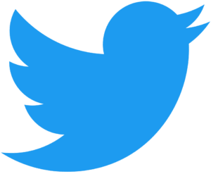
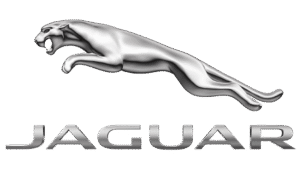
Literal
A literal icon depicts a recognizable, real-world object. Even if stylized or simplified, it clearly represents something tangible.
Literal marks may be direct or symbolic.
The object itself is real, but its meaning can extend beyond the literal image through brand storytelling and positioning.
Examples include: Apple (apple), Twitter (bird), Jaguar (jaguar), Target (bullseye)
![]()
Choosing the Right Direction
There is no universally better logo type. The right choice depends on:
- Brand personality
- Industry positioning
- Long-term growth plans
- Competitive landscape
- Recognition goals
A well-designed logo is not just attractive. It is strategically aligned with where the brand is today and where it intends to grow.
If you’re exploring a new logo or refining an existing one, clarity around structure and style is the first step. Thoughtful decisions at this stage create a brand identity that can scale, adapt, and remain recognizable over time.
If you’d like guidance choosing the right logo direction for your business, reach out to start the conversation.
The post Understanding Logo Types and Icon Styles appeared first on Huckleberry Branding.