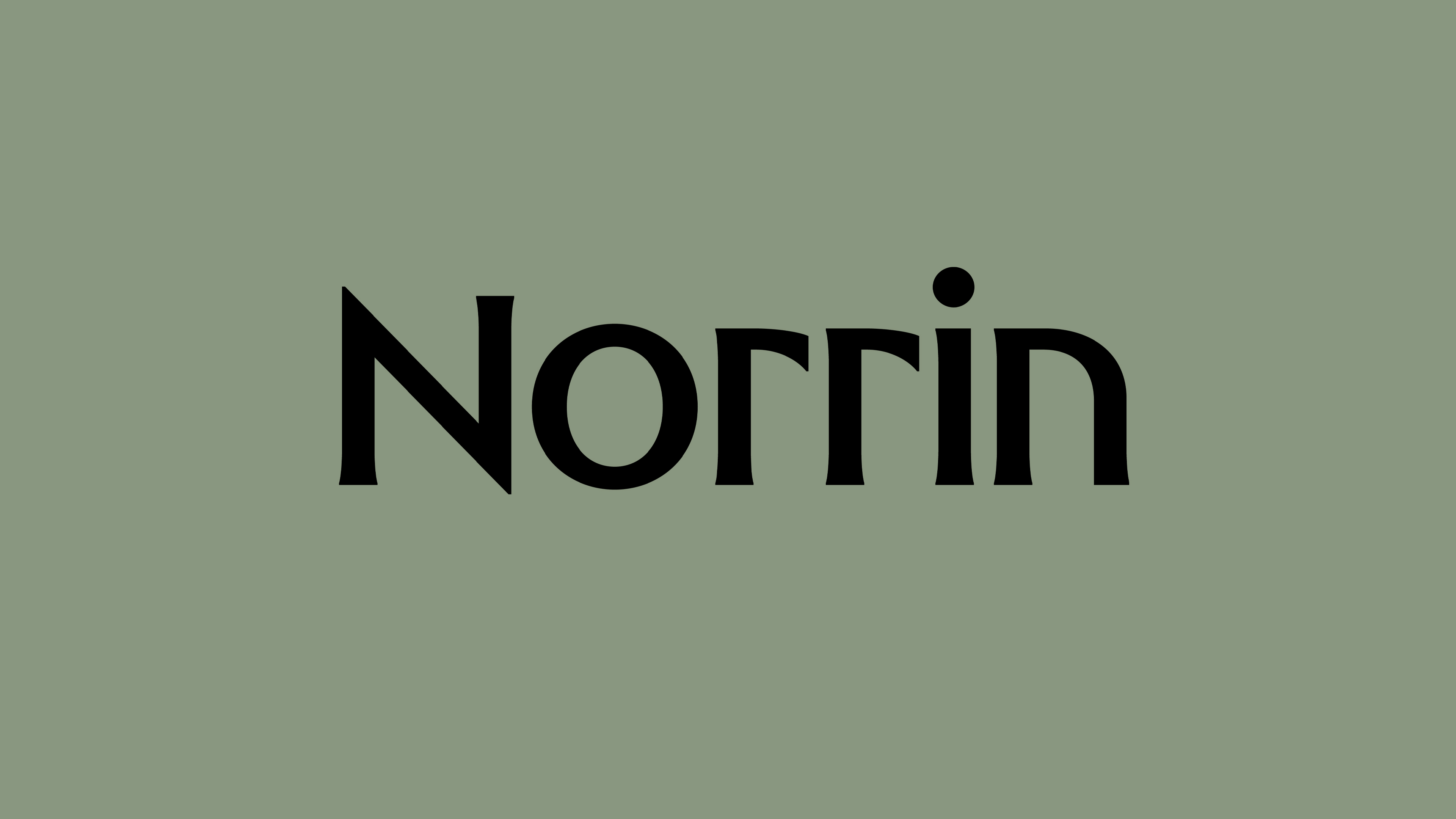
What exactly is a ‘Norrin’? A cursory search reveals that it’s a word that means very different things to different people. For the Marvel-heads, Norrin Radd is an alias of the Silver Surfer character, described as “an honorable Zenn-Lavian who became the Herald of Galactus to spare his home planet Zenn-La and his beloved Shalla-Bal from Galactus’ hunger”. Of course! Makes sense now!
For the pathologists, epidemiologists, or armchair disease fanatics, however, Norrin refers to “Norrie disease protein or X-linked exudative vitreoretinopathy 2 protein (EVR2) – a protein that in humans is encoded by the NDP gene” (thanks Wikipedia). Which honestly makes about as much sense to me – an elder-millennial English Lit girlie who writes about words and pictures – as the aforementioned Marvel lore.
I’d love to have arrived at a place where Norrin in the context of the project we’re covering here is a wholly more comprehensible entity. Unfortunately – and this is probably on me – despite my best efforts, it is not.
What I do know, because it’s on the company’s website is that Norrin is a “Finnish Microsoft technology partner enabling enterprise intelligence for [its] clients”. Norrin continues, “From strategy to execution, we lead and support transformations in business productivity and capability – making technology potential a business reality.” Which is all well and good, but still, the day to day physical tangible visible reality of what ‘enterprise intelligence’ etc. – what Norrin as a company/brand/entity actually is and does – still feels like a total mystery.
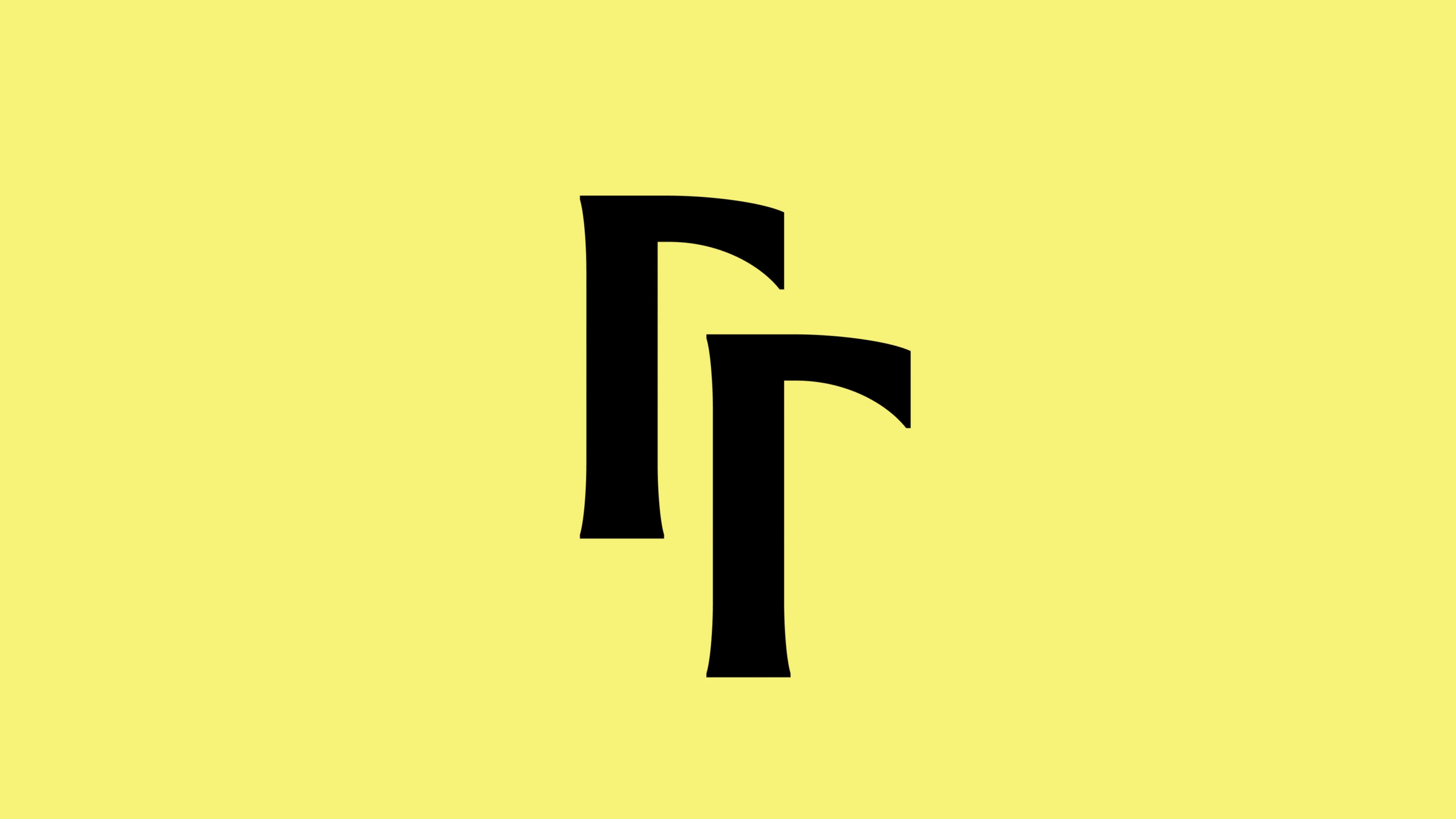
Norrin was formed from the merging of three separate companies with names that feel so ludicrously ‘impenetrable-big-nerd-tech’ that you wouldn’t be half surprised if they were drawn from They Live or something to do with Philip K Dick – Cloud1, Devisioona, and Smartbi. With that unholy trinity now united as the singular Norrin, the company has unveiled a new brand identity created by Bond (Siuru, North Star Film Alliance, Cable Factory, ArtRabbit), which has studios in Helsinki, Dubai, Tallinn, New York and San Francisco.
Since Bond describes Norrin as “an AI-driven consultancy distinguished by its Nordic heritage, technical rigour, and co-creative mindset,” we’d wager that it was the Helsinki arm that helmed the Norrin rebrand, which aims to amplify the company’s “unique strengths – turning complexity into clarity through impactful co-creation.”
Bond worked across the brand strategy, naming, brand identity, motion design, logo and digital design for Norrin, and says that the identity system and brand narrative were designed to “vividly articulate” its core beliefs around “Nordic directness, disciplined creativity, and human-centric clarity”.
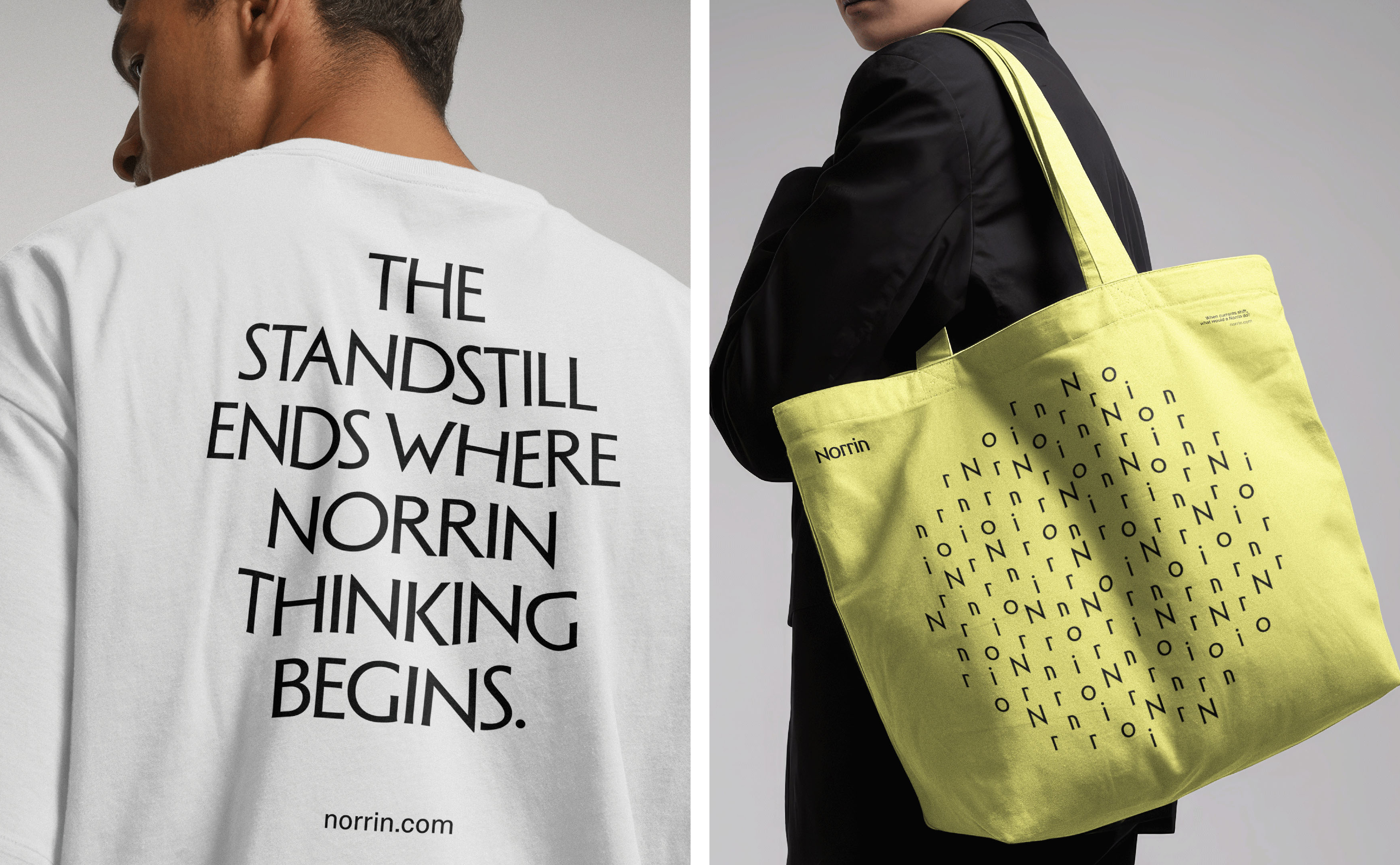
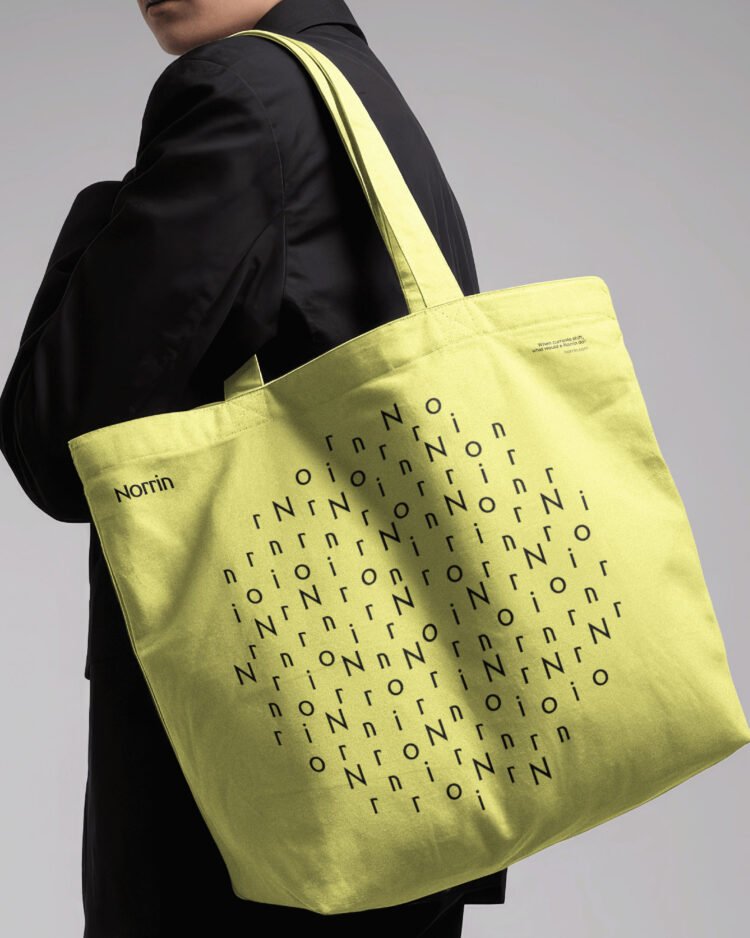
Those notions of discipline and clarity come through loud and clear in the visual identity: there’s nothing superfluous here, everything feels beholden to a modern, calm sense of precision and that distinctly Scandi mode of minimalism. The colour palette is limited to a rather autumnal selection of muted tones in a pale terracotta orange, murky green and yellow alongside black and white; while the typography centres on just two brand fonts.
The wordmark and headline brand copy uses the gorgeous flare serif Adelia by Stockholm-based foundry Letters from Sweden, which fittingly for the brand is influenced by “Nordic arts and culture of the early 1900s”, according to its creators. LFS adds that Adleia is “elegant and robust by default,” which feels like a spot on vibe for a tech product that needs to communicate that it’s powerful, resolutely functional, but intuitive and seamlessly strives to make its clients’ lives easier.
For longer swathes of text, Bond opted for Swiss foundry Dinamo’s Camera Plain, the less jazzy sibling of ABC Camera. It’s a nice choice and works well here – a smart, legible sans serif but one that feels considered and notably different from any sort of system font version of the usual suspects (Helvetica et al). As with the overarching identity, the font choice underscores the sense that every aspect of the brand is utterly deliberate, thoroughly considered, ‘form following function’ and all that good stuff.

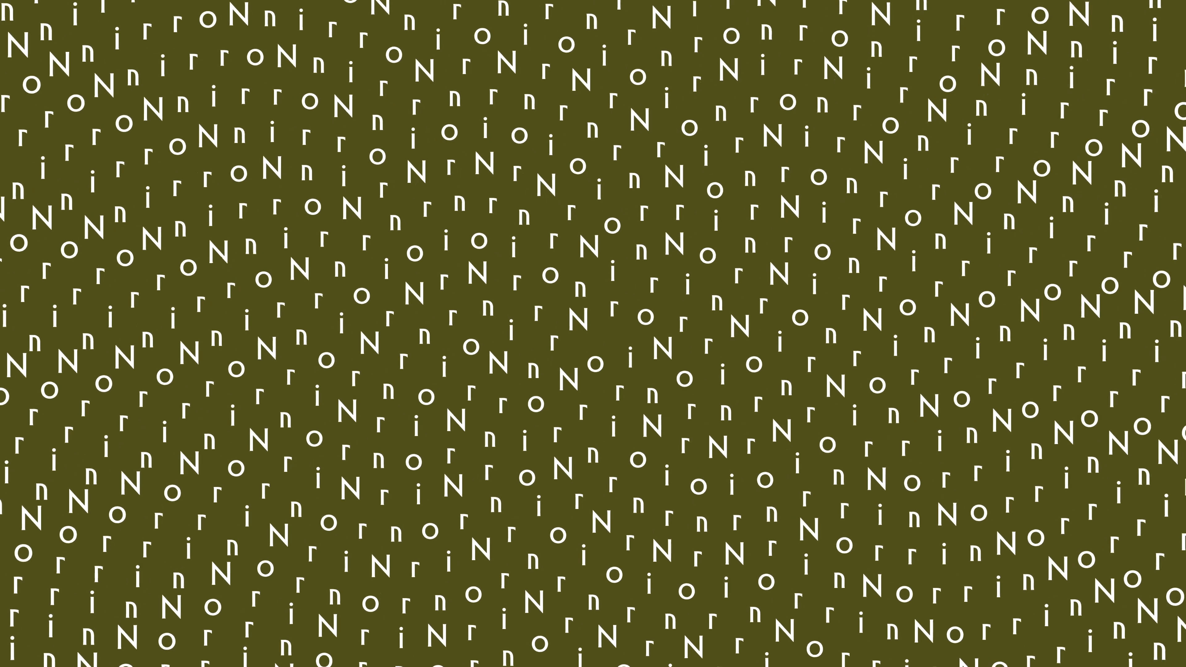
For me, it’s the typography that’s hands down the strongest aspect of the entire identity: it’s clear but feels original and contemporary; it’s used in really smart ways, coming to life in animation and forming a neat logotype of sorts from the two ‘r’ forms at the literal heart of Norrin. That adaptability across patterning, the wordmark and the shortened logotype makes the whole thing effortlessly flexible across any and all brand touchpoints and applications.
The animated lettering elements are the most obvious manifestation of a principle that Bond says is central to both Norrin’s ethos and the brand design – murmuration, more usually discussed in the context of starlings but here referring to “individual elements seamlessly uniting into a coherent, transformative whole”. And the animated letterforms, expanding and contracting and recording themselves into particle-like patterns articulate murmuration beautifully, ameliorated by sound design from Copenhagen-based studio humanrobotsoul.

In this vein, Bond says it designed visual patterns “reflective of emergent intelligence”. The agency continues, “Macro- and micro-perspectives were harmoniously integrated, bridging human ingenuity and technical precision.” While I’m still little the wiser as to the hows whys and whats of Norrin, this makes sense when it comes to the visual identity: it does look harmonious, and it certainly bridges more organic or human sensibilities and technical precision. So well done to Bond on that front.
Clearly there’s a lot that’s strong here, but it’s just not an identity I can feel massively excited about – then again, it’s not designed to appeal to the likes of me. The colours feel murky and faintly depressing; the minimalism leaves me more cold than calm. And yes, it almost definitely serves its purpose of reflecting the way in which Norrin “simplifies complex technical narratives into accessible, compelling insights that highlight how and where productivity leaps are possible,” as Bond puts it, but it does little to actually imply or communicate either what that means or why we should be interested.
Again though, perhaps if I were the intended audience I’d feel differently – not everything is for me, and not all brand design can or should be about the sort of thing that lights up my lizard brain – maximalism and terminal green and glitches for daaaaays and saccharinely cute little characters. Sometimes an identity’s success hinges on its being unremarkable – clear and calm and muted and pared back. Which, and I say this as a note to self as much as anything, does not mean boring.

