

It’s a tale as old as time: a once beloved brand – a pioneering brand even, the first of its kind or category – that gets rather lost over the years, muddled in a confusion of sub-brands and spin-offs. Such brands often fall victim to a sort of design by committee – and rarely intentionally: as companies grow and expand and deviate, they often find themselves with innumerable agencies doing multiple different things, and the singular vision that made them so successful in the first place gets lost.
Such was the case with Phoenix, an organic drinks brand that was once apparently the darling of New Zealand’s soda scene. Since its naissance in 1986, however, it’s gradually dissipated into some rather watered down, if not occasionally fairly terrible, brand design – and it seems its bottom line has fared little better.
Who better to step in and resolve all this than Marx Design, a studio whose work we love here at BP&O, and this project is no exception. Based in New Zealand, Marx Design was briefed with the hardly straightforward task of unifying Phoenix’s ranges and products – making the brand as strong as it once was, and bringing it firmly back into the hearts of Kiwis, both those who loved it before and newer audiences.
‘Once a beloved household name, the brand had lost its way, fragmented across multiple product ranges and agencies, resulting in inconsistent design, diluted messaging, and declining consumer trust’, Marx Design explains. ‘Facing terminal decline and the risk of being disbanded, the client’s objective was clear: reinvigorate Phoenix and reestablish it as a trusted icon.’

While today, organic brands are ten a penny, back in 1986, they were few and far between – pretty alien as a concept. So it’s impressive that a brand started by three guys in their garage, launching into a barely invented category, made such waves. Much has changed in the near-four decades since Phoenix first rose, however: indeed, the entire soft drinks landscape is surely unrecognisable: from the bombastic 90s of Pepsi to the noughties gamer-centric energy drink boom to today’s vast array of colourful flavoured liquids for every conceivable need, palate, age, lifestyle or Instagram aesthetic.
Where Marx Design has done exceptionally well with this newly unified, streamlined and just plain good-looking piece of brand design is in making Phoenix sort of agnostic. It’s not looking to appeal to one audience or another. It’s not trying to be too cool, grasping for Gen Z attention, nor is it nostalgically looking back to the ‘good old days’ when it first achieved success, like a man propping himself up at a bar telling everyone that he ‘used to be somebody’.
How has it achieved this? Well, as is often the case with such projects, through a combination of raiding the brand’s design archives and moreover, simplifying everything. Phoenix’s range of past designs is rich, but varies wildly in quality: the standout logo (from this image on Marx Design’s site at least) is the slightly garish 1986 palm tree one, but then I’m a sucker for anything faintly tropical.
![]()

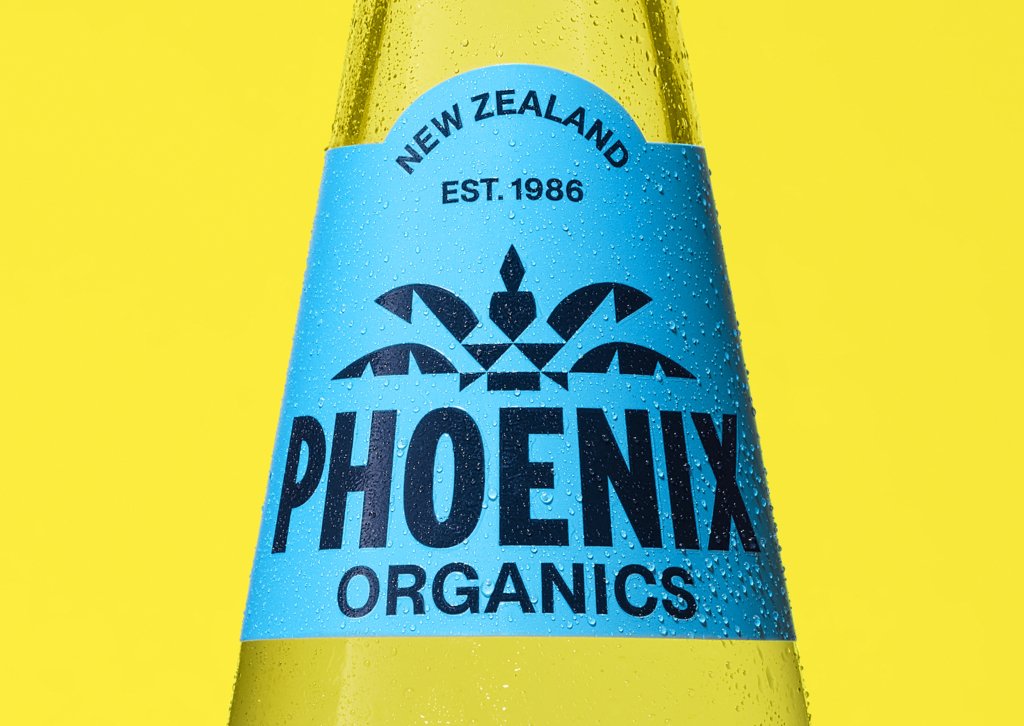
It makes sense that this was the iteration Marx honed in on to revive, but modernise. Where 1986’s foliage was rendered like a seaside resort mosaic, the studio opted to flatten the whole thing, stripping it right back into a geometrically shaped silhouette. It becomes a solid, robust graphic device rather than a brand illustration. The full logo mark uses the palm tree in its entirety, all gorgeous little triangles and spikes and curved leaves; the trunk of the palm looking almost like three sweet little owl faces.
On the bottle itself, the tree is truncated to just those top leaves, which form a framing device for the wordmark. ‘Phoenix Organics’ is spelled out in all caps, bold and clear and legible and quietly iconic. The fonts are both proud and understated: ‘Phoenix’ in blocky, Victorian poster-esque letterpress-style characters; ‘Organics’ using a more brand-conventional mid-century style sans serif. I’m not 100% sure what these fonts are, but what is certain is that they’re unfussy, legible and simultaneously never looking to shout, but nor do they whisper. They prize clarity, and they show that this is a brand that knows its own strength. It just needed to be told how strong it is – and show it in its visual identity.
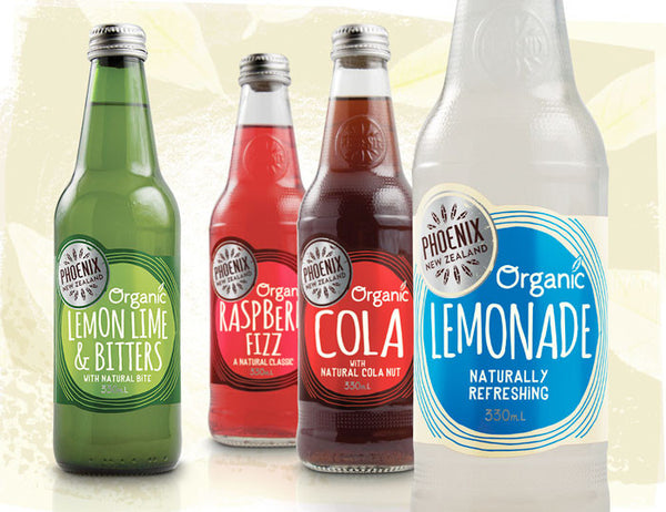
Likewise, the palette prizes simplicity, letting the colour of the liquid speak as much as the brand design itself. I love the way that the lemon, lime and bitters bottle label for instance combines striking yellow and green with the garish blancmange-pink liquid inside.


Each variant across both the soda and juice ranges use a different pairing of solid colours: for the lemonade that’s yellow and blue, the diet cola uses white and red, and apple, orange and mango uses an orange and darker yellow. As if it wasn’t obvious already, these play nicely into the conventions of soft drinks: indeed, on things like this it’s rarely wise to throw the baby out with the bath water – people like to know what they’re getting. Ranges must be navigable for shoppers who – and I hope all in the brand design world are sitting down here – don’t actively give a shit about things like kerning, or Pantone colours, unlike those creatives desperately trying to manipulate such tools to get their attention. But what most shoppers do like, even if they won’t admit it, is some degree of familiarity: if a dark, fizzy drink drink has a red and white label, it’s going to be a cola of some sort; if it uses yellow, it’s probably safe to wager that there’s some sort of lemonade-adjacent flavouring at play. Ripping all that up and starting again would just be daft.
The juice range is differentiated from the soda range by the labels’ use of shapes, which become graphic framing devices for the flavour descriptor. The sodas use a constricted circle on the rectangular label, while the juices have a more organic blobby shape that looks something like the gloop of a lava lamp midway through its ascent.


Framing is a theme throughout the project. On billboard posters, for instance, the distinctive rocket-shaped bottle is used as a cut-out to showcase close-up crops of ingredients, things like the weird, sticky, almost alien landscape that is the inside of a passionfruit. That rocket shape was pretty central to the project. It was something that Marx says it used to ‘unify the product range’. It continues, ‘the “Rocket” bottle, first introduced in the early 90s, [brings] visual consistency and recognisability’.


Tone of voice wise, the relaunch campaign leaned into the metaphor of rebirth, echoing the rising phoenix and its return to the hearts of New Zealanders. Like the visual identity, the text works beautifully when it’s kept simple – such as ‘The icon is back’, or my personal favourite, ‘Phoenix is born again, like a phoenix’. It’s deadpan. It’s hilarious. However, the copy, for me, is the only thing that occasionally lets this project down.
Elsewhere, the longer copy on campaign materials, like billboards, can be confusing at times – or simply, in my opinion, fall flat. Take the line, ‘What juice tasted like the last time baggy jeans were in’. Unless it’s referring to the here and now, it doesn’t work: everyone in their 20s (and therefore, anyone with any kind of stake in the ‘cool’ game) seems to have been wearing baggy jeans for as long as they’ve had enough pocket money to buy trousers. It’s us laughable millennials that, apparently, according to Gen Z, are still peddling the unflattering hellscape of skinny jeans. Obviously, I’m looking at youngsters in England, but I can’t imagine New Zealand could be all that much behind us in the denim game.
Another bit of brand text reads, ‘Sometimes you just want a really good juice, not the long-named exotic fruit you didn’t know you were missing out on’. I’m no comedian, but I’ve heard that the joke lies in specificity: i.e., it’s about using ‘custard cream’, not ‘biscuit’. Perhaps this is where that particular copyline falls flat; perhaps it’s on me not grasping it properly.
But it’s a small criticism in an overall superbly executed project. I’m not from New Zealand, so I wasn’t aware of Phoenix, but if it’s as iconic as it’s made out to be, I have no doubt that this will be exactly the proverbial (and literal) rocket up the commercial backside that the brand was hoping for.


