Our seemingly indefatigable fetishisation of the ghosts of branding past (i.e. why the design world is still talking about JKR’s Burger King rebrand nearly half a decade on) is perhaps little surprise: whether we’re consciously doing so or not, and to whatever extent we’re even aware we’re looking at something archival, returning to an amorphous yesteryear — real or imagined, lived through or not — scratches an itch that fleetingly makes us feel like everything isn’t all that terrible. And in a world that on so many levels feels pretty terrible, that’s a powerful thing indeed.
Beyond those abstract and political-as-personal/personal-as-political explanations though, often looking to a brand’s historical design work makes sense purely because it’s good: why slave away making something totally new when there’s gold just sitting there waiting to be dusted off and trotted out again?
Such is the case with this smart, bold work for Double Diamond – a beer brand that some might remember, but which most people under around 50 years old probably won’t. Double Diamond was first brewed in 1876 by Staffordshire-based Samuel Allsopp & Sons, and by 1958 it was the best selling bottled beer in the UK. It remained hugely popular throughout the 1960s and 1970s, by which time it benefited from heavy TV advertising based around the very-of-its-time tagline, “A Double Diamond works wonders”.
According to the new Double Diamond website, which bears the new identity design we’ll delve into shortly, when Tony Benn was Minister of Technology in the 1960s he “thought that Double Diamond was so important to the country that he wanted it nationalised”. It also nods to something that Paul Burrell, the loudmouth former Princess Diana butler, has claimed: that Prince Philip was a big fan, drinking a small bottle every night.
However, all this wasn’t enough to see the brand through the decades to follow, and the final commercial batch of Double Diamond was brewed in 1996. Now, though, the beer has been officially relaunched by Kirkstall Brewery, with its lowish ABV liquid (3.8%) sold in Tesco in four-packs of 440ml cans priced at a seemingly reasonable-ish (we’ve not tasted it) £5.75 at the time of writing.
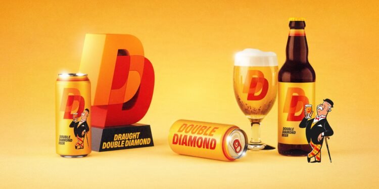
The striking identity design and branding was created by designer and lettering artist (and former JKR staffer) Alec Tear, who assembled a team around him to work across everything from strategy (Silas Amos) to illustration and character design (Satoshi Hashimoto) to motion design (Jamie Quantrill).
“Tasked with reviving such a beloved brand, I knew I had to double back to its iconic design archive and restyle the very best of its past,” says Tear. That’s exactly what he’s done, and he’s managed to make it all feel totally contemporary, brilliantly bold, and thoroughly original.

He’s also sidestepped a fair bit of terrible design work from Double Diamond’s past – its 90s packaging very much files it next to the likes of Special Brew with its bustlingly busy, somehow Medieval-esque and regal-style cans (hello, massive crest!), which were all about shiny gold, black, and red.
Instead, Tear focused on a few select assets: the very ownable yellow and orange colourways, the slanted all-caps lettering (both as seen on this 1965 label); the linked double D icon (seen in this ad from 1960 and this rather lovely 1970s bar pump, which resembles some sort of award) and the slightly demeaningly named ‘Little Man’ mascot (as shown in this ad from 1953, and seemingly used throughout Double Diamond’s history in various guises, including a funny little jug).
Tear brought in Lewis MacDonald of Glasgow-based Polytype to create the historically influenced bespoke brand typography for Double Diamond. The result, DD Boldd (geddit?) is an all-caps slanted sans serif. The fact that this is the sole typeface used across the entire brand gives the whole thing a sense of no-nonsense confidence without being cocky or shouty or too much – it does its job, and doesn’t need any support, thanks all the same.

Stripping everything back to its strongest elements seems to be the entire foundation of this identity: just as there’s one font, the palette is incredibly limited – aside from black, there’s only yellow, red, and the orange that’s born of overlapping those two primary shades.
The only additional brand element of note is the mascot, a reworked and newly animated incarnation of the ‘Little Man’. He’s not evolved too much over the years: he’s still fairly old, smartly dressed, quite chipper, and eccentric of trouser. But unless you’ve looked at the brand’s history, at first glance he’s giving Ask Jeeves – a confusingly fusty poster boy, in that it’s unclear what or who he’s really meant to represent.
Double Diamond chimes with two significant shifts that have become ever more pervasive in brand design over the last few years: the reclamation of the mascot, and the exhumation of a brand’s archival assets.
It also nods to a recent significant shift in the beer sector: the demise of craft. The bubble was going to burst at some point, and it seemingly has thanks to a combination of rising brewing costs and the sheer number of craft beer brands emerging and competing against one another – not to mention some of the biggest players such as Brewdog becoming so successful as to have shaken off the ‘craft’ moniker by dint of ‘selling out’.
Spenny craft beers are all well and good, and have undoubtedly ushered in some truly excellent design work that’s shown us that certain categories need not have a default approach to their look and feel (toothpaste packs must be white/red/blue; supermarket canned cider must have at least a splash of gold, etc.) for consumers to understand what they’re buying and why. Indeed, some craft beers leaned into industrial minimalism, others geometric illustration; the doors were flung open to outlandish typography and giving on-pack punctuation marks a starring role.
But let’s not forget that the tastes of those who frequent the Blackhorse/Bermondsey ‘beer miles’ are not representative of those of the UK as a whole. Most of us shopping for beers think about a few basic things: does it taste nice? Is it available in Asda/Tesco/Sainsbury’s? Does it (in THIS economy!) have a reasonable price tag?
The only thing I’m not sure about here is who Double Diamond is positioning itself for: the identity is super strong, but feels perhaps too radical to appeal to older drinkers who remember the brand’s heyday; and it’s not quite hitting the mark for younger drinkers who have never heard of it before.
However, there’s so much that’s impressive here. It’s a bold move to create an entire brand from essentially one font, two colours and a mascot, and visually, I think there’s no doubt that Tear and his team have pulled it off brilliantly.


