![Inside the Decision to Rebrand Grammarly as Superhuman [Exclusive Interview]](https://mgrowtech.com/wp-content/uploads/2025/12/Superhuman_Backlit_Billboard_Sky-scaled.jpg)
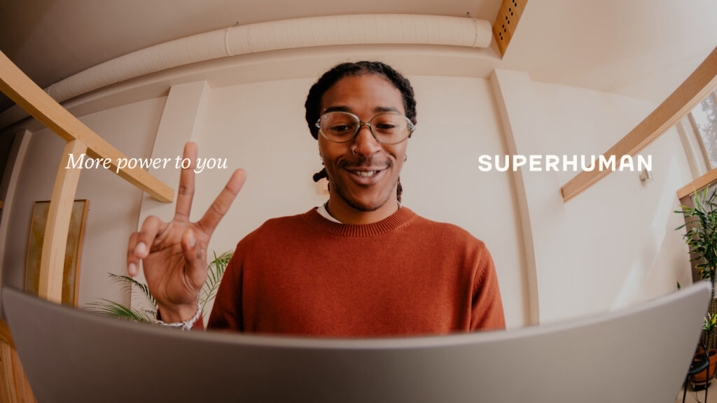
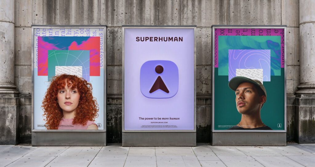
Grammarly is changing its name to Superhuman after buying Superhuman Mail and launching Superhuman Go. Instead of just being a writing tool, Superhuman is now a group of AI-powered products that help people with different tasks. The new logo, called “Hero” is a friendly character that guides users and makes the brand feel more human. This change is about helping people do more with AI, while keeping things simple and personal.
This article tells the story of how Grammarly became Superhuman, with a fresh new look and feel. It features two interviews: one with Collin Whitehead from Superhuman, and one with Mike and Chara Smith, who helped design the new brand. Together, they share how teamwork and creative ideas led to a new brand that is ready for the future of AI.
Proven Systems for Business Owners, Marketers, and Agencies
→ Our mini-course helps you audit and refine an existing brand in 15 days, just 15 minutes a day.
→ The Ultimate Brand Building System is your step-by-step blueprint to building and scaling powerful brands from scratch.
About the Rebranding Strategy: Interview With Collin Whitehead, VP of Design, Superhuman
Can you summarize what led the company to rebrand from Grammarly to Superhuman, and what the key changes were?
The company’s own evolution really drove the rebrand. In 2025, Grammarly acquired Superhuman Mail, and Coda then launched a brand new product, Superhuman Go. So what had been a single writing assistant quickly expanded into an AI-native productivity suite. That shift required a name and identity that could hold a much larger and more ambitious vision.
Because all of these acquisitions were in development, we had a prolonged strategy phase, defining ethos, positioning, and the emotional center of the brand. When Superhuman became a name option through the acquisition, everything clicked. We already understood the soul of the brand, and Superhuman was the right match for where the company was headed. The transition felt smooth and genuinely energizing.
The most important changes were moving from a single-product identity to a system that could span an entire suite, creating a symbol that could live inside the product as a guiding entity, and building a visual language that combines the power of AI with humanity.
What motivated the decision to change the brand’s name, and what were the main challenges during the renaming?
Grammarly’s name carries tremendous trust, and to be clear, the Grammarly brand isn’t going away. More than 40 million people use it daily, but as a company name, it also created a ceiling. It locked us into writing at a moment when the company was building far beyond that. Renaming was about widening the aperture so the brand could support everything the company was becoming.
We debated whether to wait for a new name before starting identity work, but beginning early was the best decision we made. We had already done the deep foundational thinking, so when the right name arrived, the identity clicked into place immediately. The name also just felt so well timed with what we see today in the transformation of technology, were everyone as access to superpowers, and also where there is a need to elevate what’s uniquely human.
The challenge was not only selecting a name. It was making sure the entire identity system could stretch across new products, new teams, and future growth. The name needed to hold the ambition, and the system needed to be ready for whatever came next.
How is the brand architectureBrand architecture defines the role of each brand and acts as a guideline for the interrelationship between the brands in your organization. Learn more structured now after the rebrand?
We designed the brand architecture for flexibility and future growth. This is an AI-native productivity suite, which means the brand must move fluidly across different jobs, audiences, and categories as the products evolve. Hero sits at the center of the system. It is the logo for Superhuman Go but it also appears throughout the product experience and functions as the connective tissue across the entire suite.
The architecture is not rigid or overly hierarchical. It was intentionally built to welcome new products, new uses, and future growth. The identity becomes a shared language for many teams and companies coming together under one unified brand.
What guiding design principles influenced the transition from Grammarly’s identity to the world of Superhuman?
We didn’t really look outward. Instead, we looked inward and asked what felt true to the product and the people who would use it. The identity needed to communicate power without leaning on visual clichés and it needed to feel deeply human without becoming sentimental. We wanted the logo to become a character, not a caricature.
More importantly, the identity had to feel useful. It needed to live naturally inside the product experience, not just appear in brand campaigns.
Which elements of the new identity feel essential to maintain as the brand evolves?
The duality between the human and the super is essential. It shapes the palette, the motion language, and the personality of Hero.
Hero is also foundational to the system. It is not a caricature. It is a character. The way it moves changes how people perceive it, and that expressiveness gives it a long life as a brand asset.
Flexibility is another key element. The identity must be able to evolve alongside the product. If the system becomes rigid, it no longer serves the company.
Looking back, is there a design decision or moment that stands out as defining for the Superhuman identity?
Seeing Hero move for the first time was the defining moment. We treated Hero like a real character study, talking about gravity, physical attributes, and how it carries itself. When something moves with human qualities, people instantly sense intelligence, personality, and life. It stopped being a static logo and became a guiding presence within the Superhuman experience.
About The New Visual Identity: Interview With Mike Smith and Chara Smith, Co-Founders of Smith & Diction
Could you walk us through the process behind creating Superhuman’s new visual identity? What were the key components of the redesign, and what objectives were you aiming to achieve?
We knew we wanted to create an identity that challenged the typical logo framework. It’s not just some static shape that sits in the top left corner of your browser. But we also knew that selling that idea through was going to be extremely challenging.
We pulled extensive moodboards and talked at length about the feeling we were looking for this identity to convey. Did we want this to feel like an assistant? A guide? A partner? A copilot? A helpful little robot? Your favorite coworker? With a product so incredibly wide-ranging, the options were endless. So we knew we needed to get everyone on the same page.
I’d say the key component of the redesign was the Hero symbol, that’s our name for the mascot/character in the logo. When we set out to make a logo, we always love when the icon matches the name. So to have a name like Superhuman, we wanted to try to have a symbol that looked like a little superhuman. That’s such a special moment for us. Then add in some motion that gives it more personality than most other typical identities, and we really felt like we landed on something special. Now, Hero can guide users through the massive org changes seamlessly while making the UI feel a bit more friendly and, dare I say, human.
We really wanted to breathe new life into an organization that was going through a major shift, and get everyone internally really excited about this new chapter. Externally, we just wanted to make an identity that felt a bit warmer than the standard digital product. And we wanted to help users feel like, “Okay, as long as Hero (Go) is around, I can kinda just use it to do whatever I need.” We wanted to design a little buddy that wasn’t overtly a little buddy, if that makes sense. The symbol can still hold its own as a favicon or an avatar while also containing all the personality and joyfulness of a mascot
With a tight three-month timeline, which constraints actually helped the creative process or led to unexpected solutions?
We had to make decisions quickly. We probably worked the hardest and fastest we ever have on this project. So we moved with conviction and designed with a lot of Hail Marys. For instance, we got a super low-fidelity explainer video of Hero made for round one of the presentation, before anyone on the client side had seen the symbol—because we just knew that this mark was 10x more powerful in motion.
And when you’re working with a digital tool, you know it’s going to have to move eventually, so we decided to take a big swing and bake that in from its conception. And without a doubt, that’s what sold the idea through.
Which parts of the brand strategy were most important in shaping Superhuman’s visual identity?
We spent a long time talking about how we wanted this brand to feel. We pulled moodboards around lots of different ideas, exploring all kinds of questions: Should it feel new or familiar? Should the brand feel quiet or loud? Etc. And basically we landed on wanting to build a brand that makes humans more powerful. That’s why the entire art direction is focused on the process of human ideation.
That’s why Hero has human-like characteristics, but also superhuman powers. That’s why we chose colors that feel warm, but that also stand out. Just about every aspect of the brand ladders back up to building something that feels super, but also feels human.
What inspired the idea of evolving Grammarly’s cursor into a character?
People were used to Grammarly being right beside them, working right in their documents. They didn’t mind the helpful tips and suggestions. So what we developed was just an extension of where that already was, but zoomed out a level to let that helpfulness continue no matter what you’re doing. Hero is designed to be there for anything you need, and to feel just ever-so-slightly accessible by looking like a little human shape that you can rely on.
One nod that we haven’t really mentioned too much is that Hero is also supposed to represent the lowercase letter i, which is the international symbol for information. So even when Hero is scaled down to 12px, it’s designed to look like an information symbol—which, subconsciously, we’ve been trained to understand as a place where you can get helpful tips. Just an unbelievably subtle little Easter egg we hid in there.
How did you balance simplicity with expressiveness in Hero’s design?
Well, we drew Hero out in about 10 seconds on a piece of paper between meetings. Later on, we went ahead and made about 30 different options just to go back to the simple first one. Sometimes you just need to see what could have been to make sure that where you landed originally is actually the best option.
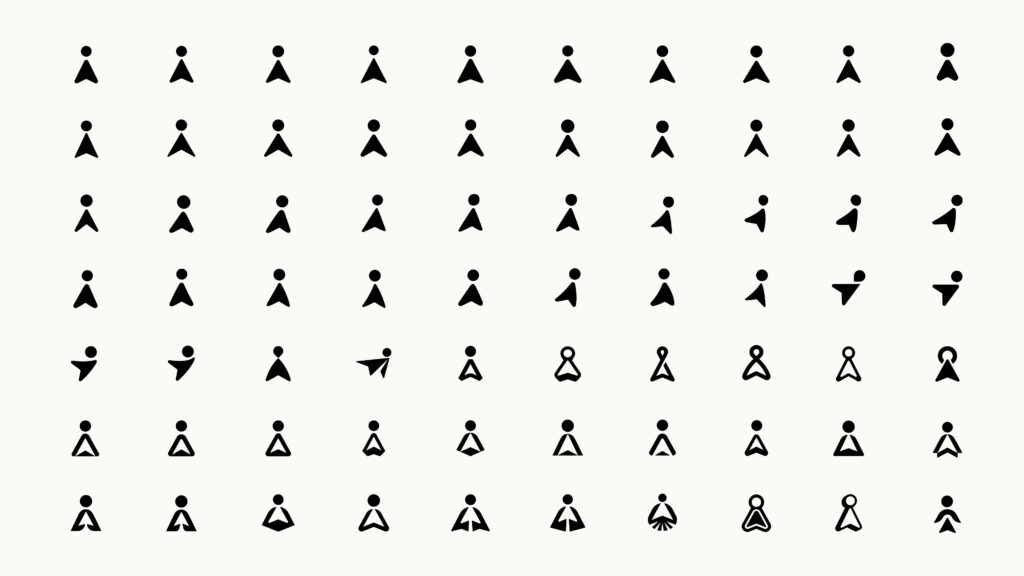
When sketching Hero for the first time, we realized that if you flipped it upside down it could turn into an exclamation point. And then once we realized that the circle on top could have pseudo-magic powers and morph into literally anything, we were off to the races. Allowing the two shapes to have some independence and flexibility, rather than always being just one connected static symbol, allowed us to take some major liberties with the character. The head can become a portal to another dimension. The mascot can wave. It can point to things with the cursor shape rather than just typing out directions in a text panel.
The character can become a guide, and when you’re working on a product that’s evolving so dramatically, you need a little help from time to time. Hero just became the perfect partner to help you do that. And hopefully there’s enough personality to make you smile just a little bit, too, because we really were channeling our best Pixar energy when developing it.
What kind of emotional response were you hoping to evoke with your color choices?
Color is always so tricky these days, especially with a product-first company like Superhuman. The ask was to develop a palette that was AAA accessible, yet felt distinctive and human, which is ultimately why we led with the darker Heart color. By starting deep and warm, we could evolve from there and bring in some lighter tones to support it. But instead of going with super poppy tones that feel like cotton candy, we started at the soul of the brand.
Lots of AI companies these days are just black and white, maybe with a splash of blue, so we wanted to take a hard right away from that, but still wanted to feel like Superhuman is a relevant part of the conversation. That’s where Mysteria—the light wisteria tone—came in. We wanted a color that almost represented the feeling of hovering or flight. When your logo is a superhero, you need to have a super-feeling color.
That being said, we also didn’t want to lean too hard into any of the classic comic character colors either, so it was an extremely delicate balance to create something that felt like it belonged in the space but also felt inherently warm and inviting.
Is there anything about the project—challenges, lessons learned, or big takeaways—that you think is worth sharing?
My biggest takeaway, I think, is that you just have to present the weird ideas. Even if it doesn’t always land. We almost didn’t present Hero, because personally I didn’t know if people were going to get it. It’s a triangle and a circle, this feels extremely risky. BUT we also knew it was a really fun thing to draw and extend. And when you find yourself in those moments where you feel your mind start to run away with the concept, that’s when you know you’re on to something.
On the flip side, it also opened up an entire can of worms by making a logo that’s also a mascot, that’s also a UI guide, that also needs to have a whole library of attributes developed around its personality—that’s definitely not the smartest thing to do when you’re crunched for time. It was a lot of work to get those two shapes to feel just right even though from the outside it seems incredibly simple.
I’m so happy with how it turned out and can’t wait to see how the Superhuman team integrates it deeper into the product in the future.
A big thank you to the team for answering our questions!
Proven Systems for Business Owners, Marketers, and Agencies
→ Our mini-course helps you audit and refine an existing brand in 15 days, just 15 minutes a day.
→ The Ultimate Brand Building System is your step-by-step blueprint to building and scaling powerful brands from scratch.