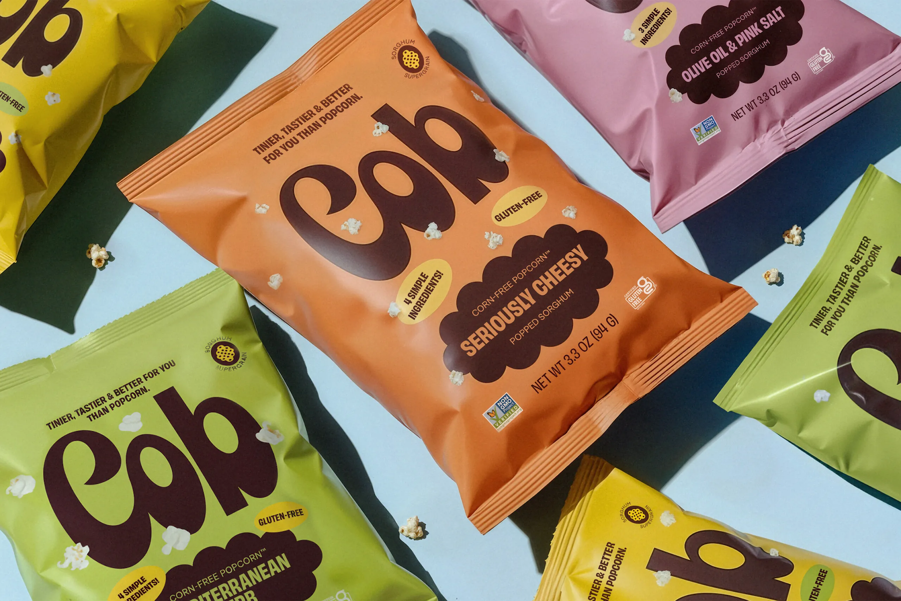
If there’s something we’ve come to rely on Saint Urbain totally nailing, it’s a wordmark. Even the most cursory glance across their recent projects affirms the agency’s knack for a grabby, smart, playful yet sublimely appropriate approach to brand type, and this new project is no exception.
The work in question is for Cob Foods, for which Saint Urbain (Buena Fé, Entrée) – a sprawling outfit spread across Montréal, New York, Los Angeles and Mexico City – worked on the brand identity and strategy, animation, copywriting, naming and photography.
Cob Foods (we’ll just refer to it as Cob from now on, since its full title makes it sound like a range, or at worst, a large-scale supplier of greyish school dinner slop) is a corn-free snack brand backed by tennis legend Novak Djokovic and founded by entrepreneur Jessica Davidoff.
The corn-free thing comes as a bit of a surprise: to the untrained eye, the snack looks just like popcorn. Then there’s the name – ‘cob’ is rarely not the suffix following ‘corn-on-the’. Apparently that’s deliberate: Saint Urbain argues that its work here is all about “creating a world that recalls a time when snacks were simple, ingredients were clean, and design was honest”.
It continues, “The name Cob captures that spirit perfectly: a cob is the absence of corn.” Is it though? We’re all familiar with beans on toast, but that doesn’t make toast the absence of beans. I don’t think Cob is a bad name here by any means – it’s short, punchy, and makes for a great logotype. But that rationale doesn’t make a tonne of sense.
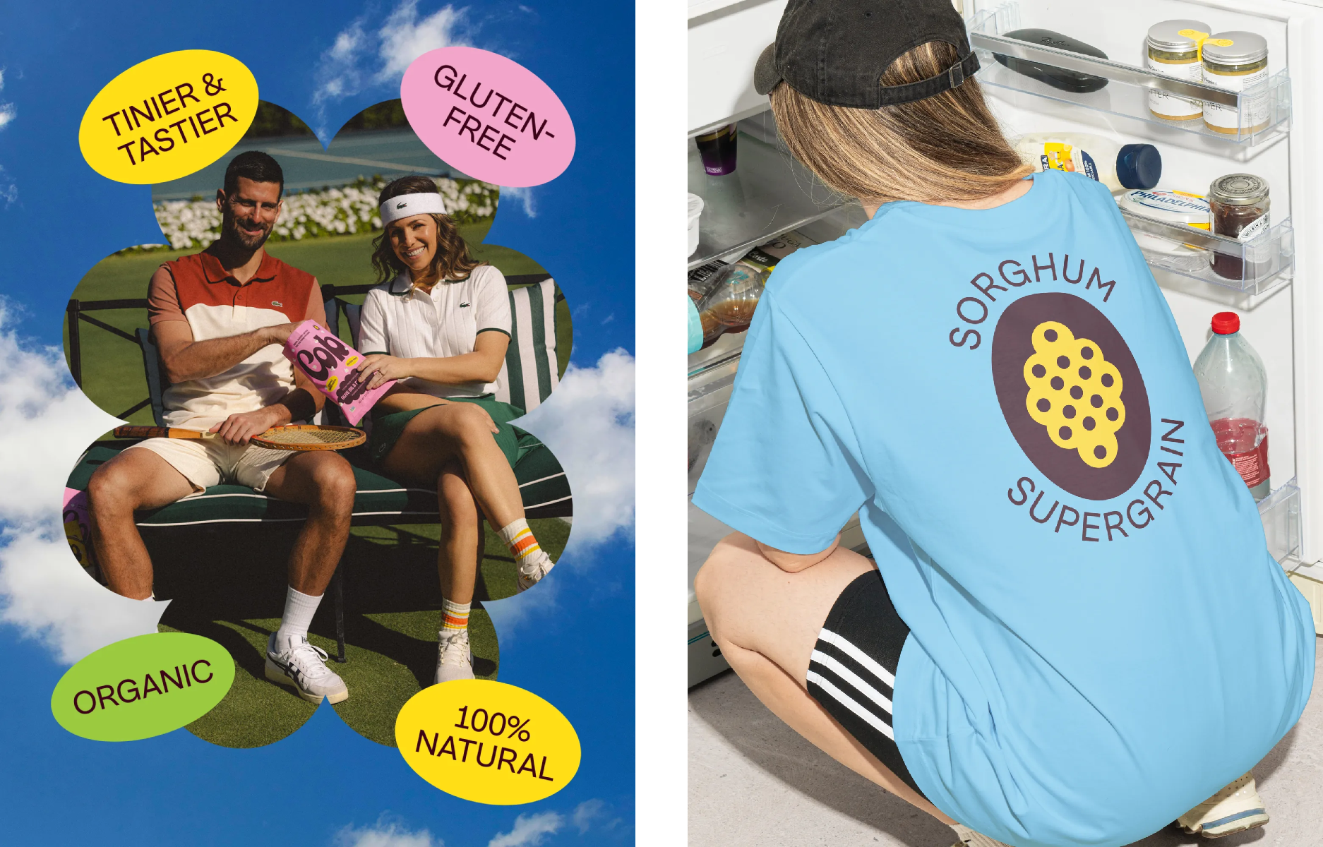
 So Cob is not corn, it is in fact made from sorghum, a gluten-free cereal grain (it’s worth noting here that corn is also gluten-free) that’s also known as millet. According to the brand, its creation was inspired by Davidoff’s son’s allergy, and she “set out to build a brand that made eating clean feel nostalgic, joyful, and real”.
While the ins and outs of the collab with tennisman Djokovic’s origins are unclear, the brand continues that it has something to do with his “belief in clean, high-performance eating,” which aligns with Davidoff’s “personal mission for trustworthy, allergen-free snacks”.

I have a bit of an issue here with the whole ‘clean’ thing – aren’t we over all that by now? The implication that some food is clean, some dirty is at best an overtly moralising stance; at worst – and as proven by a number of studies, and a stance backed by many eating disorder charities – a potential route to illnesses such as orthorexia.
‘Healthy’ and ‘natural’ work as adjectives for snacks – ‘clean’ does not. Likewise, ‘dirty’ is, I’d argue, just as damaging, and the whole thing feeds into (pun very much unintended) a wholly depressing and outdated diet culture of ‘naughty’ vs ‘good’; a puritanical high-horsing that dovetails into countless issues around not just EDs, but class and economics and culture.
It’s like ‘wellness’, another term we’ve seen a justified backlash to in recent times thanks to its wishy-washy, frequently nonsensical vagueness and ready associations with charlatans who range from the unhelpful and daft to the downright dangerous (i.e. that ‘influencer’ who lied about having cancer, and solving it with things like green juice, though the list of similar situations is endless).
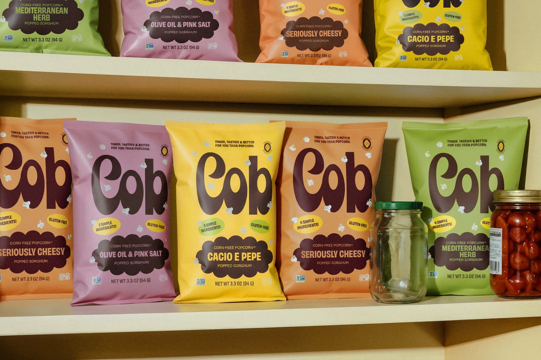
While I could clearly harp on about all that stuff for hours, I won’t, because it’s ultimately beside the point here: we’re talking about branding, after all, and as branding goes, Cob’s is very very lovely indeed. So lovely that we’ll forgive the way it’s described as bridging ‘wellness and warmth’ because in context, we get what they mean by ‘wellness’ – here, it describes a trope we’ve become very familiar with of the sorts of visual cues associated with ‘healthier alternatives
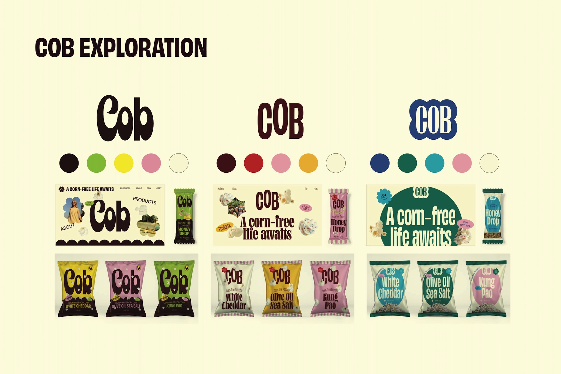
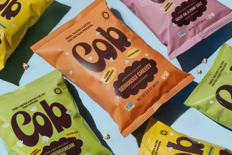
According to Saint Urbain, the visual identity looks to give us “proof that healthy food can still be joyful, iconic, and craveable” through a “bold, nostalgic, and refreshingly real” approach to design. And joyful it certainly is: what’s not to love about that wordmark, with its big, hulking, hyper-retro letterforms, lumbering in like Noddy Holder’s platform boots?
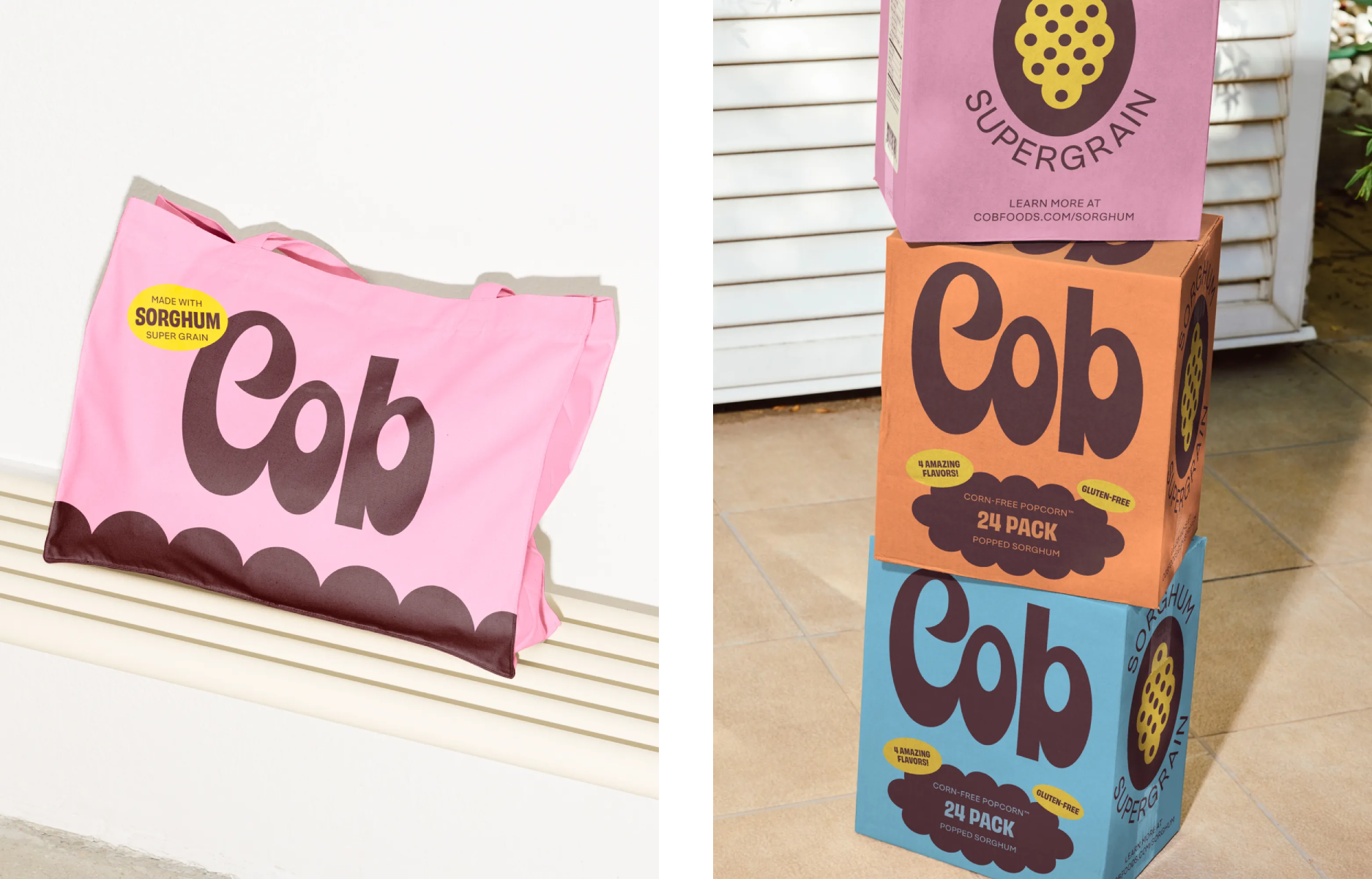
I love the outlandish ‘C’, with its quiff-like top-half curving into itself in a grandiose flourish; the way it flows into the exaggerated contrasts of the ‘o’. The aberrant linking of the first two letters but not the third makes it all the more charming, leaving the big boot of the ‘b’ to stand tall and proud, offsetting its undulating predecessors with sharp right-angled stems, an oval-shaped bowl that perfectly matches that of the ‘o’, and a no-nonsense stomp.
With a wordmark like that taking centre stage, the rest of the identity has sensibly been kept simple: it’s all about graphic shapes, a limited palette of peppy but not eye-wateringly vivid hues, and a couple of sans serif supporting fonts.
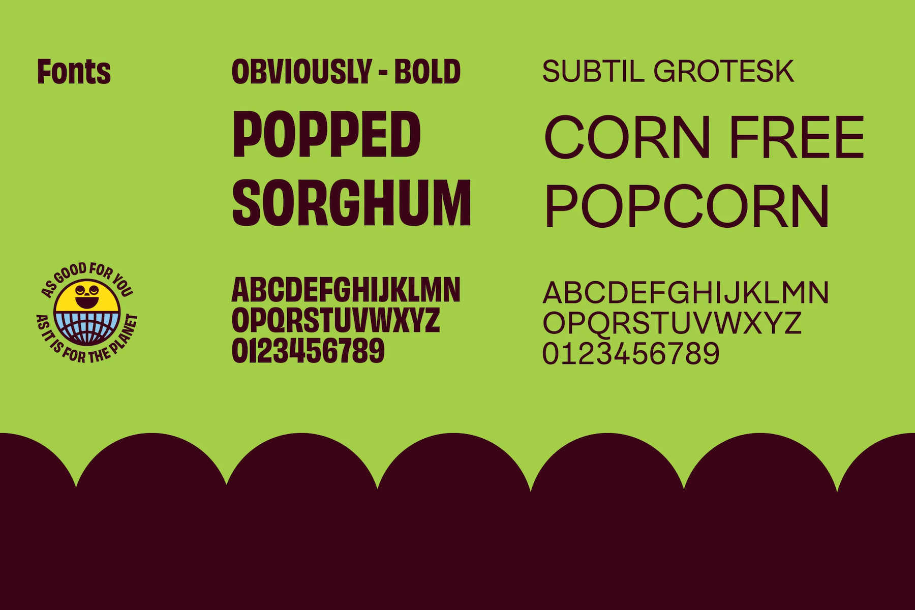
These are Subtil Grotesk by collective-like foundry Type By (in this case the font was created by German type designer Thomas Thiemich) – a take on classic Grotesque fonts that’s deliberately rather warmer in tone, and in which “neutrality concedes to sensitivity, and a strict design construction is finally allowed to be playful,” as Thiemich puts it. All of these qualities, plus its inherent legibility, make it perfect for a brand like Cob.
The identity’s other typeface is another sans serif, San Jose-based foundry Oh No Type’s Obviously Bold. In-keeping with Cob’s bid to elicit a sense of nostalgia, Obviously was, according to its designer James Edmondson, “ inspired by stretched and squished display type found on vinyl signage” and looks to be befitting of “the nail salon, the laundromat, and the mechanic,” Edmondson continues. “Subtlety is for the birds.”
On the website, designed by Montréal-based digital creative agency Mill3, another font is also used for certain sections of text – GT Standard by the ever-wonderful Swiss foundry Grilli Type. Again, the font choice is great: a contemporary take on Swiss modernism that’s firmly centred on working for digital applications. Again, it’s geometric but warm; rigorous but unthreatening – very much a font for Cob and what it stands for.

The colour palette, like the wordmark, is inspired by all things retro, and feels optimistic and confident without being too bombastic: blocks of rich brown-tinged purple; a lighter candy pink shade; sunshine yellow; sky blue. For the most part, ‘Cob’ uses that summery yellow (which, like the name itself, seems to suggest that this is in fact corn, rather than sorghum, but again we’ll let it go).
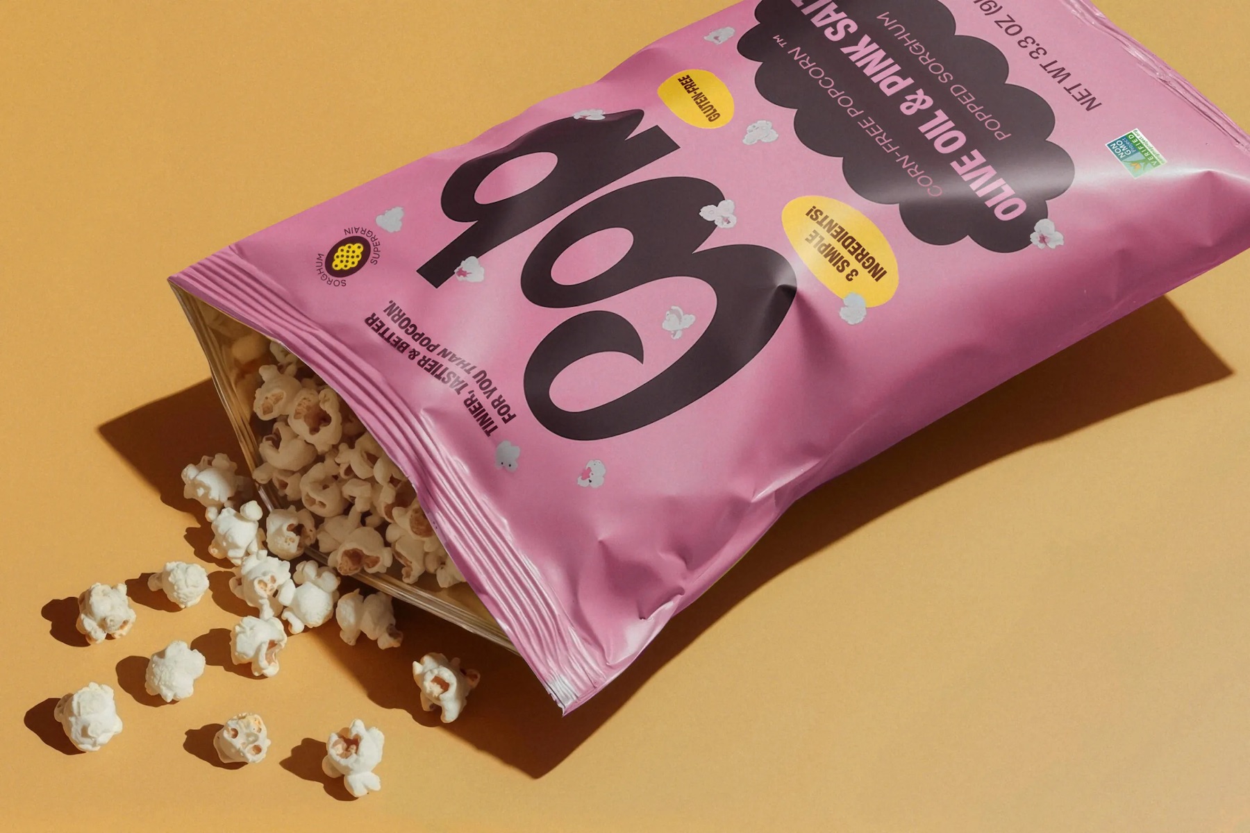
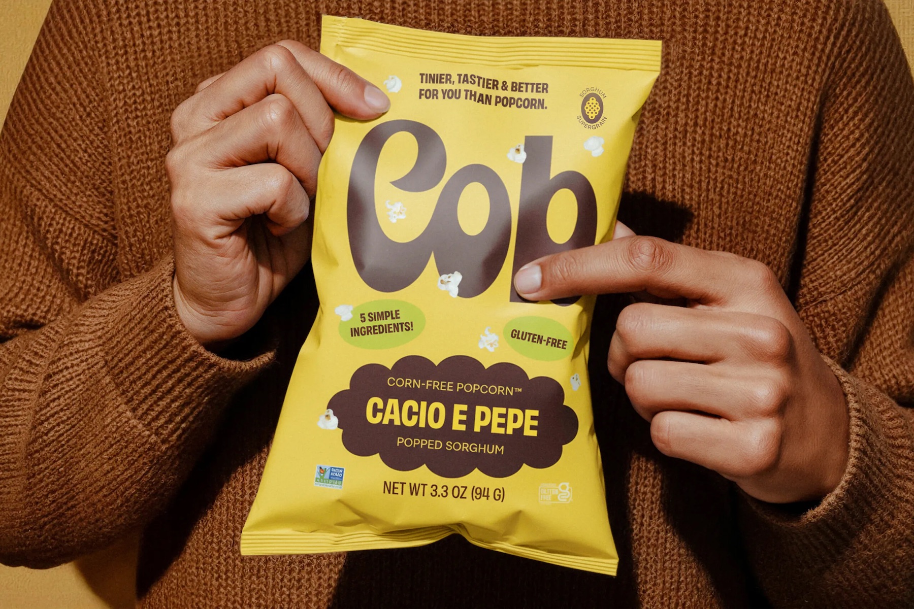
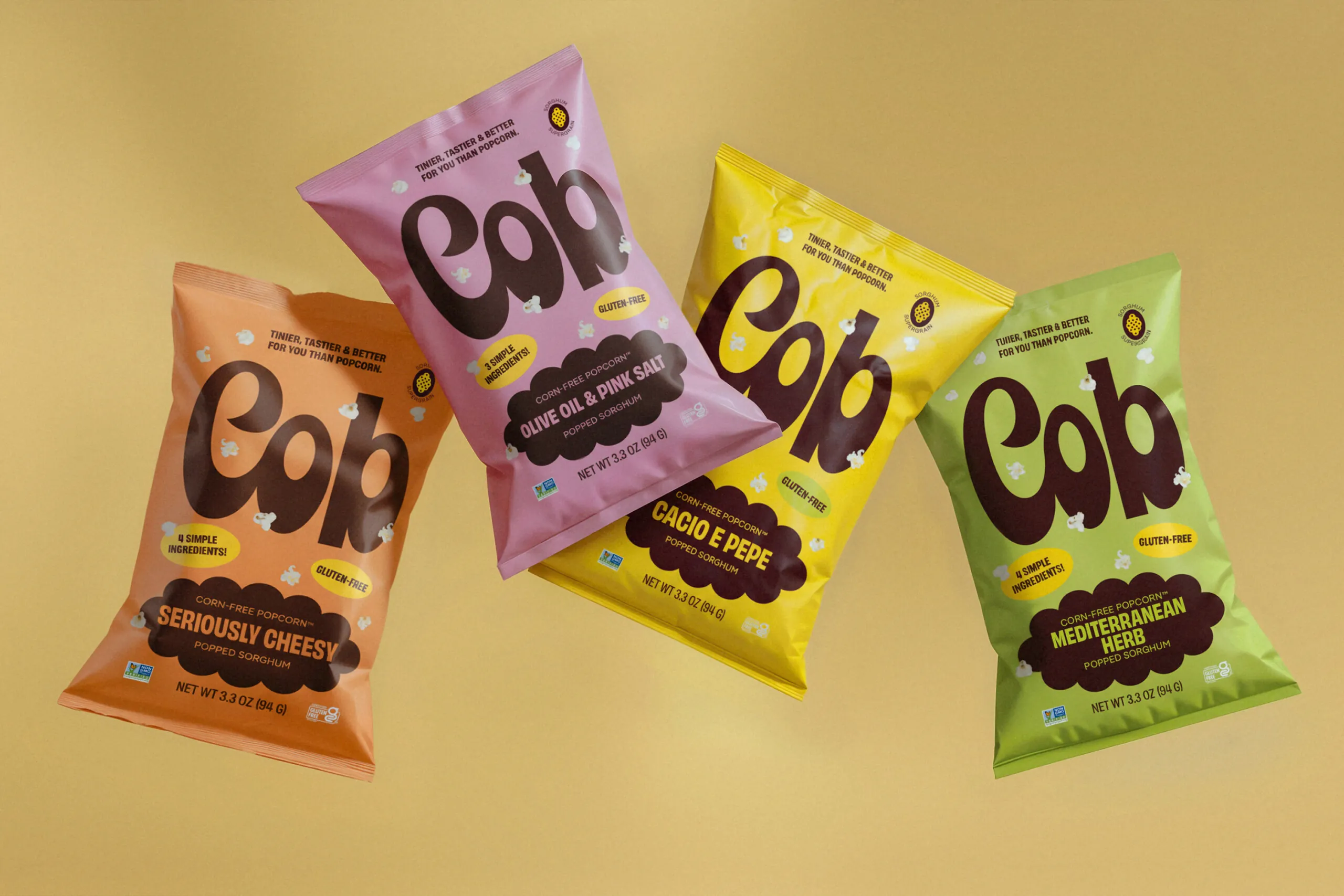
On packs, a different colour is used to delineate each of the different four flavour variants, which are spelled out in a cloud-shaped lockup: orange for ‘seriously cheesy’; pink for olive oil and pink salt; green for Mediterranean herb; yellow for ‘cacio e pepe’ (cheese and pepper). Packs are kept punchy and simple, with just as much text as is required – the fact Cob only uses four ingredients, the flavour, the gluten-free credentials, and a short claim about it being “better for you than popcorn”.
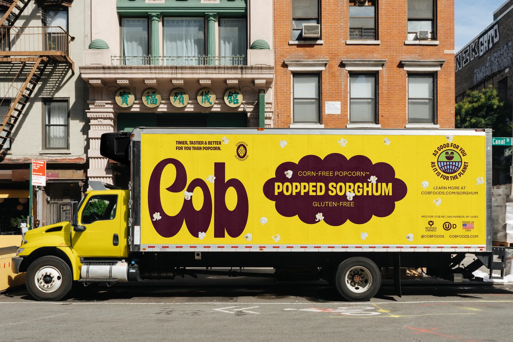
The cloud lockup appears in various permutations across the identity and works beautifully in animations which bloom endlessly and are just the right level of in-your-face. The whole thing, according to Saint Urbain, is about playful design that aims to make Cob (or more precisely, the fact it’s “corn-free”) feel “exciting, not restrictive” and to show how “thoughtful branding can bring care and optimism back to the snack aisle”.
Exciting and optimistic it certainly is: these packs positively pop, as do the animations and the rest of the branded applications – the t-shirts look great, the posters are fab, the art direction feels retro without veering into pastiche, slightly campy without being kitsch.
So all in all, despite the confusing name and frustrating perpetuation of the whole ‘clean eating’ thing, once again Saint Urbain has offered us a masterclass in creating a brand world that gives a sense of the instantly iconic but without ever needing to yell. It ain’t popcorn, but it sure as hell pops.
