A homepage is often your business’s digital handshake — your one chance to turn a curious visitor into a customer. If you’re a business owner frustrated by a lack of leads coming through your website’s lackluster results but can’t pinpoint what’s wrong, you’re not alone. The answer usually lies in the details. A conversion-focused website design blends compelling value, trust-building content, and frictionless usability, ensuring your website does more than look good — it drives real action.
Why Most Homepages Miss the Mark
Ever stared at your analytics and wondered why calls, emails, or sales are scarce? You’re not the only one. Many business owners sense their website isn’t working, but can’t put their finger on the problem. More often than not, the culprit is a homepage built to inform rather than convert. Conversion-focused web design is about persuasion — making it obvious what visitors should do next, every step of the way.
Core Elements Every Conversion-Focused Website Design Needs
1. Clear Value Proposition
Visitors should know within five seconds what you do and why it matters. Your value proposition is the backbone of your homepage. It answers the visitor’s unspoken question: “What’s in it for me?”
“A homepage should answer a visitor’s biggest questions within seconds. If users can’t see your value right away, they’ll move on before you have a chance to connect,” says Jason Gresalfi, Web Operations Director at Huckleberry Branding.
Make your value proposition clear, bold, and visible above the fold. Pair a punchy headline with a supporting subheading. Reinforce it with visuals that connect emotionally, such as photos of your team or customers enjoying your product or service.
Want to see what this looks like in action?
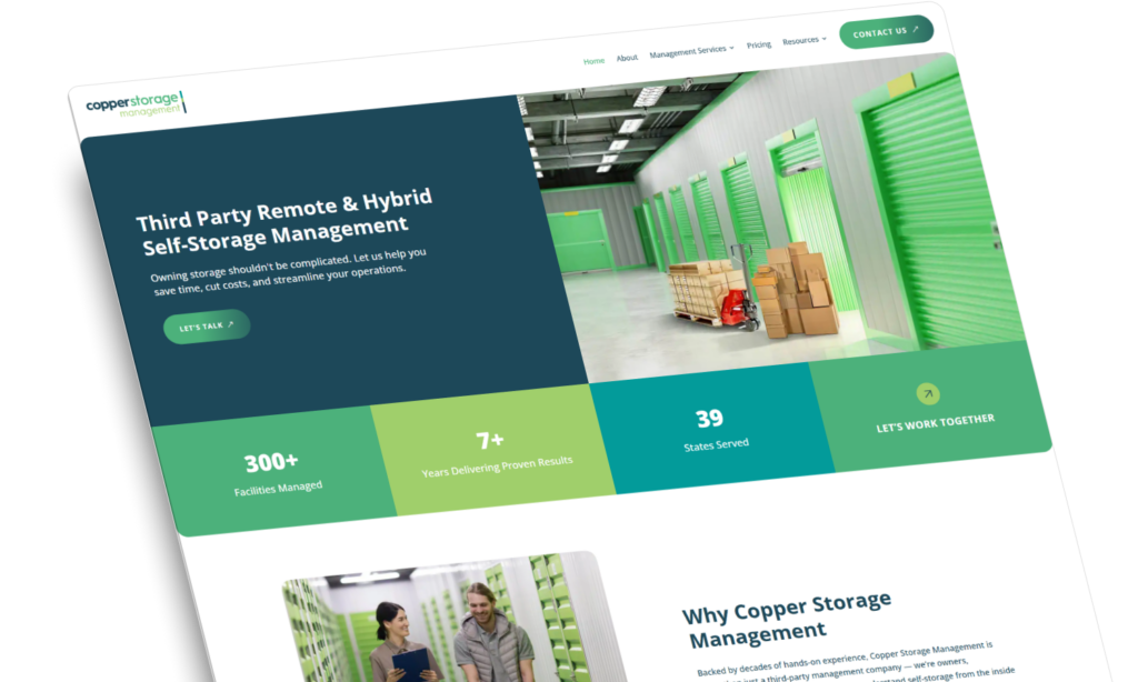
Above: A homepage from Copper Storage Management’s portfolio, featuring a bold value proposition, a clear CTA, and powerful social proof — hallmarks of web design that converts and drives measurable results.
2. Compelling Calls to Action (CTAs)
Every homepage needs a standout CTA that tells visitors exactly what to do next. Examples include “Shop Now,” “Book a Demo,” or “Get Started.” Design your CTA buttons to pop against the background, and use direct, benefit-driven language. Test different phrases and colors to see what resonates. For visitors who aren’t quite ready, offer softer CTAs like “Learn More” or “See Pricing.” Make sure there’s always a clear, inviting next step.
3. Trust-Building Social Proof
Humans trust other humans. Display reviews, testimonials, client logos, or case studies near your CTA. Show off five-star ratings, social media shoutouts, or recent customer activity to build credibility quickly. For service businesses and SaaS companies, highlight before-and-after results, partner endorsements, or video testimonials. Social proof is the shortcut to trust. Make it impossible to miss.
4. Easy Navigation
Navigation should feel effortless. Too many options overwhelm visitors and stall decision-making. Pare your top menu to the essentials: home, products or services, about, contact, and maybe a blog or resources page. Use clear labels and logical grouping to help users find what they need with zero friction. Always keep your main CTA visible, even as users scroll.
5. Mobile Optimization
With most web traffic now coming from mobile devices, your homepage must deliver a flawless experience across all screen sizes. Optimize images, streamline layouts, and test pages on real devices. Avoid intrusive pop-ups or slow-loading sliders. Ensure all buttons are large enough for thumbs, and that copy remains legible without pinching or zooming. If users can’t navigate your site on mobile, you’ll lose them to a competitor who has taken the time to optimize for mobile the right way. can.
6. Visual Hierarchy and Clean Design
Your homepage should direct visitors’ eyes to what matters most. Use a clear visual hierarchy: headlines grab attention, subheads guide, and body copy supports. White space helps elements breathe, while bold colors and varied font sizes signal what’s important. Avoid overwhelming visitors with text. Break up content with images, icons, or infographics that reinforce your message and brand personality.
7. Fast Load Times
Speed is non-negotiable. Compress images, leverage browser caching, and minimize scripts. Every second added to page load time can cost you conversions.
Analytics: Tracking and Optimizing for Better Results
A conversion-focused website design is only as strong as the data that powers it. Understanding how visitors interact with your homepage is essential for continual improvement. Here are the analytics metrics every business owner should keep on their radar:
Bounce Rate
A high bounce rate means visitors are leaving without exploring your website further. This might signal a disconnect between your messaging and their expectations. Review your value proposition, page speed, or CTA placement. Sometimes, even a simple headline tweak can reduce bounce and increase engagement.
Conversion Rate
This is the percentage of visitors who complete a desired action, whether it’s filling out a form, making a purchase, or scheduling a demo. Use your analytics platform to set and track specific goals. Monitor how changes to your homepage — such as updated CTAs or testimonials — affect conversion rates over time.
Average Time on Page
Longer time spent can show engagement, but it isn’t always positive. If users linger but don’t convert, your layout or CTAs might be confusing. Watch session recordings or heatmaps to spot where visitors hesitate or drop off. Use these insights to streamline the journey to conversion.
Click-Through Rate (CTR)
Keep a close eye on how many visitors click your main CTA. Low CTRs can mean the offer isn’t compelling, the button isn’t prominent, or users aren’t seeing it soon enough. Experiment with placement, size, and copy until you see real improvement.
Device and Traffic Source Breakdown
Know where your visitors are coming from and what devices they use. If mobile conversions lag, prioritize mobile improvements.
E-Commerce Essentials for High Conversion
Conversion-focused e-commerce website design is all about guiding shoppers from the first click to checkout. The best website design for e-commerce conversion prioritizes product discovery, trust, and seamless paths to purchase. Here’s how to implement conversion-focused website design for e-commerce and create a web design that converts:
Product Highlights and Fast Paths to Purchase
Feature your bestsellers, new arrivals, or seasonal deals above the fold to capture immediate attention. Use crisp, high-quality product photos and clear pricing to reduce uncertainty. Streamline the path to purchase — let users add items to their cart or start checkout with a single click. Offer limited-time deals or bundles to create urgency and boost average order value.
Trust Signals and Guarantees
Display badges for secure checkout, free shipping, and hassle-free returns to boost confidence. Show recent customer purchases, trust seals, or live chat availability for extra reassurance. Highlight your satisfaction guarantee or customer support policies where they’re easy to see.
Personalized Experiences
Use browsing data to recommend products, spotlight trending items, or personalize banners. Offer discounts or loyalty rewards tailored to returning customers. Personalization not only increases conversion rates, but also makes your store feel more welcoming and relevant.
Social Proof
Encourage customers to share their experiences through Instagram photos, video reviews, or unboxing clips. Feature this user-generated content on your homepage to inspire confidence and foster community. Shoppers are more likely to buy when they see real people loving your products.
Key Metrics for E-Commerce
- Cart abandonment rate
- Average order value
- Product page conversion rate
Website Design Essentials for Service Businesses
For consulting firms, agencies, and local service businesses, your homepage must instantly establish credibility and prompt potential clients to connect. In conversion-focused website design for service businesses, trust is everything. Make your expertise and reliability unmistakable from the very first scroll.
Authority Signals
Showcase professional certifications, awards, and key affiliations to build instant authority. Feature authentic photos of your team or founder — people connect with people, not faceless brands. Add short bios to introduce the people behind the business and reinforce your expertise.
Clear Next Steps
Guide visitors to book a consultation, request a quote, or call you directly. Place a simple contact form or click-to-call button in a prominent spot. Keep forms short by requesting only name, email, and a quick message field. The easier you make it, the more leads you’ll generate.
Content That Educates and Engages
Educate and engage visitors by adding a section with recent blog posts, FAQs, or explainer videos. This content not only demonstrates your expertise but also answers common questions, helping visitors feel comfortable before reaching out. Addressing objections upfront can increase your form submissions and calls.
Key Metrics for Service Businesses
- Form submission rate
- Phone call click-throughs
- Engagement with educational content
Website Design Strategies for SaaS Companies
SaaS homepages face the unique challenge of communicating complex value quickly and moving users from curiosity to action. Conversion-focused website design for SaaS companies means instantly addressing pain points, showcasing tangible benefits, and guiding users toward a free trial or demo with zero friction.
Feature Highlighting
Show your product in action with real screenshots, short explainer videos, or interactive product tours. Place these visuals near your main CTA so users see the value before they’re asked to act. Consider offering a quick, clickable walkthrough to reduce hesitation and increase trial sign-ups.
Free Trials and Demos
Make starting a free trial or booking a demo effortless. Strip your sign-up forms down to the essentials, such as name and work email. Use progress bars or welcome messages to reassure users during onboarding. Less friction means more conversions.
Want more inspiration?
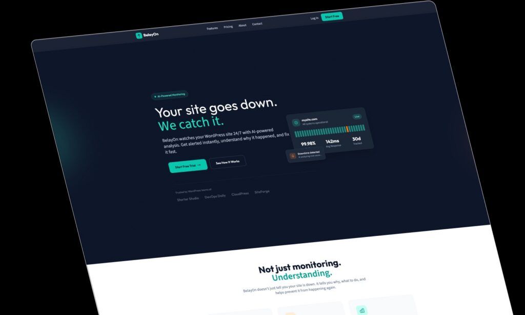
Above: Example SaaS homepage showing starting a free trial effortlessly.
Customer Logos and Case Studies
Highlight logos of well-known customers and link to in-depth case studies or testimonials. Feature customer quotes about how your SaaS solved their problems. Social proof in the form of recognizable brands and real results builds trust instantly.
Key Metrics for SaaS Companies
- Trial sign-up rate
- Demo requests
- Onboarding completion rate
Unlocking the Power of Conversion-Focused Web Design
A high-converting homepage is the result of intentional, data-driven decisions and a deep understanding of your audience. Focus on a clear value proposition, trust signals, and a frictionless path to action, and you’ll turn your homepage into a true business growth engine. For conversion-focused website design that delivers measurable results, reach out for the best conversion-focused designs in your industry.
Want to see real-world examples? Explore our portfolio for annotated screenshots and case studies of our conversion-focused website and e-commerce design work. These real examples make it easy to spot what works — and why.
The post Anatomy of a Conversion-Focused Website Design appeared first on Huckleberry Branding.