
From your logo and color scheme to fonts, imagery, and layout, visual branding shapes a brand’s first impression, often in a split second.
It’s why Coca-Cola’s bold red is instantly recognized, Apple’s minimalist design signals innovation, McDonald’s golden arches evoke familiarity in any language, and Spotify’s green instantly cues music and movement. Each of these brands uses visual branding not just to stand out, but to stick.
What is visual branding?
Visual branding is the use of design elements, such as a logo, color palette, fonts, imagery, and layout, to express a brand’s identity and values. It shapes how audiences recognize and emotionally connect with a brand. When done well, visual branding creates a consistent look and feel across all touchpoints, helping build trust, recognition, and lasting impressions.
But for early-stage startups and design teams juggling tight timelines, maintaining visual consistency is easier said than done. That’s where brand asset management software comes in. It helps centralize design elements and keep everything aligned as your brand scales across platforms and campaigns.
Ready to level up your visual branding strategy? Keep reading to learn how to build a cohesive, memorable brand identity and the tools that can help you achieve it.
TL;DR: Everything you need to know about visual branding
- What is visual branding? It’s how a brand uses design — logos, colors, typography, and imagery — to communicate identity and values.
- Why does it matter? It shapes first impressions, builds recognition, and reinforces brand trust across every touchpoint.
- What’s the difference between brand and visual identity? Brand identity is who you are; visual identity is how you look to the world.
- What tools help manage it? Brand asset management software, style guides, and graphic design platforms like Canva or Adobe Express.
- What makes a visual brand effective? Consistency, emotional resonance, simplicity, and alignment with your core brand story.
- How do you build a strong visual brand? Define your identity and audience, develop a clear visual language, and apply it consistently everywhere.
Brand identity vs. visual identity: What’s the difference?
Brand identity refers to your brand’s holistic personality, voice, mission, values, tone, and emotional appeal. It’s how your brand speaks, acts, and behaves across all touchpoints. Think of it as your brand’s soul.
Visual identity, on the other hand, is how your brand looks. It includes your logo, typography, color palette, iconography, imagery, and layout systems. It’s the visual language you use to express your brand identity to the world.
For example, Patagonia’s brand identity emphasizes sustainability, activism, and ethical production. Its visual identity reinforces this with natural imagery, earthy colors, and minimalist typography, all aligning with its deeper mission.
The two must work in harmony. A playful visual identity that uses bright, cartoonish graphics would clash with a serious brand mission focused on legal advisory services. When there’s cohesion between what a brand stands for (identity) and how it looks (visuals), the result is clarity and trust.
| Aspect | Brand Identity | Visual Identity |
| Definition | The core personality, voice, values, mission, and emotional tone of the brand | The visual representation of the brand through design elements |
| Purpose | Builds emotional connection and communicates the brand’s “why” | Creates recognition and communicates the brand’s “look and feel” |
| Examples | Mission statement, brand voice, company values, storytelling | Logo, typography, color palette, imagery, iconography, layout |
| Focus | Emotional resonance, customer perception, and tone consistency | Visual cohesion, aesthetic appeal, and design consistency |
| Tools involved | Messaging guidelines, brand manifesto, and tone of voice documents | Style guides, mood boards, brand kits, creative templates |
| Real-world example | Patagonia’s commitment to sustainability and activism | Use of natural imagery, muted color tones, and simple, earth-inspired design |
Why is visual branding important?
Visual branding is essential because it creates immediate recognition, emotional connection, and lasting recall in your audience’s minds.
In many cases, a brand’s visuals are the first interaction someone has with a business. Whether it’s a logo, a website hero image, or a social media banner, these design elements shape initial perceptions quickly and often subconsciously.
An appealing visual identity not only communicates professionalism but also helps brands stand out in a crowded market.
Nike’s consistent use of the Swoosh logo and motivational messaging helps the brand maintain a clear identity across all platforms. These recurring visual cues build trust and deepen emotional resonance with consumers over time.
Visual branding also supports broader brand marketing efforts by reinforcing what a company stands for. When a brand’s values and personality are consistently expressed through its visual assets, the result is clarity, cohesion, and a stronger brand story.
Consumers are more likely to trust and engage with a brand that presents itself in a unified, polished manner across every channel, from websites and packaging to digital ads and product experiences.
When visual branding is fully integrated into marketing and product design, the result is a seamless brand experience. Design teams and brand strategists should work together to ensure that the visual language is consistent across every touchpoint, not only to build recognition but also to reinforce trust and emotional connection with every interaction.
Is visual branding important on social media?
Visuals include far more than just a logo (and its variations, as we’ve learned). Think about banners, images, and videos regularly posted across your social media profiles.
In today’s digital landscape, for better or worse, social media marketing is non-negotiable if you want to expand your audience and keep them informed at all times. Navigating these endless visual requirements can be overwhelming.
You need to consider special occasions like Halloween, Thanksgiving, and other significant events, and maintain a steady stream of regular updates and campaigns.
It’s also important to consider the impression your page leaves on first-time visitors. If they can’t instantly grasp your brand’s essence, no matter how visually appealing your content is, you’re missing the mark.
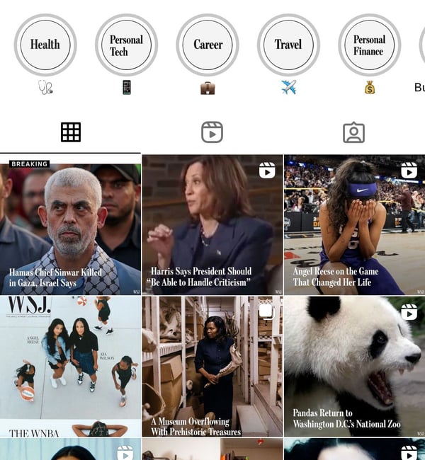
Source: Wall Street Journal’s IG feed
Brand consistency is key. Every element, from your profile images to your banners, should reinforce your brand’s identity and values. Each post should feel like an extension of your brand, creating a cohesive narrative that your audience can easily recognize and relate to.
Finally, engagement is crucial. Visuals should not only look good but also invite interaction. Use elements that encourage likes, comments, and shares, and ensure that your content is optimized for each platform’s unique format and audience.
What are the key elements of visual branding?
There are many factors that contribute to a business’s memorable visual identity. Some common features include:
- Brand logos
- Typography
- Image styles
- Composition styles
- Memorable color patterns
Knowing your audience is crucial (as ever) for choosing the right visuals. That means choosing the visuals that appear to your customers rather than you yourself, for which it is always recommended to seek a second opinion.
As successful startups often point out, ask laymen for their opinions when you are stuck. This holds true for visuals, too. Simply ask people who don’t know what your brand is about and what associations your logo invokes.
1. Brand logos
Many of the world’s biggest brands feature some of the simplest logos, yet they are nonetheless recognizable for that.
Contrary to popular belief, logos do change over time. Businesses that have been in the game long enough (did we mention Coca-Cola?) have adapted their logos to be more evergreen, but the trick is that they remain equally recognizable after the redesign and finishing touches.
Source: First Launch
It’s important to remember that the internet is our main form of information distribution, so visual branding has taken on a whole new meaning. Not only will your logo be plastered on your products, but it will also be heavily featured in online marketing campaigns. Therefore, it’s worth it to make it memorable.
Simplicity makes evolution a much simpler task than is the case with complex logo designs.

One of the best examples is National Geographic, which has grown internationally without compromising its visual identity. Note the subtle changes in design that are all but logical.

When it comes to typography, many companies may opt for something that offers depth and is unique. However, you must be sure to balance being eye-catching without being too complicated.
One brand that shouldn’t be overlooked in this area is Marvel. It is highly specific in that it features a simple font and an easily created one-colored background. It’s precisely that simplicity that allows for additional experimentation, as illustrated below:
3. Image styles
More complex designs are known to evolve. The trick is in keeping them recognizable. When you create an image, you are also creating its specific style. One way to do it is to do what Starbucks has done: add slight changes over time but retain the original shape and style.
4. Composition styles
Some brands have as many logos as there are linked associations. This is when blending various ingredients to create a unique composition style comes into play. Our favorite example is Batman, who seems to have undergone every possible transformation imaginable, melding many different styles yet remaining equally recognizable.
5. Memorable color patterns
Memorable color patterns are crucial in developing a visual brand identity, establishing brand recognition, and consistency.
Selecting a thoughtful color palette and appropriate shapes is essential, as these elements should evoke the desired emotions and resonate with your target audience.
Ultimately, the right color palette and shapes should reflect the brand’s values and personality and adapt to changing trends and audience preferences. Brands like Google exemplify this approach with their vibrant and diverse color scheme, which evolves in campaigns while maintaining core visual elements.
![]()
Source: Looka
This strategy allows Google to stay relevant and engaging while ensuring that its visuals remain recognizable and connected to its brand identity over time.
If Antonio Damasio is right, what matters when it comes to visual branding is how people feel rather than how they think about a brand. Now, there’s a whole color theory that will help you underline that one emotion you decided to invoke in your audience.
The psychology of colors in branding
- Red: Triggers buying purchases.
- Yellow: Happiness and optimism.
- Orange: Playfulness and friendliness.
- Green: Prosperity and growth.
- Black and Purple: Royalty and luxury.
- Pink: Youth and femininity.
- White: Virtue and health.
- Gray: Neutrality.
- Brown: Traditional values and reliability.
- Dark Blue: Formality and professionalism.
- Light Blue: Trust and openness.
Let’s dwell a bit more on the light blue. If you think about it, you’ll recall that nearly all banks you’ve ever heard of use a light blue color scheme. Surely it’s more than just a coincidence?
We previously spoke of a color palette. Many brands choose to use the same color, and with good reason. Using the same color consistently strengthens brand awareness. Think about it this way: when did you last see the Facebook logo in red?
How to build a visual branding strategy
A great visual brand doesn’t just happen — it’s the product of a clear, intentional strategy. While it may be tempting to jump straight into designing a logo or choosing colors, skipping the strategic foundation can lead to a fragmented or inconsistent visual identity. Whether you’re a new business or refining an existing brand, building a strong visual branding strategy comes down to three essential phases.
1. Define who you are and who you’re for
Start by clarifying your brand’s core identity. This includes your mission, values, personality, and positioning. Ask yourself: What does your brand stand for? How should people feel when they encounter it? These answers shape the emotional and tonal direction of your visuals.
Once you have your foundation, define your audience with just as much clarity. A brand targeting Gen Z gamers will naturally look and feel different from one aimed at enterprise decision-makers. Create detailed audience personas, including demographics, goals, visual preferences, and emotional triggers. This will guide every aesthetic decision — from color palette to font style.
2. Create your visual language
With identity and audience nailed down, you can begin designing your brand language. This means choosing your core elements: logo, typography, iconography, color palette, and imagery style. Together, these form the visual toolkit that expresses your brand’s essence in a way your audience will understand and remember.
Start by creating a mood board — a curated collection of design references, textures, colors, and visuals that reflect your intended brand vibe. Tools like Pinterest, Milanote, or Figma can help organize your thinking visually. At this stage, it’s not just about looking good — it’s about designing with purpose and consistency.
Then, translate your visual direction into a formal brand style guide. This document should cover every visual rule: logo usage, spacing, minimum sizes, approved color codes, font pairings, tone of imagery, layout rules, and even icon styles. Style guides aren’t just for designers — they help marketers, developers, and vendors present your brand consistently.
Top 5 graphic design tools
These tools are not only popular among designers but are also recognized on G2 for their strong usability and customer satisfaction ratings
- Canva – Best for drag-and-drop design
- Adobe Express – Best for social media content
- GIMP – Best for freeform editing
- Plasfy – Best for marketing materials
- VistaCreate – Best for animated content
*These are the top 5 leading graphic design software solutions from G2’s Summer 2025 Grid® Report.
3. Apply, test, and refine
Once your system is built, it’s time to put it into practice. Roll out your new visual identity across all brand channels: your website, product UI, social media, advertising, print materials, and internal documents. Ensure every asset, no matter how small, reflects the new visual language.
Then, gather feedback from users, team members, and stakeholders. Is your branding resonating? Does it work across formats? Is it easy to apply without guesswork? Treat this stage as an ongoing process. Your strategy should evolve as your brand grows, but its core should remain strong, consistent, and recognizable.
A thoughtful visual branding strategy improves your appearance, aligns your team, speeds up decision-making, and builds audience trust. When done right, it becomes one of your brand’s most powerful assets.
Common visual branding mistakes (and how to avoid them)
Even strong brands can trip over avoidable visual missteps. Inconsistent application, unclear messaging, or clashing aesthetics can confuse audiences and damage trust. Here are some of the most common visual branding mistakes and how to steer clear of them:
- Inconsistent application across touchpoints: Your logo, color palette, and fonts should look the same on social media, your website, packaging, and print materials. Inconsistency weakens brand recognition. Prevent this by using detailed brand guidelines and brand asset management tools to maintain cohesion.
- Designing for yourself, not your audience: Just because you love a certain aesthetic doesn’t mean your target audience will. Always validate design decisions through customer feedback, surveys, or A/B testing. If your visuals don’t resonate with your users, they’re missing the mark.
- Overcomplicating visual elements: Complex logos, intricate fonts, and too many colors reduce clarity and memorability. Simple visuals scale better and are easier to recognize. Think of brands like Google or Airbnb — clean, minimal, and instantly recognizable.
- Chasing design trends without a strategy: Visual trends come and go. Jumping on every new aesthetic can dilute your brand’s identity and confuse your audience. Rebrand with purpose, not just because “everyone else is doing it.” Stay current, but grounded in your brand values.
- Ignoring accessibility: Using low-contrast colors, unreadable fonts, or missing alt text excludes people with visual impairments and reduces usability for everyone. Accessible design isn’t just ethical — it broadens your audience and improves UX across the board.
Avoiding these mistakes ensures your visual branding doesn’t just look good — it works hard to communicate your message, build trust, and make your brand unmistakably you.
Visual branding: Frequently asked questions
Q. What makes a visual brand memorable?
A memorable visual brand relies on consistency, emotional resonance, and clarity. Simplicity in design, repeated use of recognizable elements (like color or icons), and alignment with brand values all help lock a brand into audience memory.
Q. Can a small business benefit from visual branding?
Absolutely. In fact, visual branding can help small businesses appear more established and trustworthy. A cohesive brand presence levels the playing field, even without the budget of major corporations.
Q. How often should a company update its visual identity?
There’s no set timeline, but most brands revisit their visual identity every 5–10 years or when undergoing major strategic shifts. Subtle evolutions (not total overhauls) help keep branding current without losing recognition.
Q. What’s the difference between rebranding and a visual refresh?
A rebrand usually involves a broader change in brand identity, including mission, messaging, and target audience. A visual refresh focuses specifically on updating design elements (like logos or typography) to modernize the look without changing the brand’s core essence.
Q. How do I know if my visual branding is working?
Track brand awareness metrics, audience recall, social engagement, and feedback in user testing. Consistency across touchpoints, positive associations, and visual recognition are signs your branding is resonating.
Q. What role does color psychology play in visual branding?
Color psychology plays a big role in shaping how people feel about a brand. For example, blue conveys trust, green suggests growth, and red evokes urgency. Choosing the right palette helps evoke the intended emotions in your audience.
Design so sharp, it cuts through the competition!
As you can see, visual branding is an elaborate process encompassing nice graphic designs, recognizable patterns, and colors. It tells the story of your business and reminds your audience about your business promise. It stands out among the competition at all times.
Therefore, let your imagination fly free. Take time to compare different designs and color schemes until you are 100% satisfied with the result. Remember that future visuals rely on the initial choice of colors, shapes, and typography.
The first question to ask yourself is how you want your logo to affect the audience. Should it grab them by the heart with its honesty, cuteness, seriousness, or something else? Should the message be formal, funny, or something in between? Listen to your audience. Stick to your tone of voice with the visuals as you stick to consistent content. There’s no big difference between the two in this aspect.
Always consider your customers’ expectations and the competition. Both will change over time, and so will your visuals.
Explore the best graphic design software for your creative needs to stay on top of your visual branding game.
This article was originally published in 2020. It has been updated with new information.