In this article, you will learn how to choose between PCA and t-SNE for visualizing high-dimensional data, with clear trade-offs, caveats, and working Python examples.
Topics we will cover include:
- The core ideas, strengths, and limits of PCA versus t-SNE.
- When to use each method — and when to combine them.
- A practical PCA → t-SNE workflow with scikit-learn code.
Let’s not waste any more time.

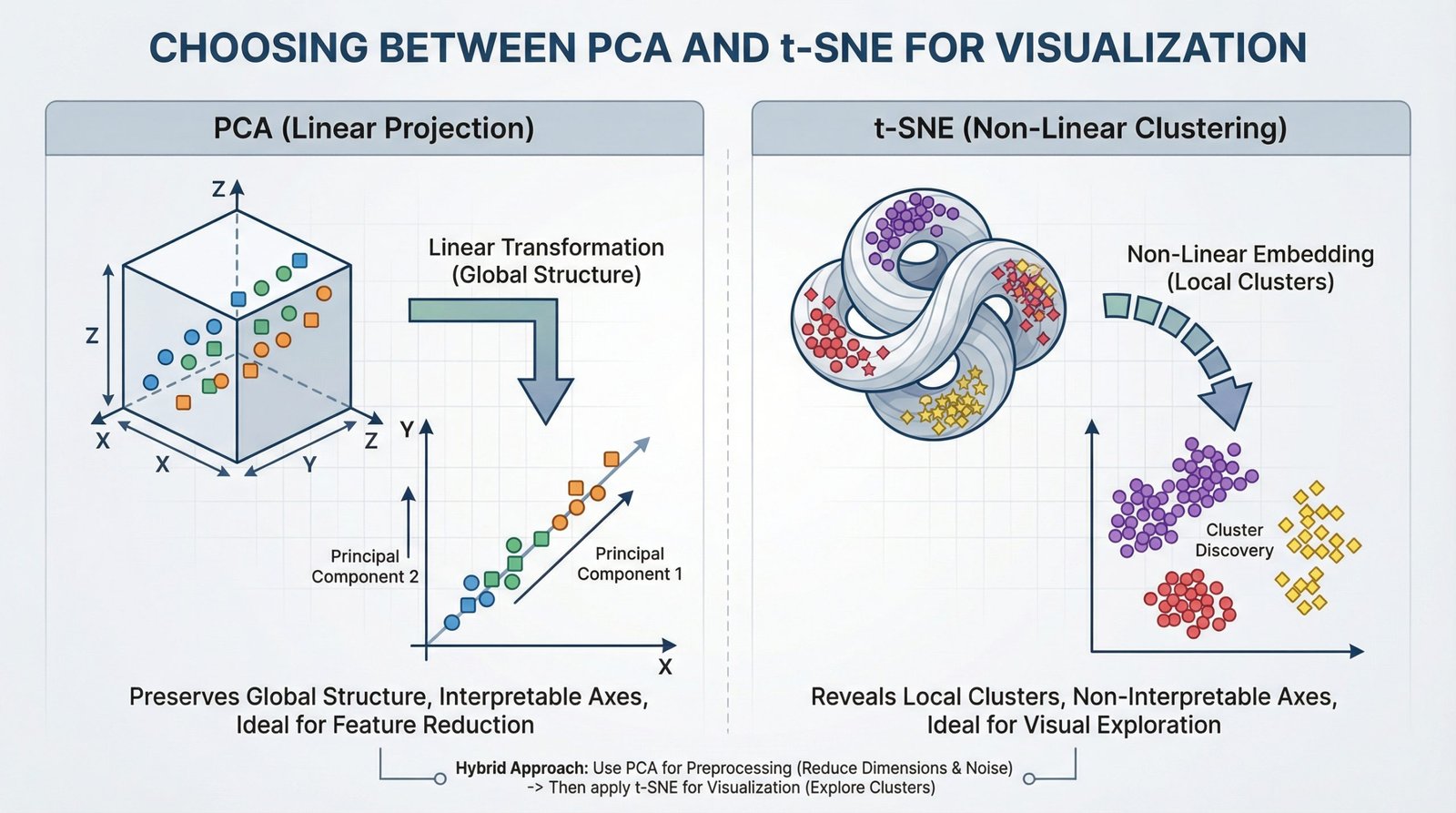
Choosing Between PCA and t-SNE for Visualization (click to enlarge)
Image by Editor
For data scientists, working with high-dimensional data is part of daily life. From customer features in analytics to pixel values in images and word vectors in NLP, datasets often contain hundreds and thousands of variables. Visualizing such complex data is difficult.
That’s where dimensionality reduction techniques come in. Two of the most widely used methods are Principal Component Analysis (PCA) and t-Distributed Stochastic Neighbor Embedding (t-SNE). While both reduce dimensions, they serve very different goals.
Understanding Principal Component Analysis (PCA)
Principal Component Analysis is a linear method that transforms data into new axes called principal components. Its goal is to convert your data into a new coordinate system where the greatest differences lie on the first axis (the first principal component), the second greatest on the second axis, and so on. It does this by performing an eigendecomposition (the process of breaking down a square matrix into a simpler, “canonical” form using its eigenvalues and eigenvectors) of the data covariance matrix or a Singular Value Decomposition (SVD) of the data matrix.
These components capture the highest variance in the data and are ordered from most important to least important. Think of PCA as rotating your dataset to find the best angle that shows the most spread of information.
Key Advantages and When to Use PCA
- Feature Reduction & Preprocessing: Use PCA to reduce the number of input features for a downstream model (like regression or classification) while retaining the most informative signals.
- Noise Reduction: By discarding components with minor variance (often noise), PCA can clean your data.
- Interpretable Components: You can inspect the
components_attribute to see which original features contribute most to each principal component. - Global Variance Preservation: It faithfully maintains large-scale distances and relationships in your data.
Implementing PCA with Scikit-Learn
Using PCA in Python’s scikit-learn is straightforward. The key parameter is n_components, which defines the number of dimensions for your output.
|
1 2 3 4 5 6 7 8 9 10 11 12 13 14 15 16 17 18 19 20 21 22 23 24 25 |
from sklearn.decomposition import PCA from sklearn.datasets import load_iris import matplotlib.pyplot as plt
# Load sample data iris = load_iris() X = iris.data y = iris.target
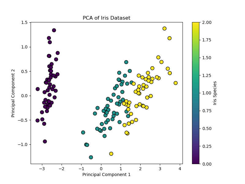
# Apply PCA, reducing to 2 dimensions for visualization pca = PCA(n_components=2) X_pca = pca.fit_transform(X)
# Visualize the result plt.figure(figsize=(8, 6)) scatter = plt.scatter(X_pca[:, 0], X_pca[:, 1], c=y, cmap=‘viridis’, edgecolor=‘k’, s=70) plt.xlabel(‘Principal Component 1’) plt.ylabel(‘Principal Component 2’) plt.title(‘PCA of Iris Dataset’) plt.colorbar(scatter, label=‘Iris Species’) plt.show()
# Examine explained variance print(f“Variance explained by each component: {pca.explained_variance_ratio_}”) print(f“Total variance captured: {sum(pca.explained_variance_ratio_):.2%}”) |
This code reduces the 4-dimensional Iris dataset to 2 dimensions. The resulting scatter plot shows the data spread along axes of maximum variance, and the explained_variance_ratio_ tells you how much information was preserved.
Code output:
|
Variance explained by each component: [0.92461872 0.05306648] Total variance captured: 97.77% |
When to Use PCA
- When you want to reduce features before machine learning models
- When you want to remove noise
- When you want to speed up training
- When you want to understand global patterns
Understanding t-Distributed Stochastic Neighbor Embedding (t-SNE)
t-SNE is a non-linear technique designed almost entirely for visualization. It works by modeling pairwise similarities between points in the high-dimensional space and then finding a low-dimensional (2D or 3D) representation where these similarities are best maintained. It is particularly good at revealing local structures like clusters that may be hidden in high dimensions.
Key Advantages and When to Use t-SNE
- Visualizing Clusters: It is great for creating intuitive, cluster-rich plots from complex data like word embeddings, gene expression data, or images
- Revealing Non-Linear Manifolds: It can reveal detailed, curved structures that linear methods like PCA cannot
- Focus on Local Relationships: Its design ensures that points close in the original space remain close in the embedding
Critical Limitations
- Axes Are Not Interpretable: The t-SNE plot’s axes (t-SNE1, t-SNE2) have no fundamental meaning. Only the relative distances and clustering of points are informative
- Do Not Compare Clusters Across Plots: The scale and distances between clusters in one t-SNE plot are not comparable to those in another plot from a different run or dataset
- Perplexity is Key: This is the most important parameter. It balances the attention between local and global structure (typical range: 5–50). You must experiment with it
Implementing t-SNE with Scikit-Learn
|
1 2 3 4 5 6 7 8 9 10 11 12 13 14 15 16 17 18 19 20 21 |
from sklearn.datasets import load_iris from sklearn.manifold import TSNE import matplotlib.pyplot as plt
# Load sample data iris = load_iris() X = iris.data y = iris.target
# Apply t-SNE. Note the key ‘perplexity’ parameter. tsne = TSNE(n_components=2, perplexity=30, random_state=42, init=‘pca’) X_tsne = tsne.fit_transform(X)
# Visualize the result plt.figure(figsize=(8, 6)) scatter = plt.scatter(X_tsne[:, 0], X_tsne[:, 1], c=y, cmap=‘viridis’, edgecolor=‘k’, s=70) plt.xlabel(‘t-SNE Component 1 (no intrinsic meaning)’) plt.ylabel(‘t-SNE Component 2 (no intrinsic meaning)’) plt.title(‘t-SNE of Iris Dataset (Perplexity=30)’) plt.colorbar(scatter, label=‘Iris Species’) plt.show() |
This code creates a t-SNE visualization. Setting init="pca" (the default) uses a PCA initialization for better stability. Notice the axes are deliberately labeled as having no intrinsic meaning.
Output:
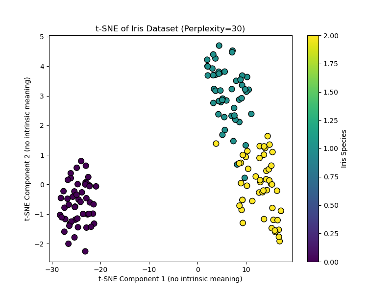
When to Use t-SNE
- When you want to explore clusters
- When you need to visualize embeddings
- When you want to reveal hidden patterns
- It is not for feature engineering
A Practical Workflow
A powerful and common best practice is to combine PCA and t-SNE. This uses the strengths of both:
- First, use PCA to reduce very high-dimensional data (e.g., 1000+ features) to an intermediate number of dimensions (e.g., 50). This removes noise and drastically speeds up the subsequent t-SNE computation
- Then, apply t-SNE to the PCA output to get your final 2D visualization
Hybrid approach: PCA followed by t-SNE
|
from sklearn.decomposition import PCA
# Step 1: Reduce to 50 dimensions with PCA pca_for_tsne = PCA(n_components=50) X_pca_reduced = pca_for_tsne.fit_transform(X_high_dim) # Assume X_high_dim is your original data
# Step 2: Apply t-SNE to the PCA-reduced data X_tsne_final = TSNE(n_components=2, perplexity=40, random_state=42).fit_transform(X_pca_reduced) |
The example above demonstrates using t-SNE to reduce to 2D for visualization, and how PCA preprocessing can make t-SNE faster and more stable.\
Conclusion
Choosing the right tool boils down to your primary objective:
- Use PCA when you need an efficient, deterministic, and interpretable method for general-purpose dimensionality reduction, feature extraction, or as a preprocessing step for another model. It’s your go-to for a first look at global data structure.
- Use t-SNE when your goal is purely visual exploration and cluster discovery in complex, non-linear data. Be prepared to tune parameters and never interpret the plot quantitatively
Start with PCA. If it reveals clear linear trends, it may be sufficient. If you suspect hidden clusters, switch to t-SNE (or use the hybrid approach) to reveal them.
Finally, while PCA and t-SNE are foundational, be aware of modern alternatives like Uniform Manifold Approximation and Projection (UMAP). UMAP is often faster than t-SNE and is designed to preserve more of the global structure while still capturing local details. It has become a popular default choice for many visualization tasks, continuing the evolution of how we see our data.
I hope this article provides a clear framework for choosing between PCA and t-SNE. The best way to build this understanding is to experiment with both methods on datasets you know well, observing how their different natures shape the story your data tells.