
We’ve arrived at a point where the idea of ‘y2k’ as an aesthetic has stretched beyond ‘trend’ or ‘cycle’ and morphed into an entity almost entirely devoid of the temporal placemarker its name suggests. Having been repeated ad nauseum, ‘y2k’ is no longer about a visual/cultural moment and/or collection of moments around 25 years back. Instead, it’s become a Burroughs and Gysin-esque ‘third mind’: faux-stalgic two-dimensional signifiers of a non-existent past simultaneously sanitised and jazzed up into a new form, faintly evocative of a time and place but with little, really, that connects to what we saw and did and liked in the actual, historical Year Two [K]Thousand.
The real and imagined early 00s alike was an era and a look defined by gradients, by drop shadows, by shonky skeuomorphism and Har-Mar Superstar and Pioneer CDJs – today, its graphics (perhaps unwittingly) borrow not from Modernism or even Postmodernism or form following function but from Rush poppers and Blackbushe Market.
This was the Seventh Wave of Irony riding the next wave of irony on a Bald Eagle’s wings, like that weasel that rode a woodpecker; people wearing E.R.O.L. Keeps the Kids Dancing t-shirts, claiming to have been at the last ever Trash at The End in central (you know, just off New Oxford Street) but we’re not sure whether to believe them or not.
Does it matter if they’re fibbing though? No. I was there though, I really was, looking like a little pisshead green triangle Quality Street in a stupid carbootsale prom dress with froufrou layers of lace and netting and corsetry. That dress felt all the more ridiculous the morning after, stumbling into Bethnal Green out the door of a man whose name I know not now, nor knew back then to clumsily navigate the objectively short but then-Odyssean-seeming journey home to Kingsland Road.
There’s a good reason people don’t really do this sort of thing as much any more, obviously: it’s dangerous and idiotic and undignified and maybe even cheugy and 100millionpercent geriatric millennial coded.
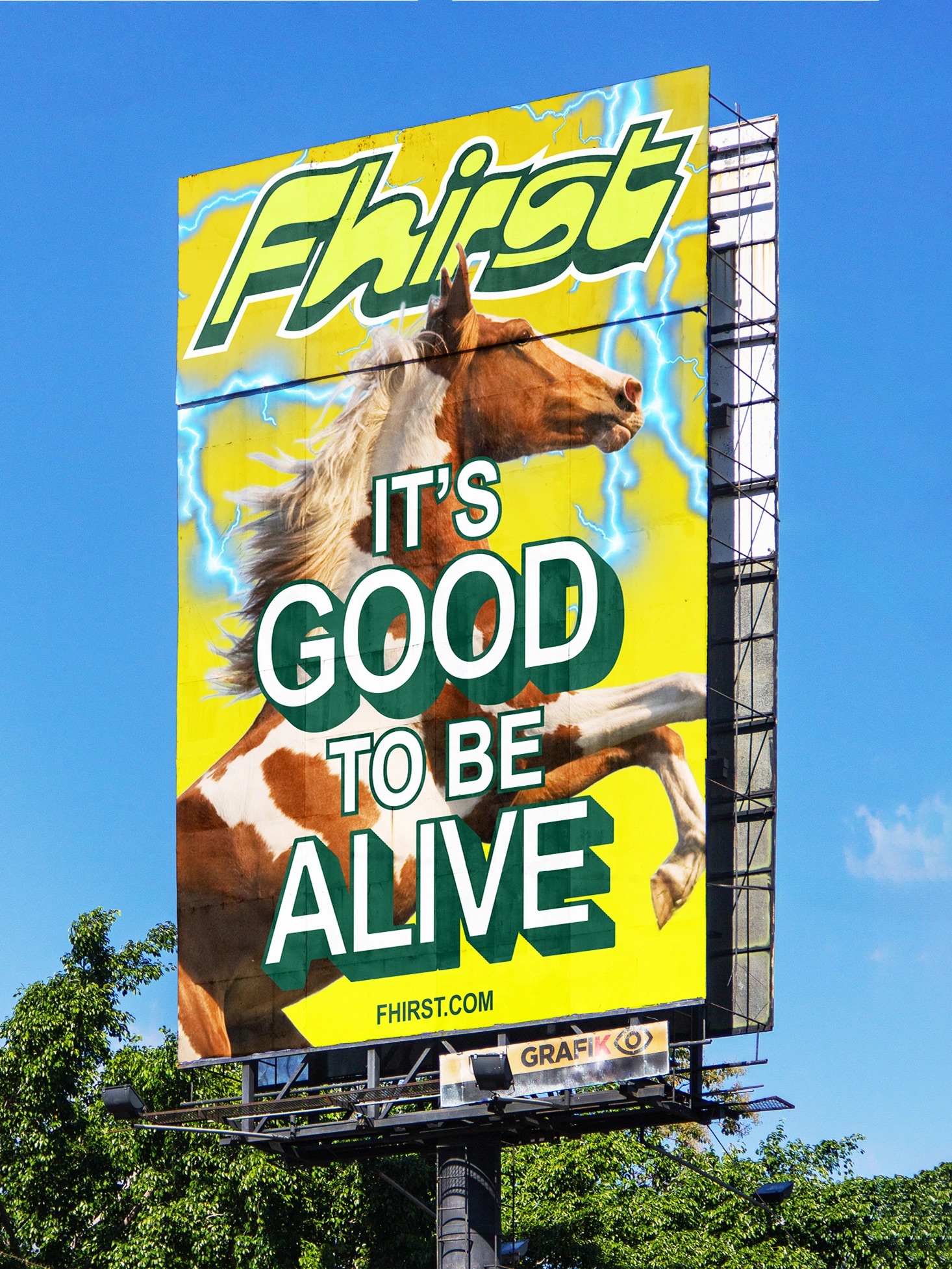
But it was also fun because of all those things – and there’s a lot to suggest that even Gen Z yearns for a little sliver of the stupidity that defined the mid-00s – a time that was genuinely more carefree than now, if just thanks to its lack of relentless digital documentation. We know people want all this thanks to brands – namely, their refusal to shake off the whole ‘y2k’ thing. Few do it well, however, but this project – Mother Design’s work for health soda brand Fhirst – is a glorious exception. Tellingly, the designs are in part Mother Design’s answer to the question: ‘What does opening real, scientifically backed happiness look like?’
![]()

Fhirst was founded by Belgian entrepreneurs Catherine and Steven Van Middelem, who spent several years developing a probiotic soda designed to support long-term mental wellbeing. Essentially, the pair used their awareness of the gut as a sort of second brain to create something that looked to make those who drink it happier: as such, the distinguishing feature is its micro-encapsulation technology, which preserves live cultures over time and gives the probiotic drink a longer shelf life than comparable beverages such as kefirs or kombuchas.
While Fhirst had been in the works for a good few years, by the time it came to launch in 2023 its category – health-focused sodas – was very much established, with its own design conventions and clichés. Its initial designs saw Fhirst sit nicely alongside the likes of OLIPOP or Poppi, with packaging that prioritised cleanness and clarity, but it didn’t really stand out, or do anything different.
Mother Design, then, had to create an identity that would differentiate the brand in a crowded sector. Its approach was to “strategically reposition Fhirst as the world’s first Superfunktional Soda: scientifically designed to boost your mood in the long run,” Mother Design explains, adding it sought “to bring an intentionally unconventional, differentiating edge – particularly to the can label.”
In short, this is an identity that’s totally, unashamedly, absolutely no-holds-barred maximalist – everything, everywhere, (almost) all at once – but, of course, in the hands of Mother Design, executed in a systematised way that makes for joyful chaos rather than sloppy lunacy.
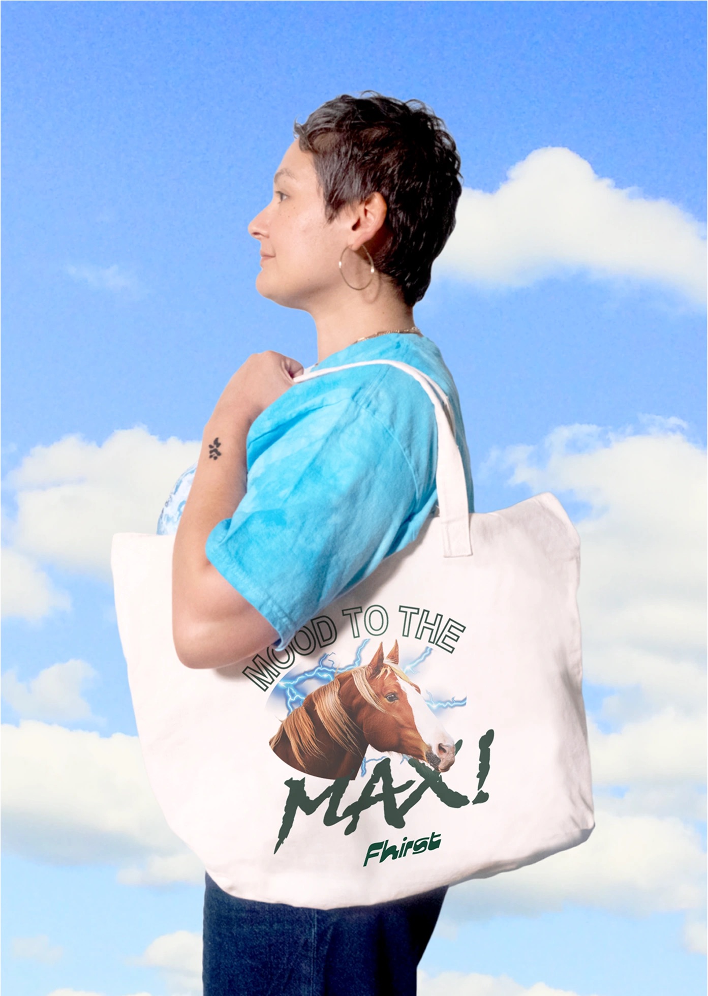
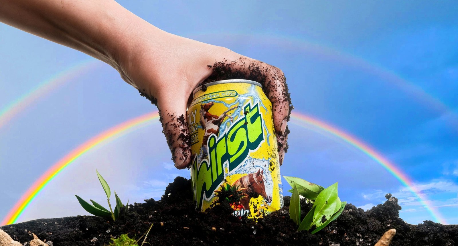
I’m a big fan of the new Fhirst wordmark, which according to Mother Design is an homage to the 1999 Motter Regatta typeface by the late Austrian designer Othmar Motter that aims to “balance timeless charm with expressive energy, reflecting the fluid movement and naturally dynamic essence” of the product. It works because it’s spirited, it’s different – a ‘brand font’ through and through, and almost painfully 90s looking but still somehow timeless enough to work brilliantly.


Gradients are often incorporated into the lettering of the wordmark, giving the logo depth and dimension on the can, while retaining legibility across multiple different applications and scales. Like the brand itself across the board, it embraces idiosyncrasy: each glyph has a slightly independent rhythm, contributing to the visual complexity of the wordmark without disrupting recognition.
The raft of secondary typefaces reads like a big-budget assembly cast list of Windows 95 all-stars: there’s the iconic bloated forms of Frankfurter, the daft hammy horror-movie Blackmoor (like Frankfurter, a font originally from the Letraset stable), the chunky high-jinks display font Beesknees, and ITC’s inoffensively saccharine part sans serif, almost brush script Eborg. Even good old Papyrus – butt of a thousand font jokes and subject of as many ‘in defence of’ think pieces – gets a look in
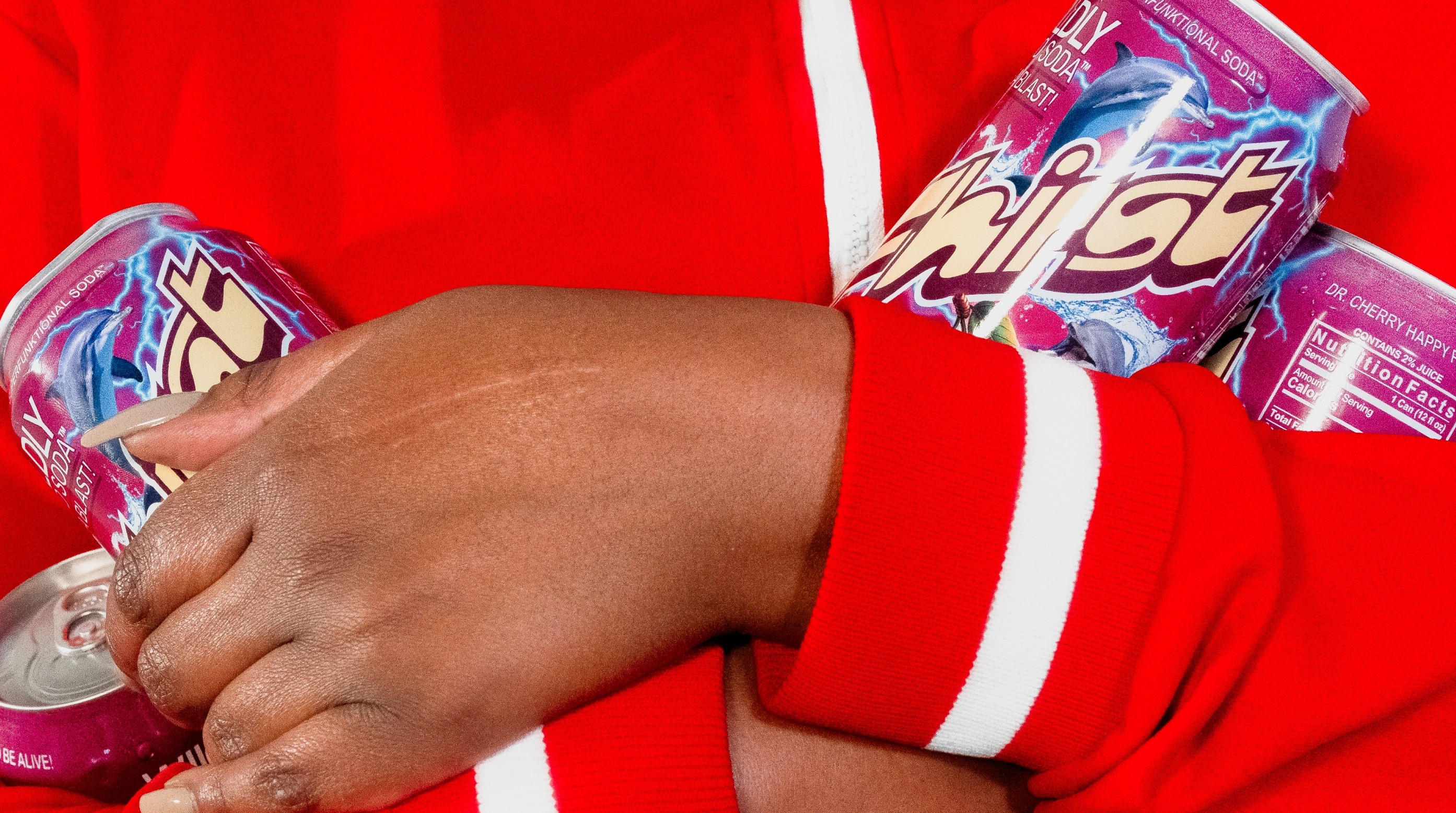
The varying typefaces add individual character to the already rather ‘extra’ flavour names: “Pineapple Yuzuphoria,” “Orange Cola Joyride,” “Good Time Lemon Lime,” and “Dr. Cherry Happy Place”. Different fonts and font pairings are also used across the various packaging components to establish differentiation between SKUs while maintaining an overarching system of sorts: typographic hierarchy and legibility are preserved through careful sizing, spacing, and placement, demonstrating Mother Design’s deft hand when it comes to ensuring the coexistence of eclecticism with clarity.
As you’d expect from a brand that exhumes countless letterform artefacts of a past many designers would rather forget, when it comes to colour, Fhirst goes hard on two things – high-contrast brights, and gradients.
The primary palette is based around two shades dubbed Fhirst cyan and Fhirst purple, which provide continuity across all cans in the range while enabling each flavour to speak on its own terms thanks to the use of a secondary palette comprising one gradient, one bright colour, and one darker tone. This approach creates individual colour “universes”, as Mother Design has termed them, for each SKU, ensuring that while the system is visually rich, the mode of colour coding is also thoroughly functional.
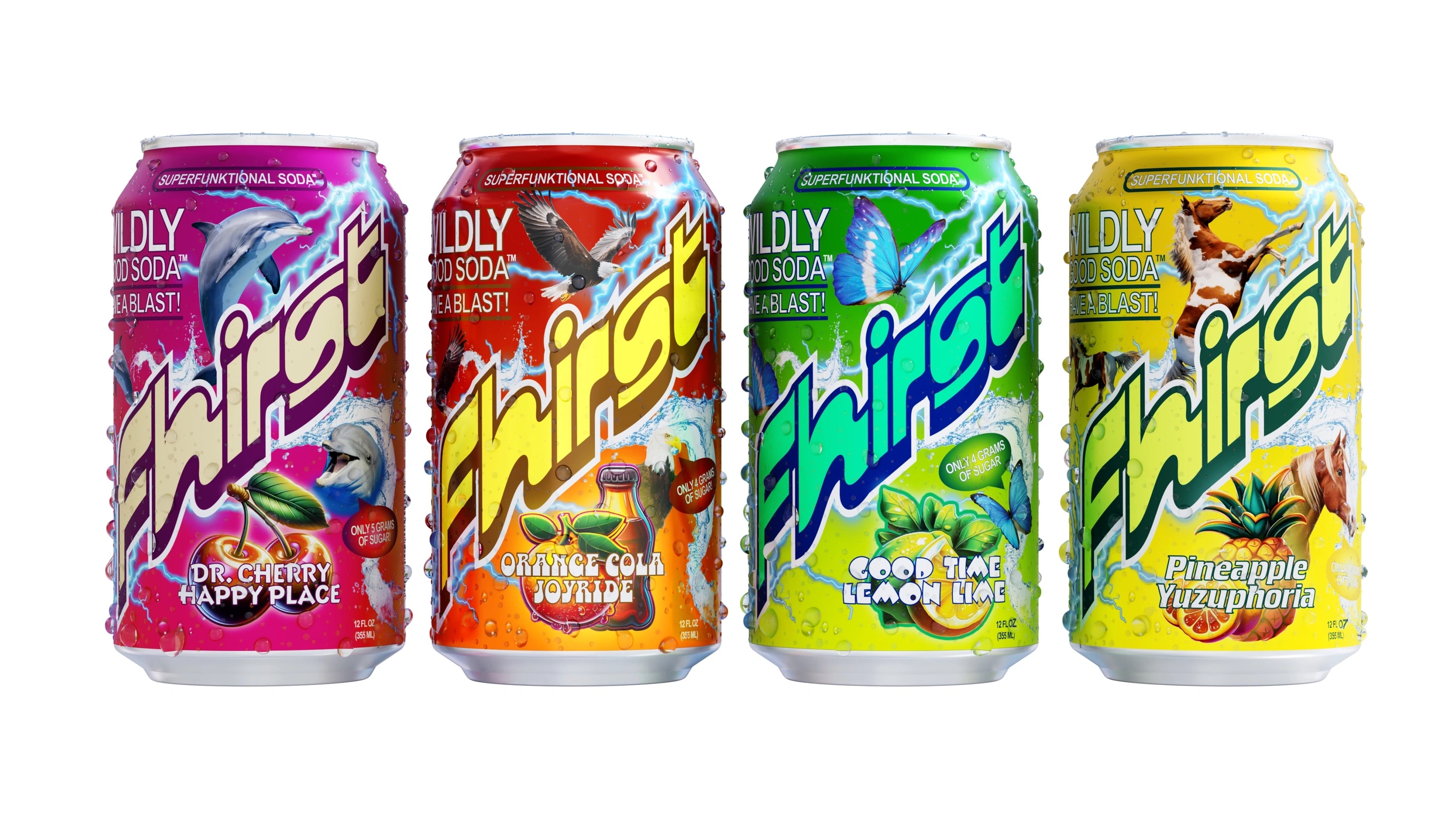
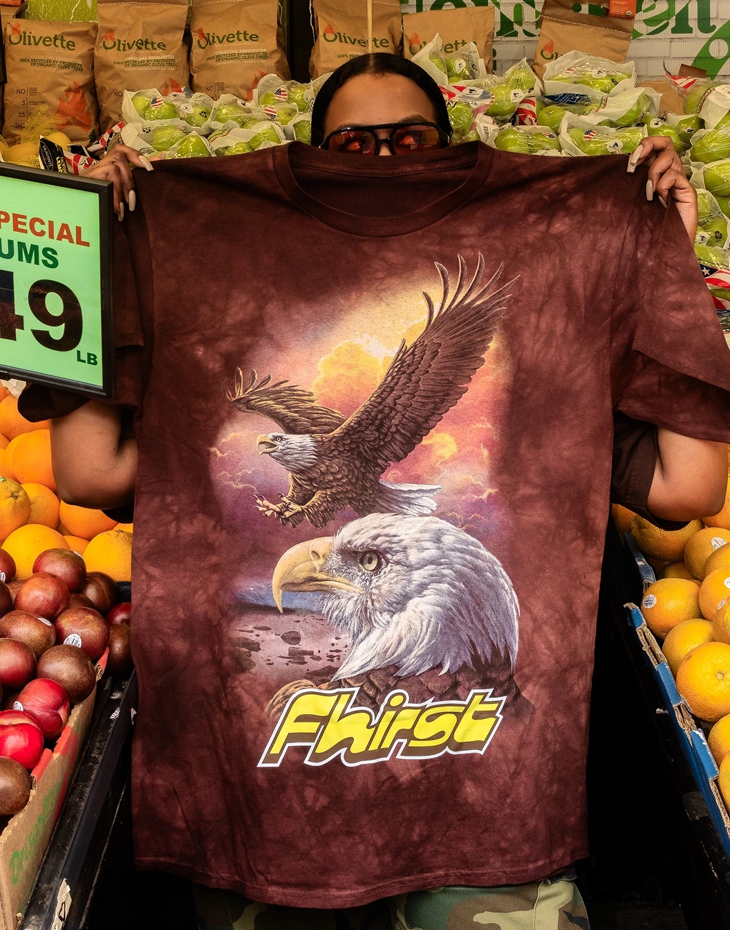
I’m totally on board with the wild cavalcade of fonts, for the record; and I’m pretty into the unashamedly loud all-guns-blazing colours, but surely we can all agree that the star of the show is the utterly ridiculous, bang on the nose, so-stoooopid-it’s-clever suite of illustrations: an eagle, a butterfly, a dolphin, and a horse. All rendered in that style most at home on the front of those flammable-looking, somehow perennially cool t-shirts; or within a silvery frame hung on a wall belonging to one of those nice, faintly eccentric women whose main interests include the collecting of ‘fairies’ (porcelain, plastic, folkloric). You know the style I mean: iridescent, literally silver linings, glowing and detailed and beautifully silly in its sincerity.
In motion design, the visual principles of ‘more is more’ and the achingly retro graphic futures dreamed up three decades back come to the fore beautifully: the colour gradients shift; depth is added to various degrees when the logo takes on its gorgeous kinetic form; the animal mascots awkwardly animated with deliberately limited ranges of motion. The blurry lo-fi product shot video is an absolute masterstroke, coming across like a mixture of early MTV grunge and a knowing tug on our collective sense of confused nostalgia for times we may or may not have experienced.
Ultimately, Fhirst’s identity exemplifies how a design system can depart from category conventions and be totally ridiculous while also actually, genuinely working – for all its maximalist silliness, it’s functional and practical and clear. Mother Design has done a superb job here of answering a very standard brief in a totally original and very smart way (kudos to a clearly brave client here, too).
In this bleak and confusing time – Vice and its pervasive mode of sneer and insincere long fallen; American Apparel exposed as just a sex offender profiting from overpriced basics – it’s weird but somehow reassuring to return to those simpler times of ridiculous pre-2008 maximalism and a hubris that was as much aesthetic as attitudinal. Who knew that the most visceral route back to that feeling would be thanks to a health drink’s branding: here, Mother Design has managed to simultaneously upend the clichés of the fairly serious health soda category, and wholeheartedly rip the piss out of trend so tired and divorced from its references that it became part of the wallpaper en route to making ‘y2k’ actually work.