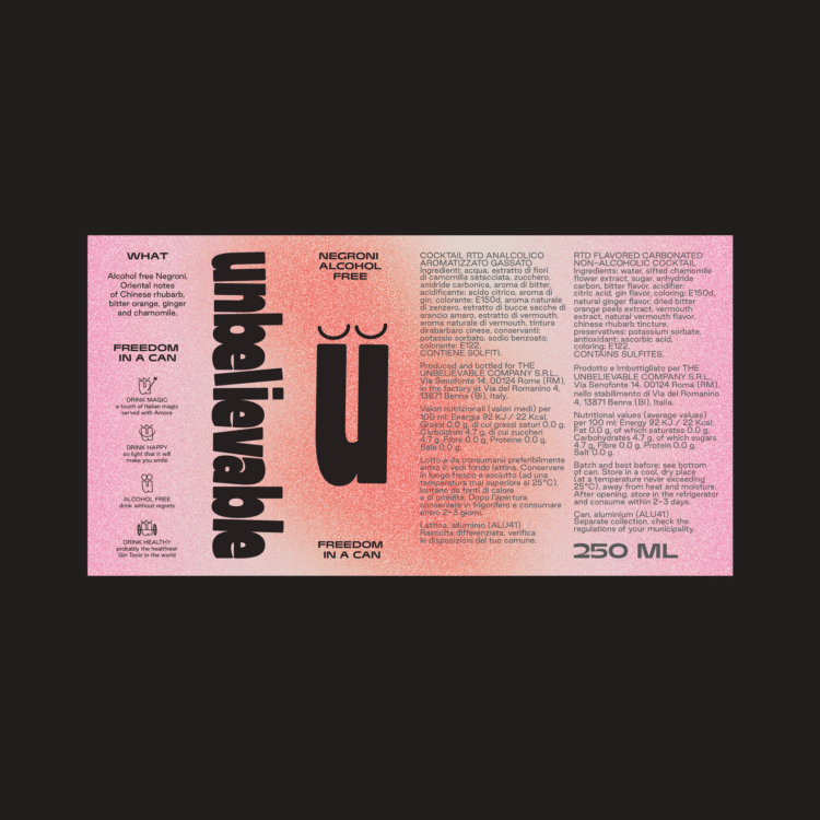
Experimental typography is where letters break free from convention and take on a life of their own. It’s design without a safety net, where creativity is only limited by the designer. The results can be unpredictable, uncomfortable, and often brilliant.
Traditionalists might clutch their pearls, but this is where things get interesting.
Experimental type plays with readability on purpose, turning letters into material rather than something to skim past. Designers treat type like clay, stretching, warping, and reshaping it into forms that demand attention. From subtle distortions to full abstraction, clarity stops being the point. You notice it first, then work it out.


