When someone sees your logo for the first time, they’re not just looking at shapes and colors — they’re experiencing an emotional response, whether they realize it or not. Visual cues like color, shape, and form are powerful triggers for trust, excitement, stability, elegance, or even the opposite. In logo design, these elements are chosen intentionally to shape how people perceive your business. Understanding the psychology of shape and color can help you create a brand identity that connects on a deeper level, making strategic design choices essential.
Let’s take a closer look at how shape and color psychology can influence brand perception — and why strategic design matters.
The Psychology of Shape in Logo Design
Different shapes can communicate different meanings — often at a subconscious level. The forms you choose in your logo design aren’t just a matter of style; they send subtle signals that shape how your audience feels about your brand. Recognizing the psychological impact of shapes helps ensure your logo supports your desired brand identity and resonates with your target audience.
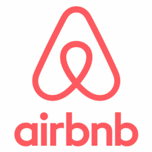
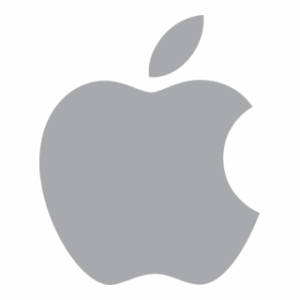
Circles and Curves: Friendly and Approachable
Round shapes — circles, ovals, soft curves — tend to feel:
- welcoming
- inclusive
- human
- harmonious
They can communicate warmth and connection, which is why you often see rounded forms in brands focused on community, collaboration, or customer care. Curves can soften a brand’s tone, making it feel less rigid and more approachable.
Some popular examples include Airbnb, Apple, CVS, Instagram, Reddit, Target, and UnitedHealthcare.

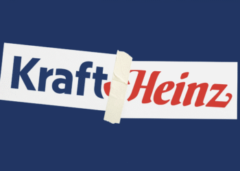
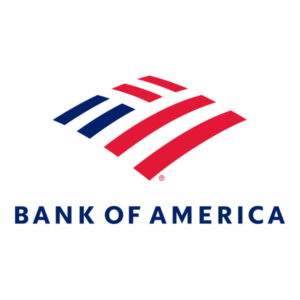
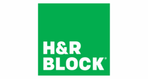
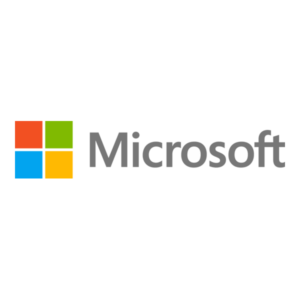
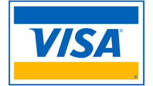
Squares and Rectangles: Strong and Structured
Straight-edged shapes — such as squares and rectangles — often create a sense of:
- strength
- stability
- reliability
- professionalism
They offer structure and organization, which is why they’re commonly used in industries like finance, construction, and the corporate sector. These shapes can communicate confidence — especially when paired with bold typography.
Some popular examples are Bank of America, H&R Block, IBM, Microsoft, and Visa.
![]()
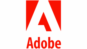
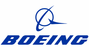
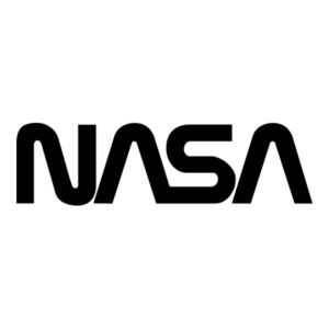
Triangles and Angles: Dynamic and Forward-Thinking
Triangles and angular forms often feel:
- energetic
- innovative
- directional
- progressive
They imply motion and momentum, making them ideal for technology, engineering, or forward-focused brands.
Angles and sharp lines convey energy, innovation, and forward momentum, but if overused, they can feel aggressive or unapproachable. Use them thoughtfully to support your brand’s voice and project confidence without overwhelming your audience.
Some popular examples are Adobe, Boeing, Caterpillar, Delta, and NASA.

![]()
The Psychology of Color in Logo Design
Color is one of the most powerful tools in branding. It can shape perception before a single word is read, impacting how people feel about your business on a subconscious level. The colors you choose for your logo are not only about aesthetics — they communicate specific emotions and values, helping to reinforce your brand identity and connect with your target audience. Here are some of the emotions commonly associated with brand colors:
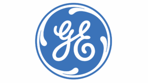
Blue: Trust, Stability, and Professionalism
Blue is one of the most widely used brand colors — especially in corporate and technical fields — because it feels:
- dependable
- intelligent
- calm
- trustworthy
Think banks, insurance companies, healthcare companies, and technology brands. Blue reassures customers that they’re in safe hands.
Some popular examples are Dell and GE.
![]()
Red: Energy, Passion, and Urgency
Red grabs attention immediately. It often communicates:
- excitement
- power
- action
- intensity
It can motivate quick decisions, making it effective for retail, food, and entertainment brands.
Some popular examples are H&M, In-N-Out, McDonalds, Netflix, and Virgin.
![]()

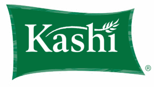
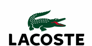
Green: Growth, Balance, and Progress
Green is strongly associated with:
- health
- renewal
- prosperity
- balance
It’s often used in lifestyle, wellness, finance, and brands focused on growth or progress.
Some popular examples are Fidelity Investments, Kashi, Lacoste, and Whole Foods Market.

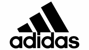
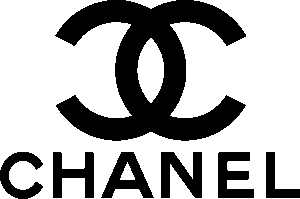
Black and Neutral Tones: Luxury and Sophistication
Black, charcoal, and metallic neutrals often feel:
- premium
- refined
- timeless
- confident
They’re common among high-end, fashion, and boutique brands that want to convey elegance and exclusivity.
Some popular examples are Adidas, Chanel, Louis Vuitton, and Under Armour.
It’s Not Just Color or Shape — It’s the Strategy Behind Them
Strong logo design isn’t about selecting random colors or shapes because they “look nice.”
It’s about aligning visual messaging with:
 who you are
what you stand for
who you’re trying to reach
and how you want to be perceived
When shapes, colors, and typography work together, the result is a brand identity that feels intentional, consistent, and memorable.
Why This Matters for Your Business
Your logo is often your brand’s first handshake.
And the right design choices can help:
- build instant trust
- create emotional connection
- differentiate your brand
- reinforce your positioning
- improve recognition over time
Customers may never say, “I chose them because of the rounded shape and navy blue tone in their logo.” But those elements are quietly influencing how they feel about your business.
Want a Logo That Connects on a Psychological Level?
If you want your brand to make a memorable impression and foster lasting connections, your logo needs to do more than look good — it should be built on the psychology of color, shape, and strategy. Huckleberry Branding specializes in creating strategic, sophisticated brand identities that not only look beautiful but also communicate meaning, confidence, and credibility. If you’re ready to elevate your brand presence, we’d love to help.
The post The Psychology of Logo Design appeared first on Huckleberry Branding.