Arguably London’s street food scene has become less a ‘scene’, more a network of long queues sprawling their way across the capital faster than you can say ‘SEVEN pounds! For some strawberries!’ From Borough to Barbican’s Whitecross Street, Spitalfields to Southbank, Camden to Covent Garden; the menus are global, the prices hefty, the hype palpable, and the branding overwhelmingly forgettable. Sure, people rave over ‘empanadas’, or ‘apple crumble’ in the case of countless Americans seeking out some authentically bland, hot, stodgy English fare. But I’ve yet to hear people cite an actual brand.
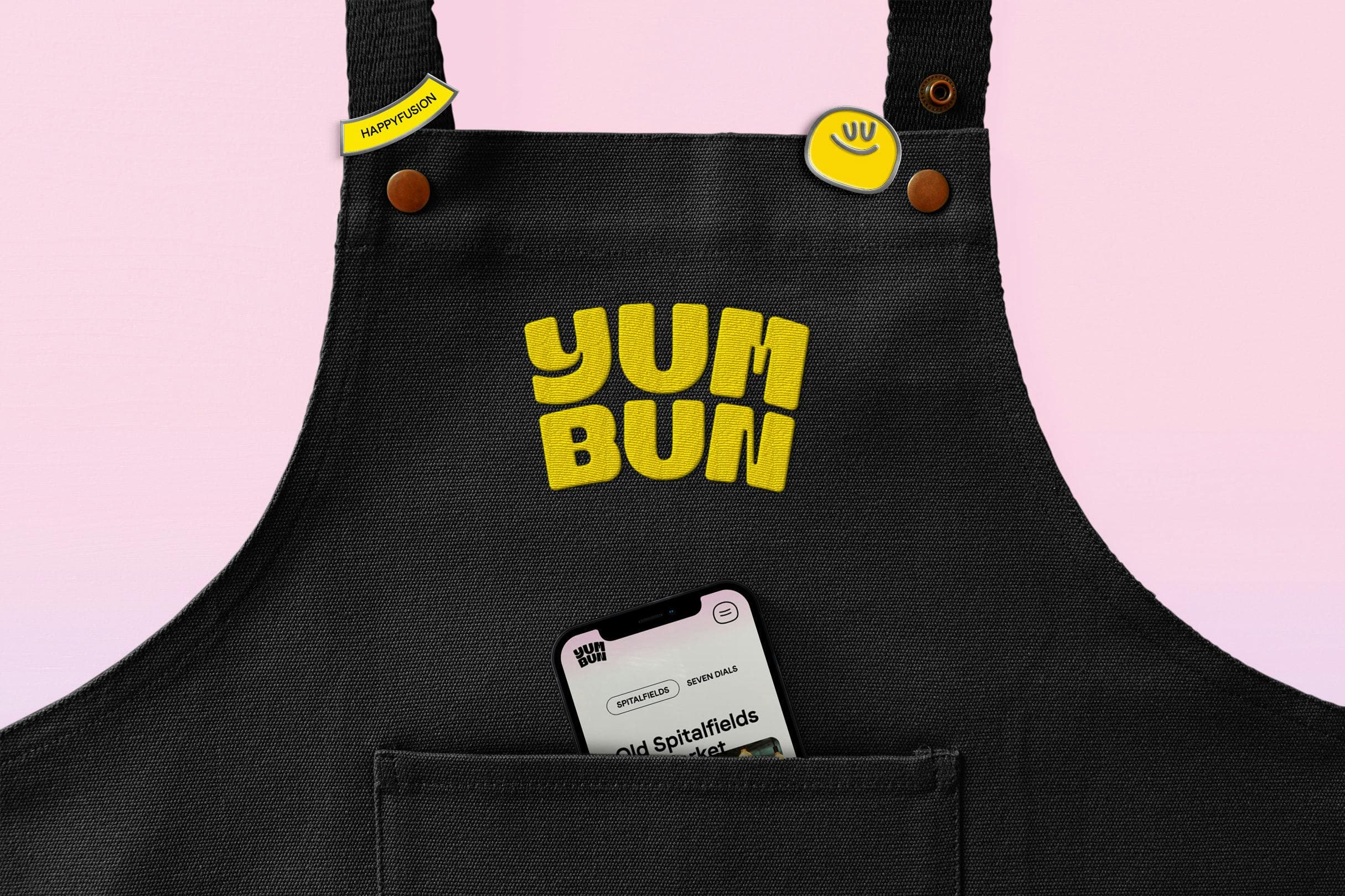
Perhaps thanks to this design overhaul by How&How (Chester Zoo & Hometree), Yum Bun is set to change all that. Established in 2014 by Lisa Meyer-Jones as a humble food truck, Yum Bun was one of London’s first street food traders to focus exclusively on bao, the East Asian, dumpling-esque uniquely pillowy little parcels of hotter-than-the-sun joy. It soon evolved into a pop-up before becoming a fixture at street food big-guns like Old Spitalfields Market in East London and Covent Gardens’ Seven Dials Market.
Its evolution into a more mature, London-wide entity meant that Yum Bun’s branding also needed to evolve – become a wee bit more grown up, future-facing, and slick. However, that doesn’t mean it’s bereft of fun: this work is weird in all the right places; defiantly optimistic; playful and bubbly but never at the cost of underscoring the brand’s heritage as a high quality, bao OG with some serious heritage in the capital.
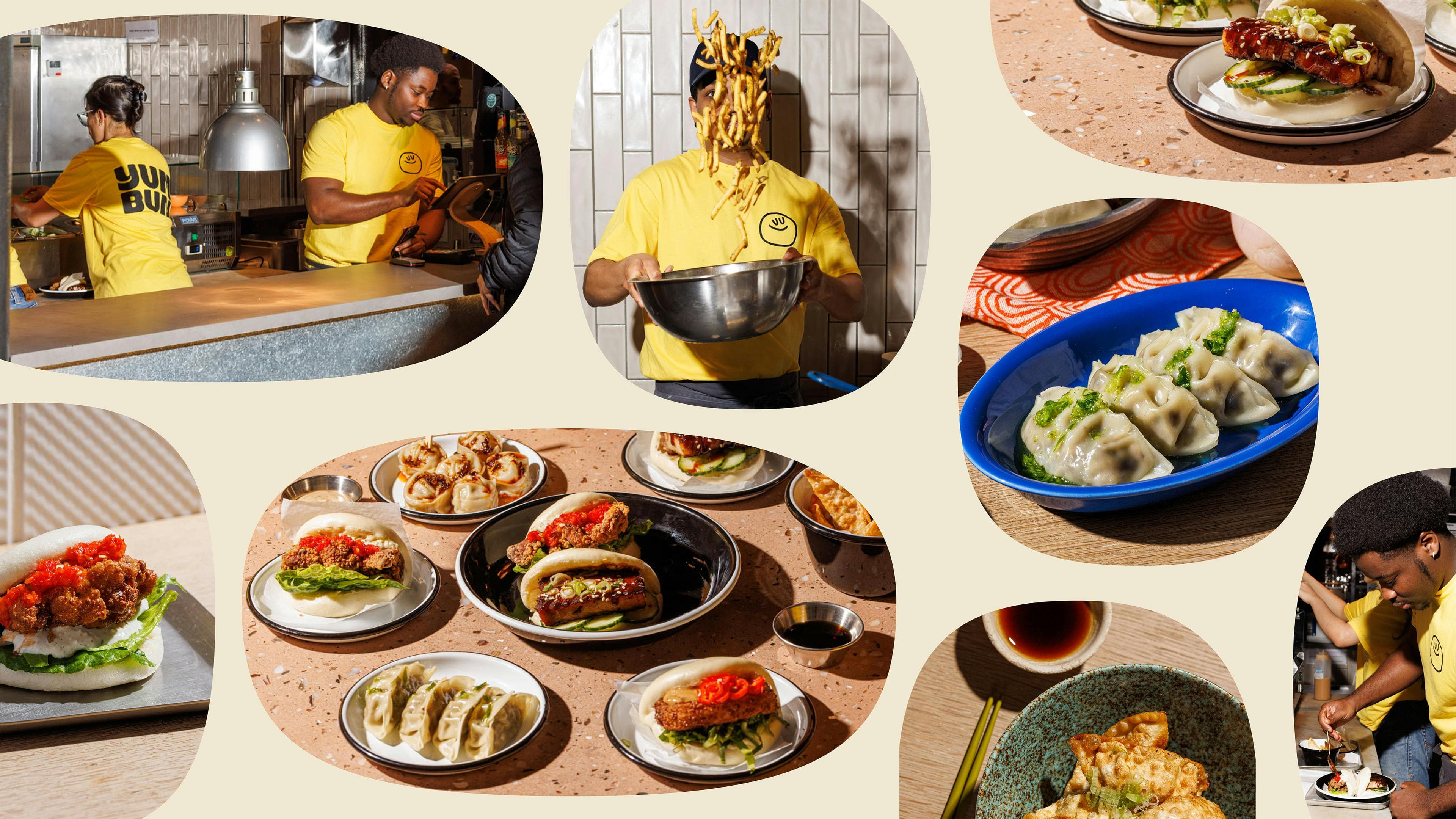
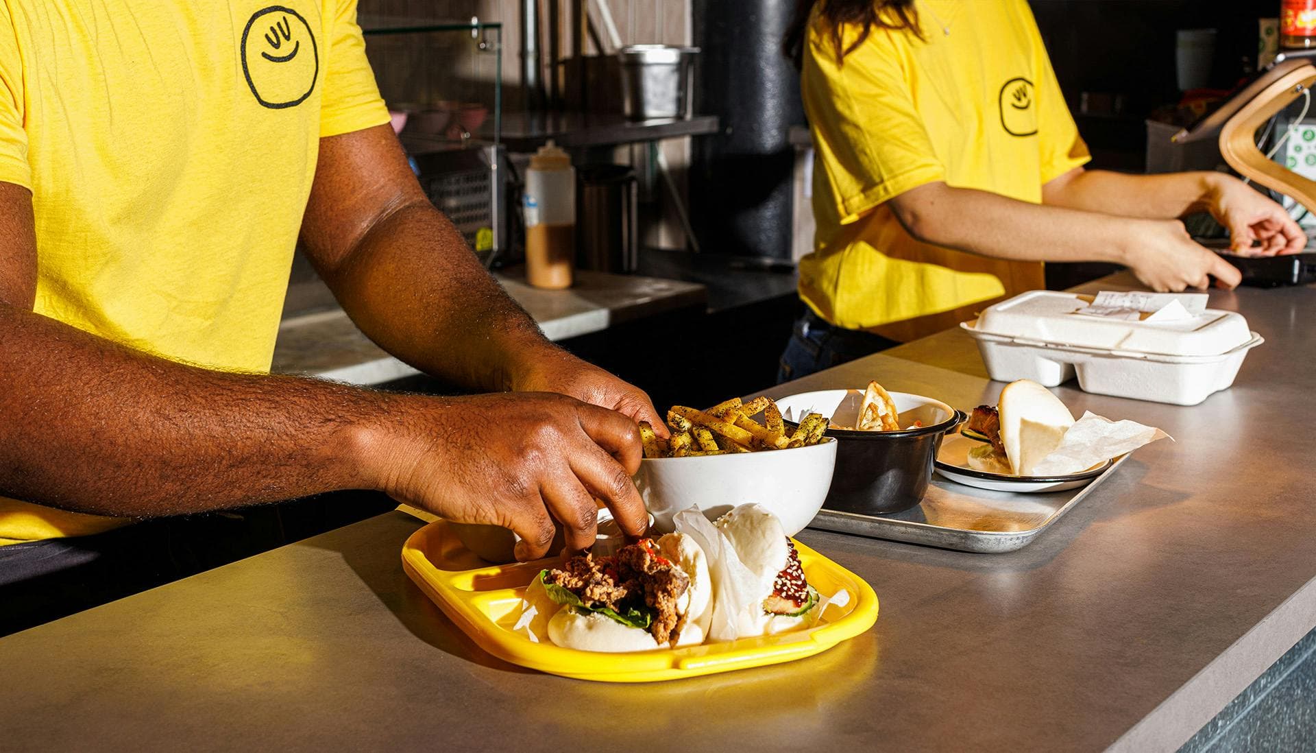
How&How landed on the creative concept Bounce and Rise as the strategic grounding for the entire brand concept and visual identity. This simple but iconic word-duo succinctly sums up Yum Bun in countless ways: it describes what it sells (fluffy, joyful, light, fluffy), how it approaches food (comforting, feel good), its attitude (cheeky, innovative, always optimistic), and its forward-thinking, business-savvy outlook.
The project is a masterclass in brevity at its best. First that concept, then the logo: it literally beams at you, articulating pretty much everything suggested by Bounce and Rise in a singular graphic masterstroke. ‘The new logo riffs off Japanese Hanko stamps with an added sunrise aperture, to mimic Yum Bun’s fusion of Japanese craft and optimistic belly-rubbing warmth’, Cat How, studio founder explains.
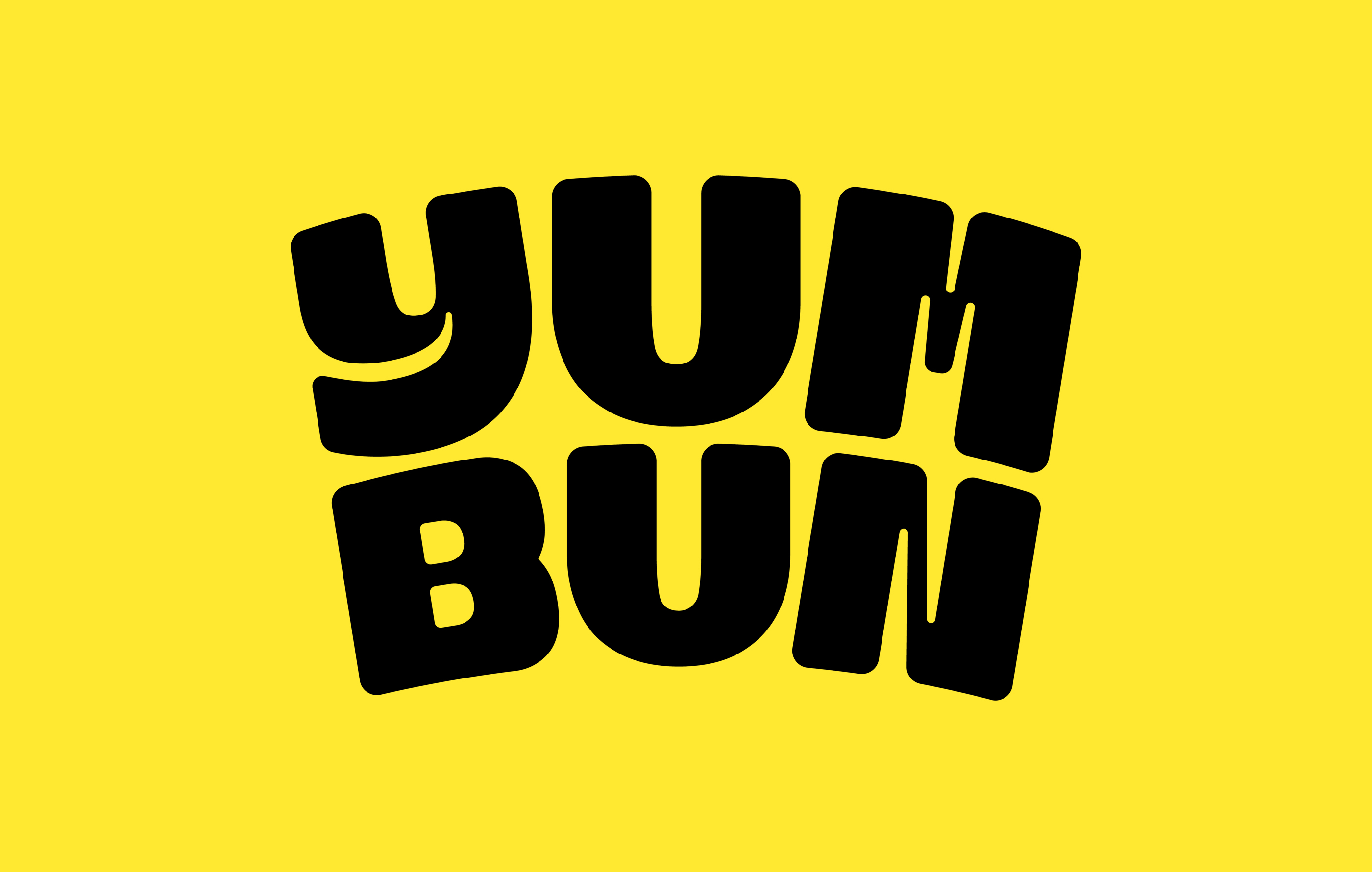
‘We also created typography formats to reflect different sights and sounds of the kitchen, such as “Steamy”; “Sizzling”; and “Goodness”.’ The sumptuous new wordmark was developed from the bombastic experimental all-caps font Ogre Mono Grotesk by Brazil’s Leme Studio. Its round, bold forms evoke the buns it represents, while subtle refinements like the rising arch (a clear nod to both Hanko stamps and the sun itself) convey optimism without veering into cliché. The ‘Y’ even gives us a little smile. There are moments of fragility in the thinner joints of the ‘Y’, ‘M’ and ‘N’, but overall, the logo’s energy holds. It’s punchy and precise, with enough visual warmth to remain inviting.
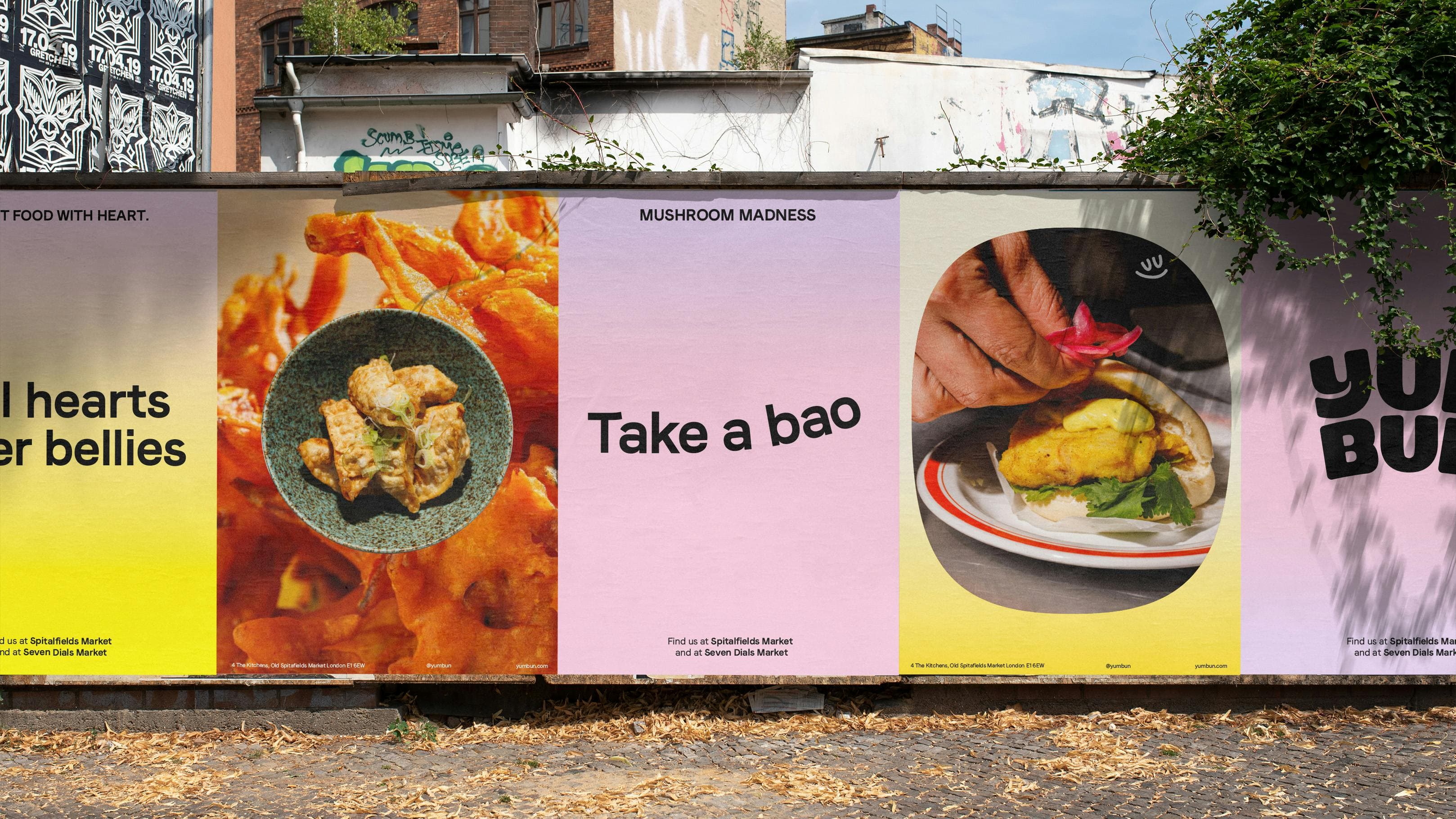
How&How’s choice of secondary fonts is also very smart indeed. The studio opted for Faro by Swiss foundry Luzi Type – a sans serif font with not just different weights, but different emotions. ‘Faro encompasses two distinct moods: Lucky and Sad, allowing you to convey different sentiments in your texts’, the foundry explains. Both are used as supporting fonts for Yum Bun, keeping things simple but just a twinge off-kilter in a way that adds layers of expression without slipping into caricature. Within Faro, there’s much that chimes with the overarching brand concept: smiling counters in the lowercase ‘a’, playful flicks in the ‘G’, and buoyant arms on the ‘T’ and ‘F’ lend a distinct personality.
While personality is certainly never lacking across pretty much all Yum Bun’s brand assets, with something this fun it’s great to see a mascot deployed with such confidence. We’re seeing a bit of a recent resurgence in mascotry – rescuing these oft-maligned creatures from the doldrums of lazy kids’ brands and outdatedness and showing that when done well, characters have a very powerful place in a brand identity, grown-ups be damned. Just look at Wildish & Co’s charming work for seemingly pedestal home services in the shape of Ding.
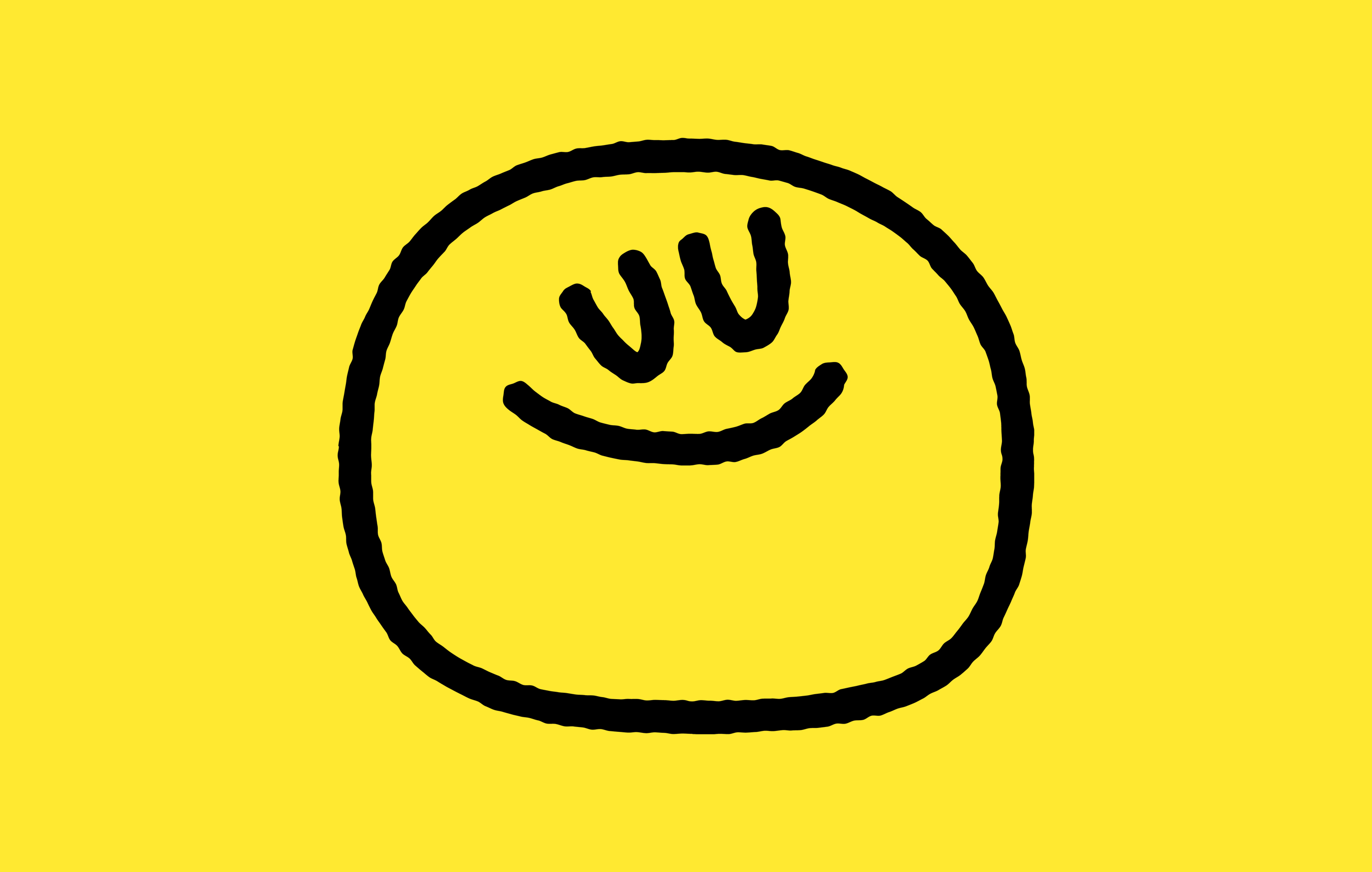
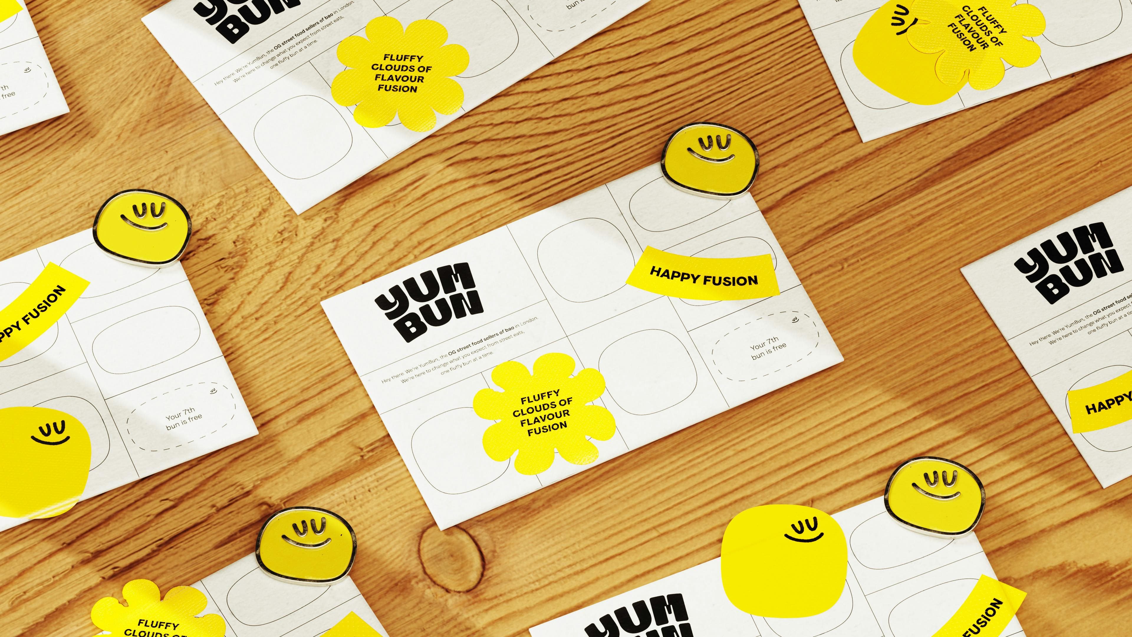
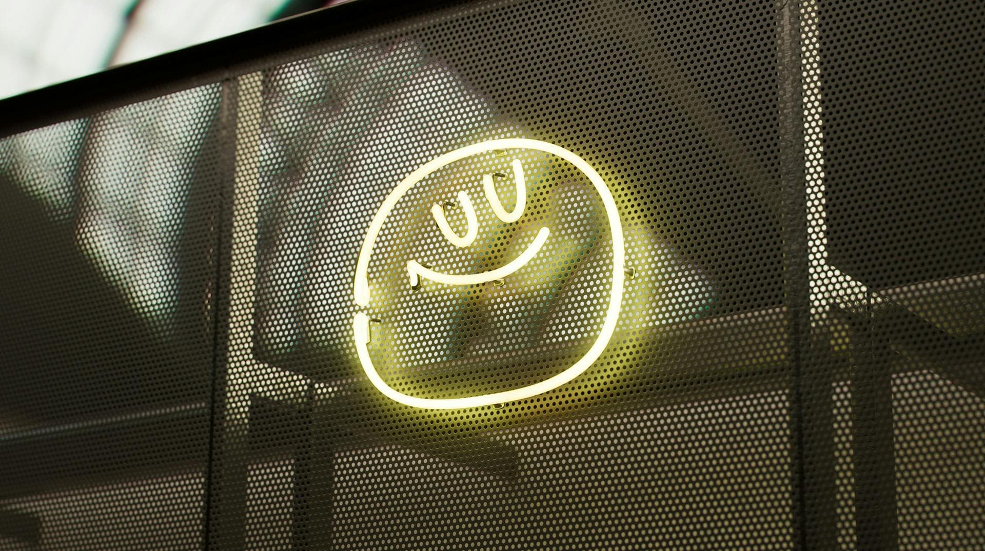
Yum Bun’s mascot is, as anyone could have guessed, very fucking smiley. Unofficially christened ‘Bao’ in the absence of formal naming, he’s round, cheerful, and ever-so-slightly dazed (as though in a food coma, rather than anything to do with Xanax). ‘The signature brand bao goes full-blown fluffy friend’, as How puts it.
Crucially, and we’ll come to this again in a bit – he’s deployed with restraint. As big and bold and cheery as he is, Bao never dominates. Like all the cleverest people/entities, he isn’t always making himself known, but when he does, he really brings it. Bao’s appearances are sparing, wise: he adds emotional texture rather than blithely bellowing good cheer to anyone in earshot.
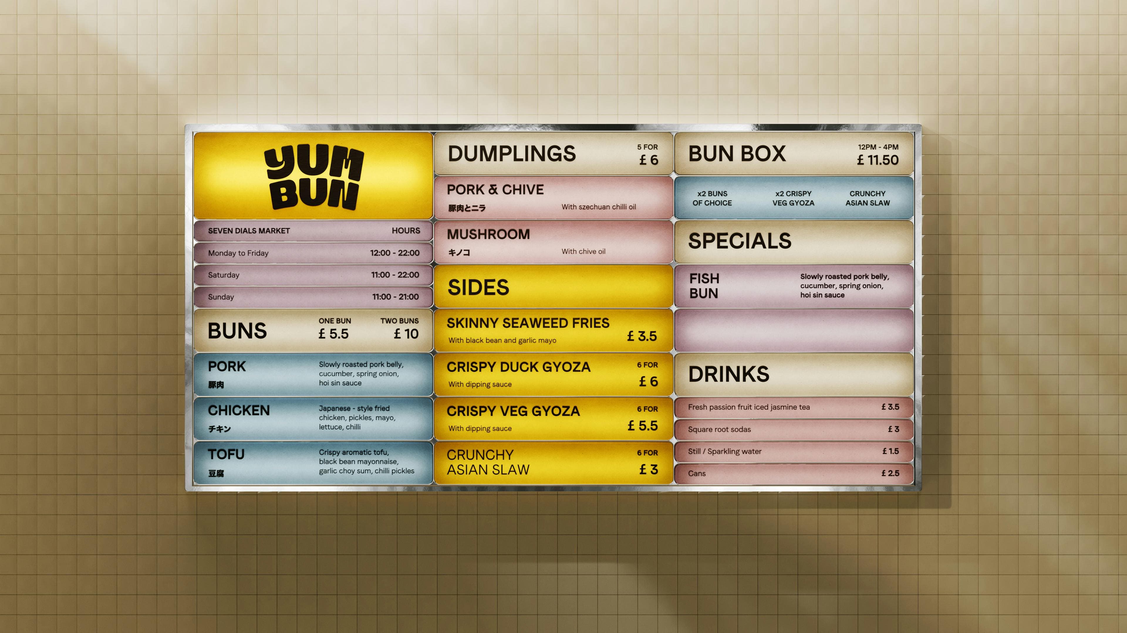
The colour palette leans into warmth, with sunrise oranges, yolky yellows, and calming pinks that echo the comfort-food-meets-craft ethos; while animation and motion design bring the ‘Bounce and Rise’ strategy to life. Online, text steams into focus, wafting across the screen with playful lines like ‘Take a bao’ and ‘We rise to the challenge’ and in doing so, proving that food puns, when well-timed, still have legs.
But back to that restraint. Despite the puns, How&How has demonstrated here that holding back doesn’t mean playing it safe, or keeping things straight laced: it shows that the real fun is in knowing what to big up and what to pare back.
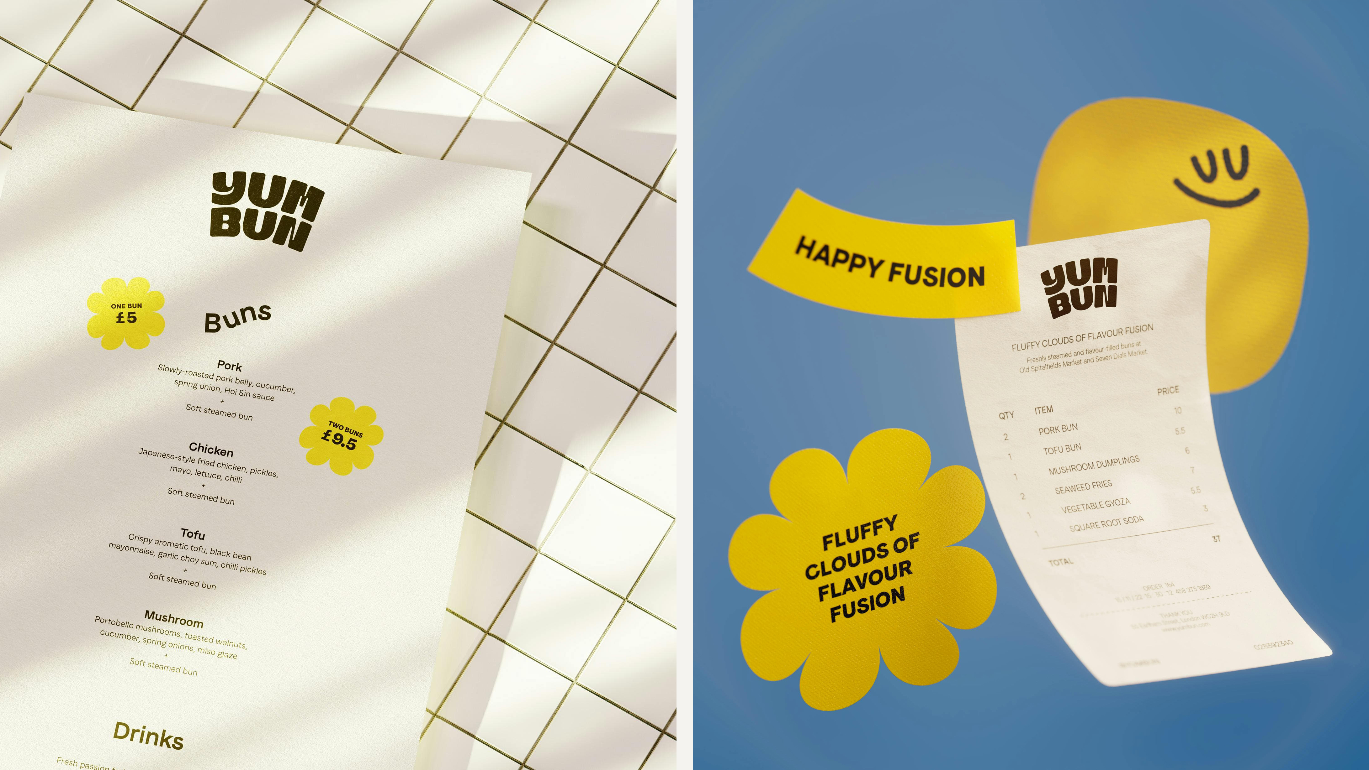
In lesser hands, this brand could have toppled into wince-inducing ‘trend blog’ territory: the gradients! The mascot! SO INSTAGRAMMABLE. But Yum Bun’s new look could never be seen to be fashion-following, try-hard, or clichéd. The tone of voice is cheeky but not cringey. The motion design is engaging without being frenetic. The mascot adds charm without infantilising the brand. How&How has shown a level of design maturity that keeps things buoyant rather than bombastic, but which is never, ever, afraid to have a good time.


