The social and cultural activity of sharing stories has been, and continues to be, an essential part of the human experience. Storytelling has contributed to the cohesion of, and sometimes control over, individuals and groups, preserving and passing on knowledge, and instilling moral values. Many of us live by (some challenging) the values and knowledge established over thousands of years through stories. We also, with improvisation and/or embellishment, use them to entertain.
The spaces in which we congregate are important points of exchange and shape the nature of the stories themselves. The gossip round the water-cooler at work, tall tails at the pub, a tet-a-te at a cafe. The restaurant adds a temporal and theatrical dimension; the rhythm of new courses, the structure of chairs and tables, the props, presentation and clearing of plates, the character of the space and the tone of the hosts.
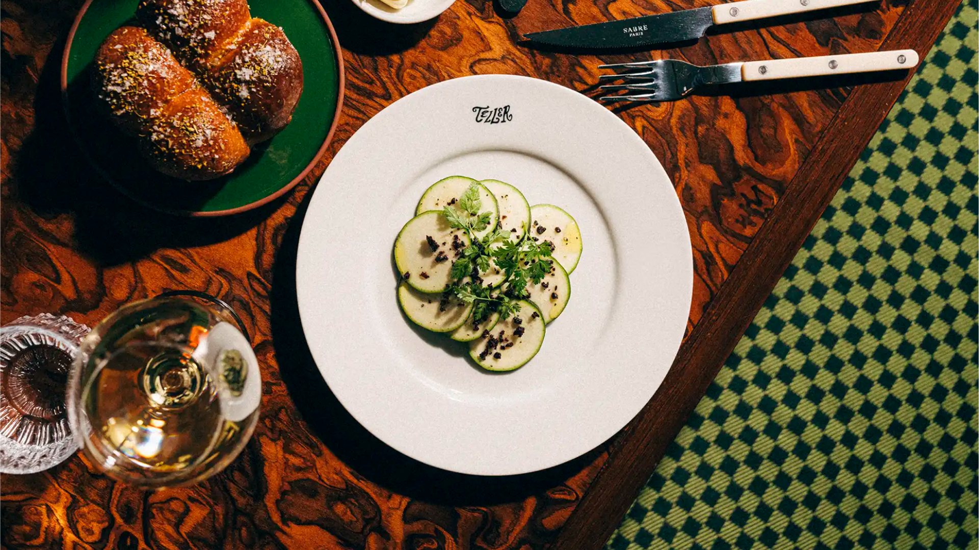
Teller, a restaurant in Helsinki’s ‘slightly sleepy’ neighbourhood of Töölö (the story begins!), is well aware of this, and has made it a central premise. Their intention is to transform dining into storytelling, to bring all the “imaginable tidings of comfort and joy to its diners and winers.” Werklig (Sitko, Pirkkalan & Helsinki), responsible for developing the visual identity for Teller, pushes this further with the embellishment of a ‘magical realism’; a sprinkling of supernatural added to the realism of food.
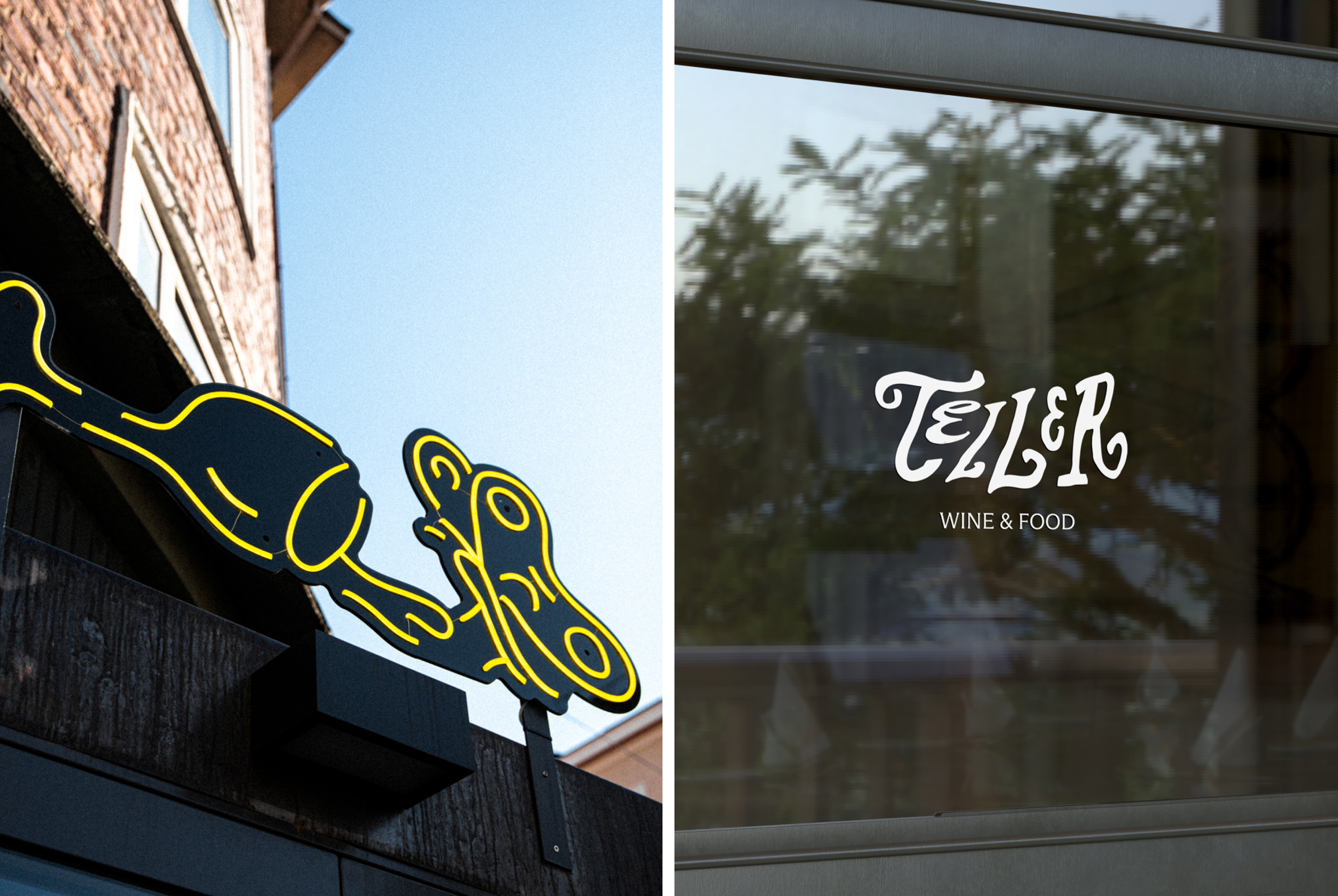
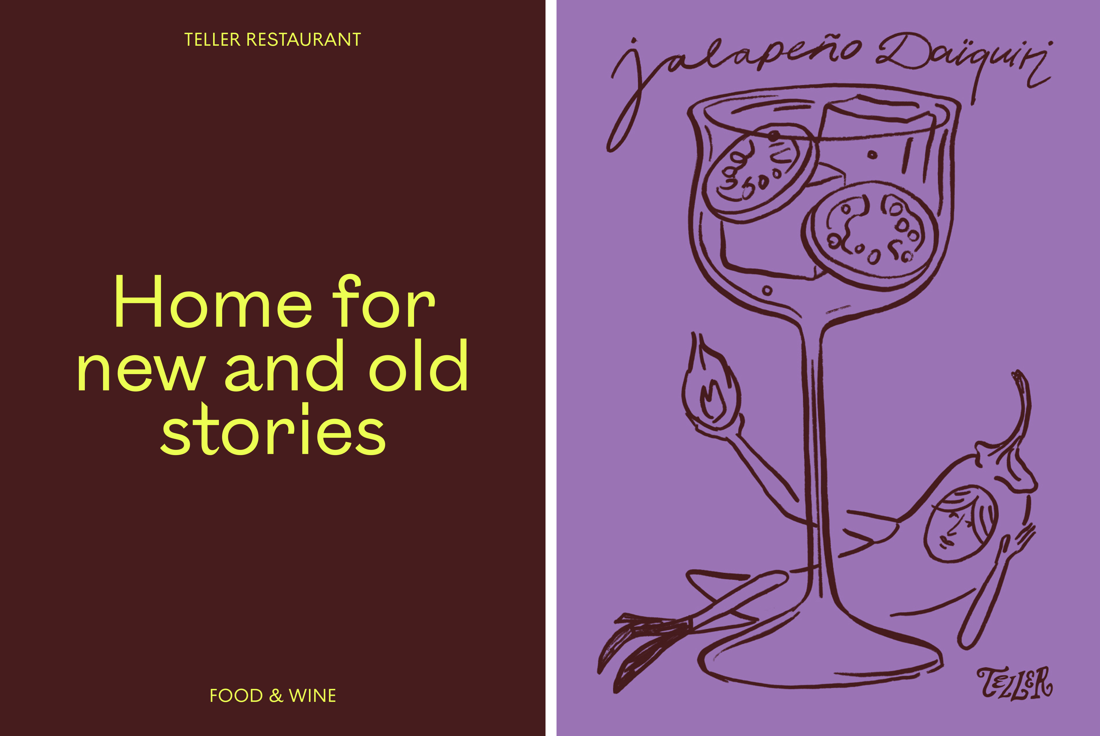
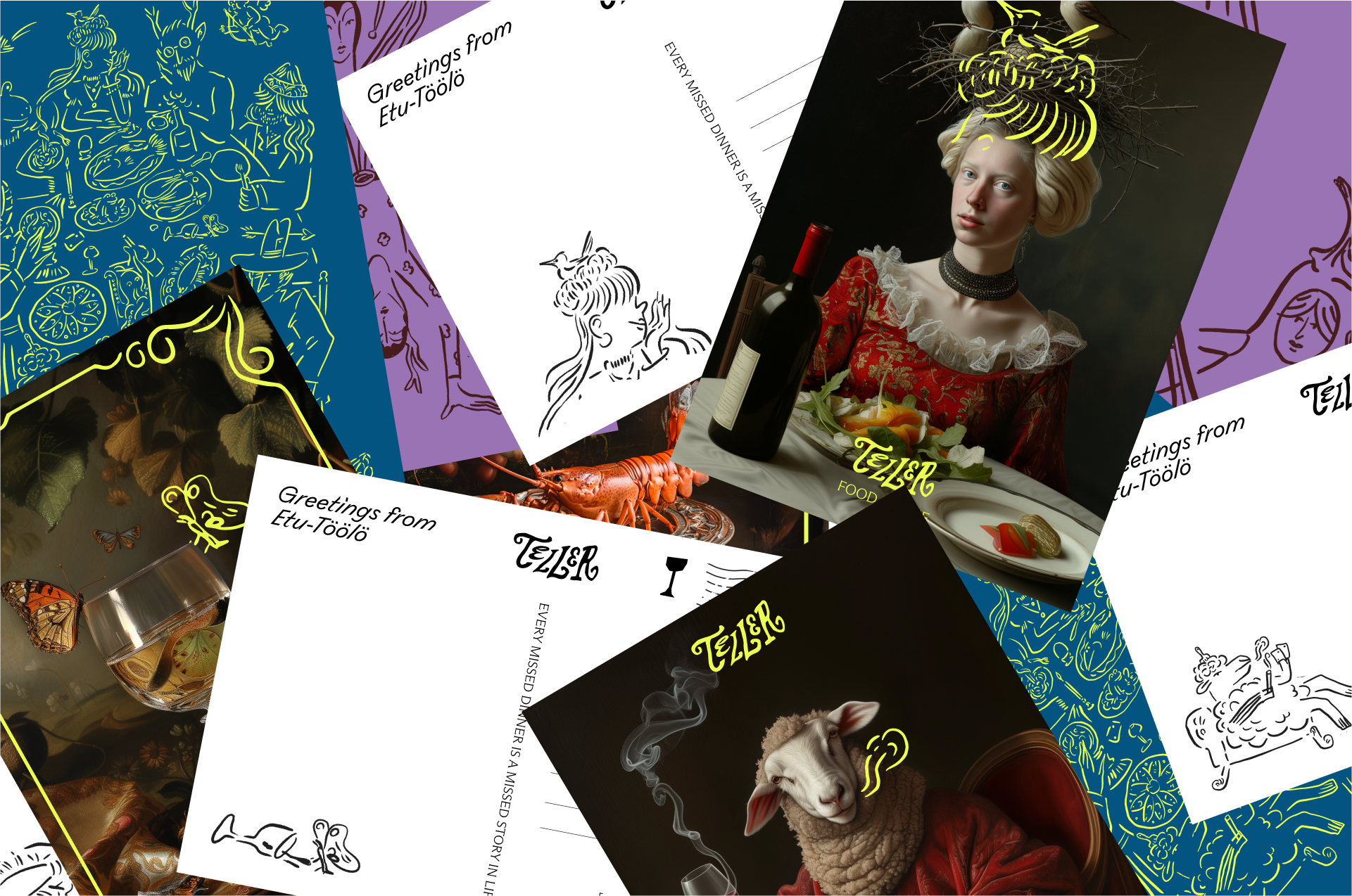
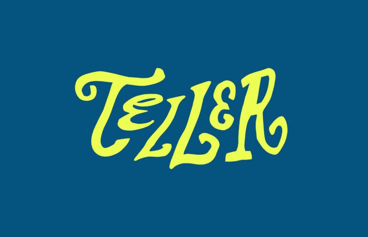
Werklig’s approach appears intentionally loosing defined, full of subtle motifs, playful elements that impinge on material reality. The notion of the unreliable (perhaps slightly intoxicated) narrator comes to mind. This begins with the quirky character and irregular lines of the logotype, which feels like it is moments away from collapsing, falling from reality into complete fiction, or blown away by the hot air of an enthusiastic orator. And extends to the illustration of the butterfly (placed over the entrance offering up the suggestion of the fantastical space that exists within). Fantasy is conjured up by characters that site around the table and used to breath life into tote bags, website and social media. These illustrations, not only bring to visual life the idea of stories spoken, but are also a nod to the history of Töölö as a colony of artists.
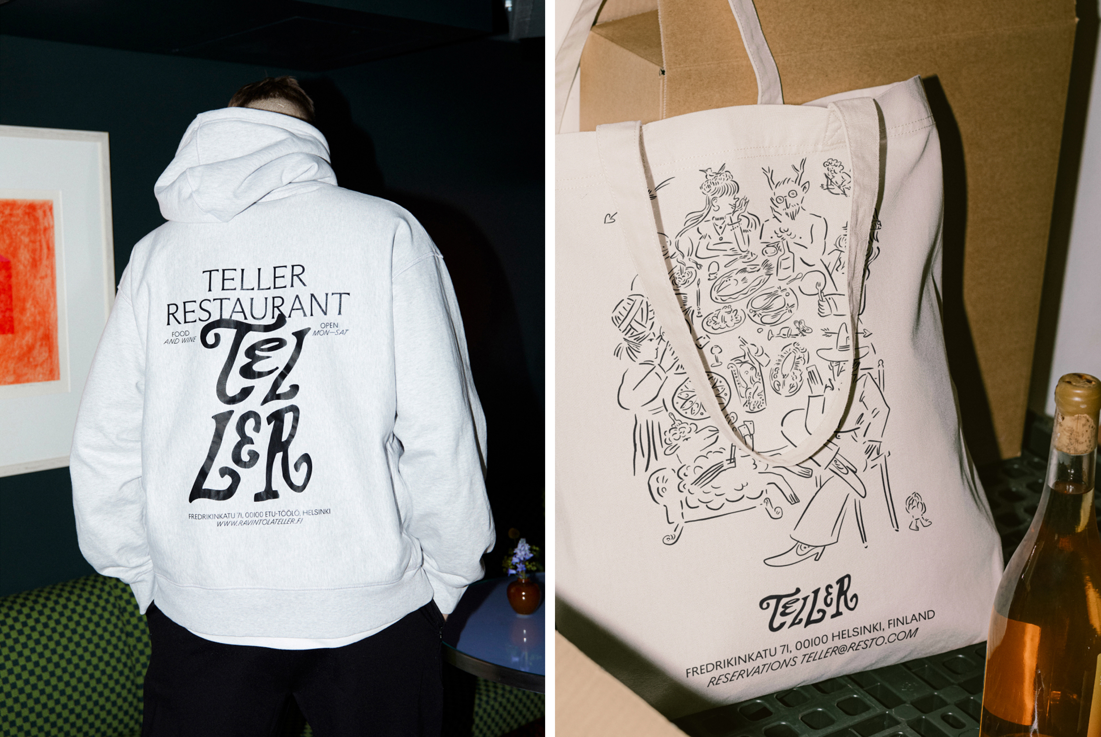
Just like the logotype, the illustrative style is loose. They appear as though they could dissolve as quickly as they were made to appear in the mind. Existing only for the length of a meal, itself an ephemeral experience that must be grasped and enjoyed in the moment, for it will soon only exist within the mind, and take on a haziness, a memory of a memory, taking on mythic proportions, or forgotten. The typeface Arizona Flair adds moments of structure, while Ostia Antica Italic plays with the space between type and illustration.
Solid block colour silhouettes of produce add a touch more range. This colour also skirts boundaries of expectation, a little wilder than you might expect, not replicating the experience but offering more of a ‘vibe’ ahead of a visit. The ‘dining and storytelling’ concept is made explicit in copy, defining courses as ‘the full story’ ‘opening chapter’ ‘the plot’, ‘the main act’, ‘side quests’ and ‘sweet endings’, which it just about gets away with thanks to the general look and feel of the website.
There’s lots to like in here. The creative concept of magical realism is wonderfully overlaid on top of the more formal aspects of the dining experience, and tied to the artistic nature of the area the restaurant sits within. A realm of imagination conjured up by the guests as they eat. It’s a nice idea, realised with whimsy and skill, balanced throughout.
