

ITO Gin is first and foremost, brilliantly eyecatching – huge fluorescent letters, the epitome of ‘make it big’ when it comes to a brand name; deep black bottles – behind this bold exterior lies a narrative woven across cultures, histories, and generations.
The brand was born of a collaboration between Komaki Distillery in Japan and UK-based gin brand Kokoro. However, according to Leeds-based studio Analogue, the ethos that anchors the entire brand was inspired by the life and legacy of CW Nicol, a Welsh-born environmentalist, author, and storyteller who spent over 50 years in Japan – namely drawing on his ideas of human connection, cultural lineage, and craft.
Nicol dedicated his life to forest conservation, authoring over 400 books that explored nature, society, and local histories. He bridged Japan and Wales, cultivating human and cultural connections that resonate in every element of ITO Gin. This is hinted at in the name itself: ‘ITO’, meaning ‘thread’, symbolises the bonds between people and across cultures, echoing Nicol’s lifelong efforts to connect Wales and Japan.

The collaboration behind ITO Gin began in 2019, when the seed was planted at a gathering in the Afan Forest in Wales, hosted by Nicol himself. The project matured over several years, with Analogue starting work on the label design in 2023. The gin launched in Japan in 2024, but is yet to launch in the UK. ‘The brief was fairly open-ended’, says Analogue creative director Barry Sutherland. ‘We helped with the blend, the liquid, the naming and all the design. The main goal was to make a brand that would work both domestically in Japan and for overseas markets too.’
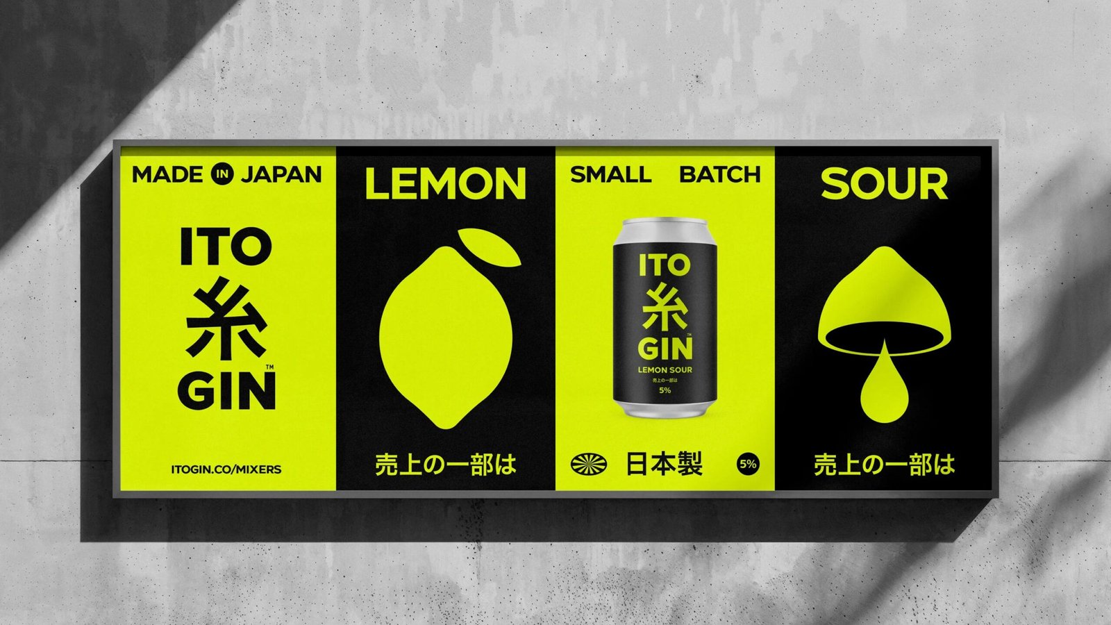
The solution was simplicity married with impact: minimalist branding; confident typography; high-contrast colours; and chiming with that focus on forging a visual language that’s legible in both English and Japanese, a peppering of pictogram-like icons that strive to be universally recognisable.
That notion of an identity that has a sort of dual nationality comes to life in the typographic choices. Analogue opted to use Giga-Sans Bold, designed by Arwan Sutanto and published by Locomotype, for the brand’s Roman characters – a neat, modern feeling geometric sans serif that gives the whole thing a sense of understated confidence. For Japanese characters, ヒラギノ角ゴ StdN W6 (also known as Hiragino Kaku Gothic) is used as a nice balance to its Giga-Sans Roman counterparts. Both prioritise clarity, eschew fussiness and make an impact; ITO is a clear departure from the traditionally more ornate packaging that often typifies Japanese spirits packaging.
![]()


The brevity of the brand name and its pairing of two three letter words, ITO and GIN, means it lends itself beautifully to ‘I <3 NY’ style stacking when it comes to the wordmark. And as Sutherland points out, both words can be understood in Japanese and English. He continues, ‘On the back labels it was a case of having both translations so the bottles can be exported to the UK without the need for additional labels.’ It’s a solution that underscores Analogue’s precision in marrying aesthetic restraint with practical communication.
The orange and black colour palette was inspired by the Satsuma region surrounding the Komaki Distillery; while on a more physical, practical level, gloss UV detailing adds a nice sense of tactility while allowing the fluorescent orange to pop against the deep black background. The type system is pared back but powerful, reflecting the gin itself – fragrant and delicate but packaging a 48% ABV punch. The typography mirrors that precision in its marriage of a structured system but with room for something a little more expressive, bridging kanji and Roman scripts with surprising ease.


Aside from the lettering, there’s very little here in the way of decoration. Everything has a purpose: there are no illustrations, but that suite of icons serves the dual purpose of communication and adding visual flair within the rigid constraints of their pared back geometric linework. Each of these icons has a meaning beyond simple symbolism, sometimes a nod to the brand’s inspiration, CW Nicol. A tree represents the Afan Woodlands established by Nicol, while a volcano references the active peak overlooking the ITO distillery in Kagoshima.
![]()
![]()
The icons work alongside all the other equally minimalist-leaning brand elements – the typography, the black and orange, the tactile 3D packaging – to form an elegant visual storytelling system that looks great while constantly reinforcing the brand’s ties to its region and heritage, translating complex ideas into instantly recognisable symbols. There’s a notable visual restraint throughout the entire brand, positioning ITO as a modern alternative to heritage spirits: it’s all about utility but boldness; craft but modernity – it’s very much aligned with the new cues of luxury coming to the fore when it comes to categories like spirits and beauty.
Analogue’s backstory for ITO Gin positions the bottle as a vessel for CW Nicol’s environmental and cultural ethos, and while every detail from inks to fonts has clearly been considered in light of this, the storytelling isn’t obvious without explanation. The connection between Wales and Japan, or Nicol’s wider legacy, feels more asserted than truly legible in the design itself. But perhaps that doesn’t really matter: ITO Gin stands out for its immediacy and its willingness to break with category norms. It may not fully deliver the layered narrative Analogue suggests, but most gin-buyers probably wouldn’t be too fussed about that anyway: as a piece of spirits branding it’s ambitious, memorable, sophisticated and undeniably striking.


