When it comes to brand design, of all the sectors, mobile networks seem to play it pretty safe: functional, practical, all in all, pretty dry – or at the very least, unadventurous.
Some are better than others, of course: I for one think that Giff Gaff’s wordmark is actually alright – I’m far from opposed to the quirk in joining the vowels to the double ‘f’. EE? Less good – feels like something of a turquoise and yellow afterthought. But spare a thought for poor old Vodafone, soldiering on with a look and feel that’s all rather dated; to put it kindly, it looks like something your aunty whipped up with a little help from 99Designs.
So it’s very refreshing when a project comes along that demonstrates that no, it doesn’t have to be this way. Turns out there can be a smidgen of playfulness, a touch of whimsy, a little bit of – dare I say it – fun in the otherwise jargon-packed, functional, infinite small-print-terms-and-conditions world of mobile networks and their brand design.
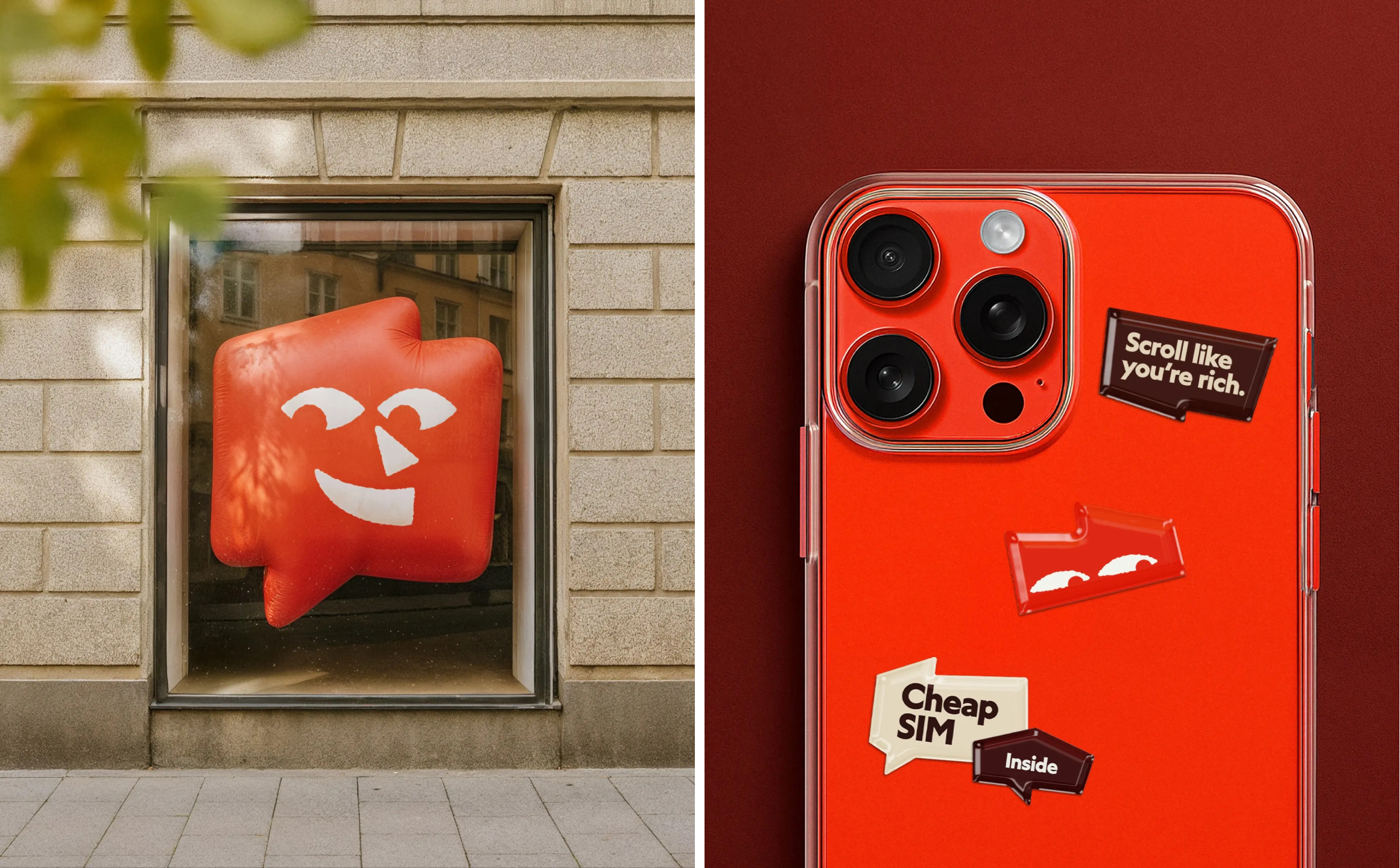
Said project is the identity for Swedish mobile carrier Fello by Bold Scandinavia (Bold for short), which has offices in Stockholm, Copenhagen and Oslo – a slick but cute identity that marries no-frills simplicity with bags of character (literally, it centres a character/mascot).
According to Bold (Qasa, Pressbyrån, The Swedish History Museum), Fello is “one of Sweden’s most trusted low-cost mobile carriers… Built on the belief that mobile services shouldn’t be overly complicated or expensive”. It continues, “Fello has grown by staying true to its roots: clear pricing, honest communication, and a focus on customer care grounded in no-nonsense simplicity.”
Fello was founded in 2013, and approached Bold for the recent brand refresh in a bid to strengthen how the brand “shows up across Sweden’s competitive telecom landscape,” according to the agency. That meant creating a new identity that would sharpen Fello’s recognition, unify its visual language, and finally “ensure that their friendly, down-to-earth character carried through every touchpoint in a way that’s consistent and easy to work with,” Bold adds.
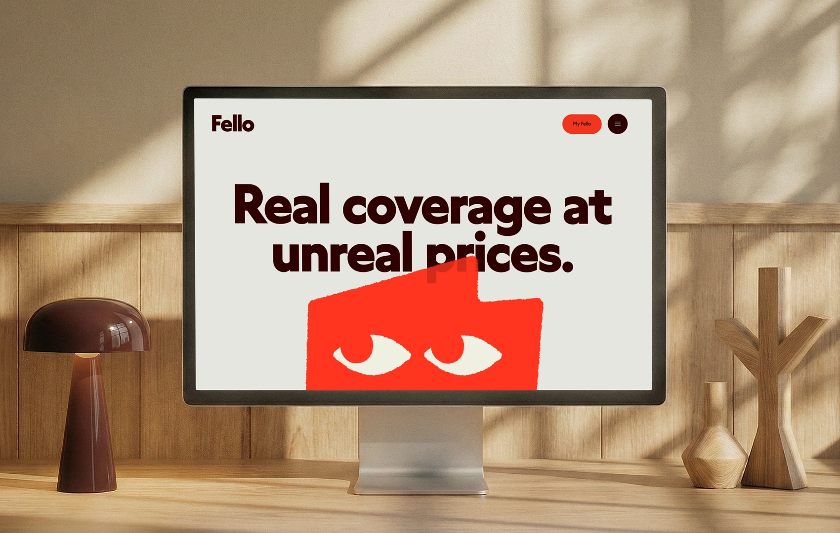
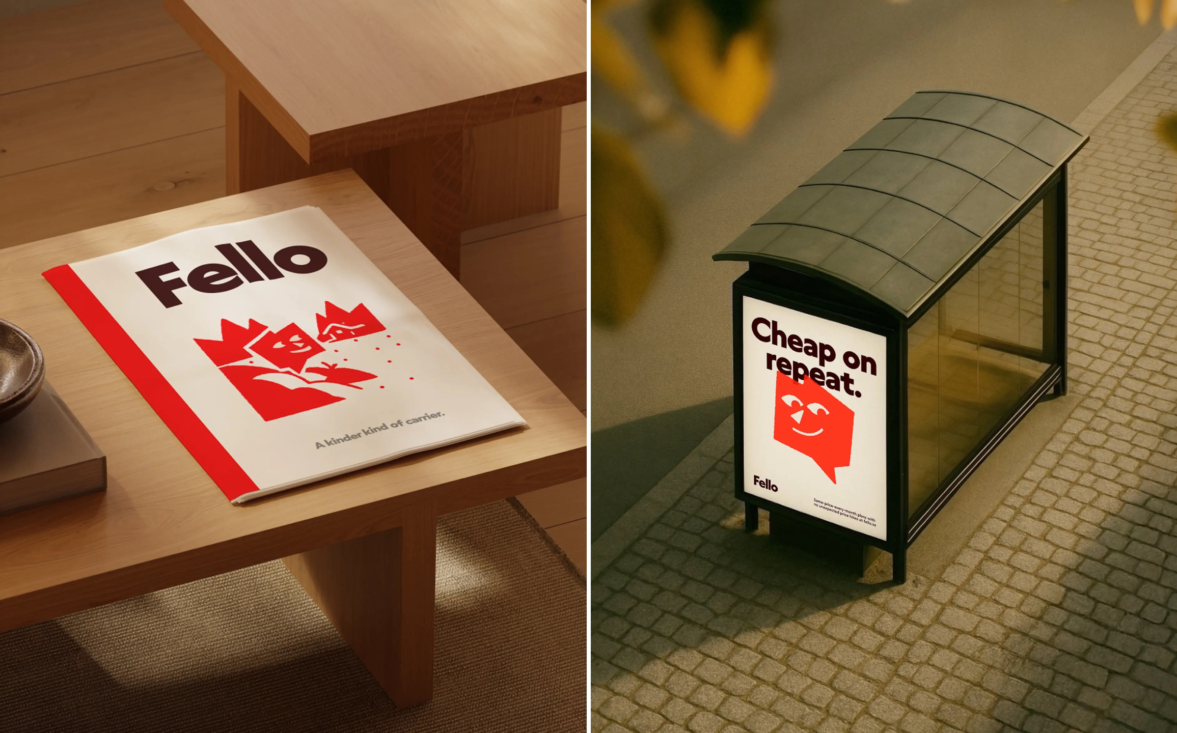
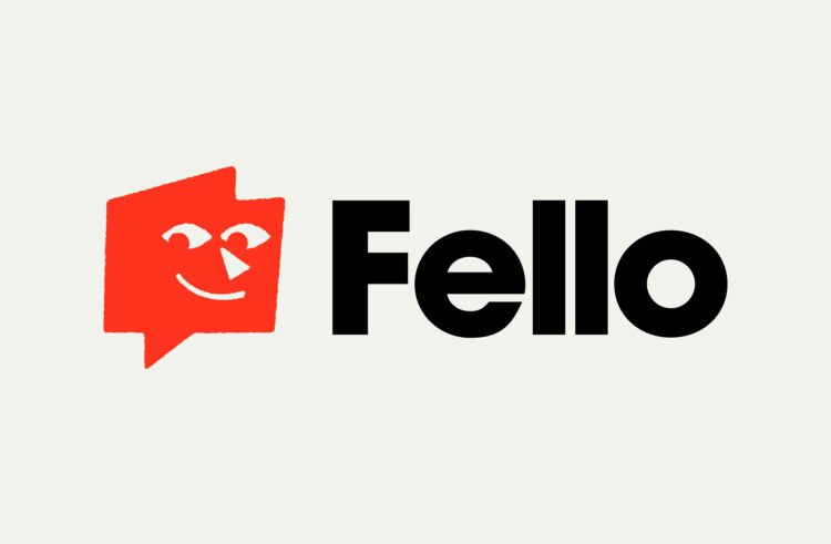
At the heart of the new branding is the aforementioned mascot – after all, with a name like Fello, it would seem almost churlish not to make a little, well, fellow the posterboy of the network. The character is naturally called Fello, and he’s a cute but hardworking wee chap; shapeshifting across any and all applications big and small – from static print in posters and stationery to dynamic motion design such as on the new website.
In some configurations – namely when it’s just a pair of eyes embedded into a triangular shape – the mascot looks a hell of a lot like the Dice logo. I’m not suggesting in any way that there’s been a cheeky bit of copying here, just that perhaps they’re cousins or something – it’s not just the shape that’s similar, but the slightly side-eye-ish expression.
However, that doesn’t in any way take away from the quality and deftness of hand here: after all, you can’t copyright eyes. And it fits so perfectly into the overall graphic system, serving as – as Bold puts it – “a chatty, straight-talking little character [that] acts as a short-hand to the entire brand experience.”
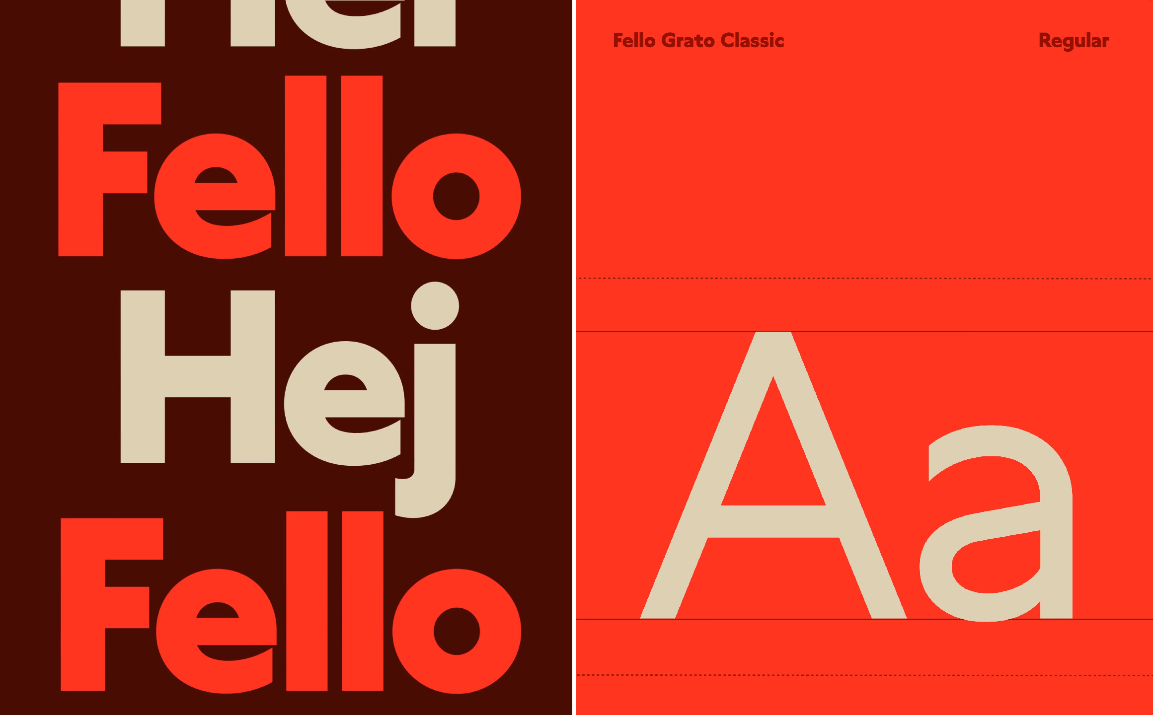
The other main agent shaping that graphic system is the use of a single font – one created specifically for the brand, dubbed Fello Grato Classic. It seems to be a riff on the Grato Classic family designed by Jakob Runge for German foundry TypeMates, a humanist geometric font that perfectly combines legibility and an adorable friendliness that owes a lot to the almost perfect circles of the letterforms’ counters. It’s round and sweet and lovely, but crucially, still absolutely functional and hardworking. In short, a great choice for a brand font that flexes across wordmark, headlines, and longer copy with just a shift in weight.
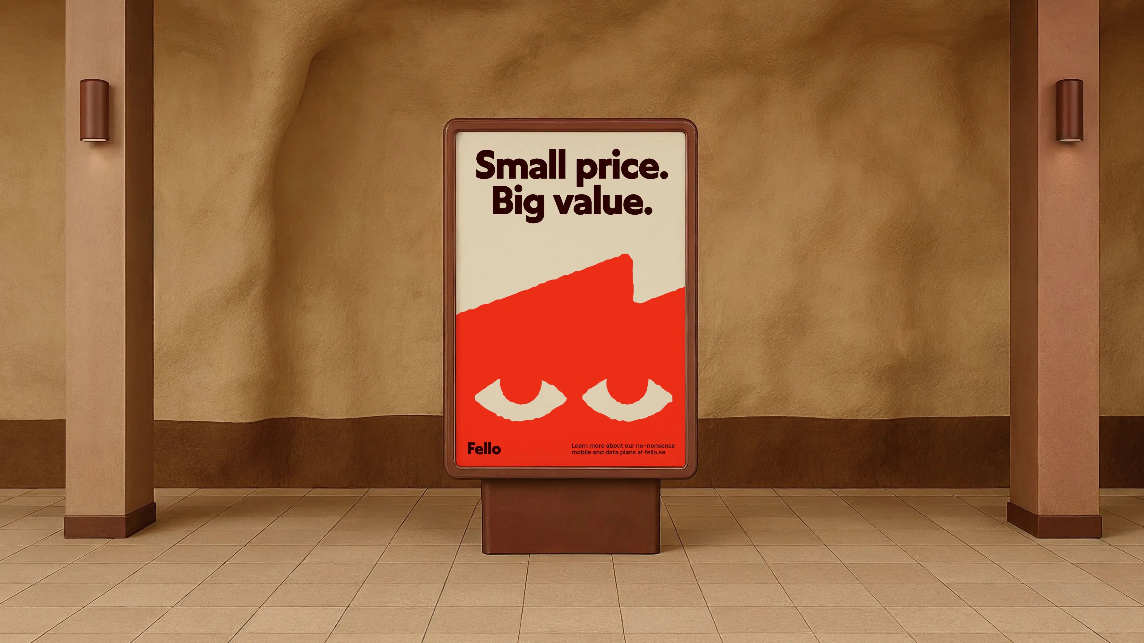
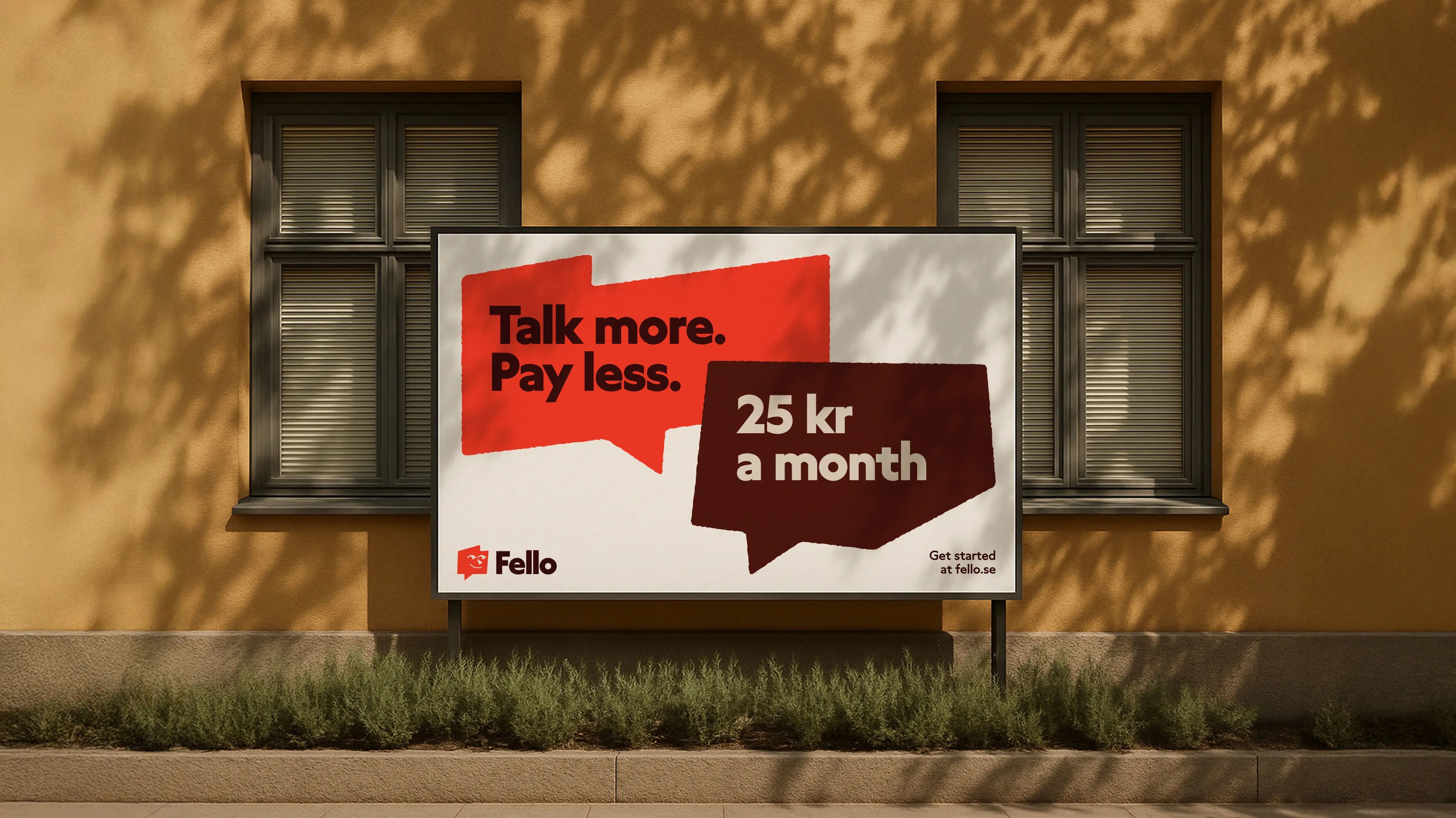
Bold has done a lot here with a little; shapes are put to excellent use, with speech bubble-like devices enhancing the Fello character and providing functional holding devices across the identity, housing information as well as acting as endlessly flexible graphics that offer decorative flourishes as well as brand-specific anchor points.
The use of colour is minimal but absolutely bold (the agency is ever true to its name, after all). Aside from black and white, just a few shades are used across the identity: a rich brown/maroon; pale peach; and most prominently, an unabashedly vivid orange which is used for Fello the character and other standout aspects of the new identity. It perfectly fits the brief of achieving standout – you really cannot miss that sunglasses-baiting hue.
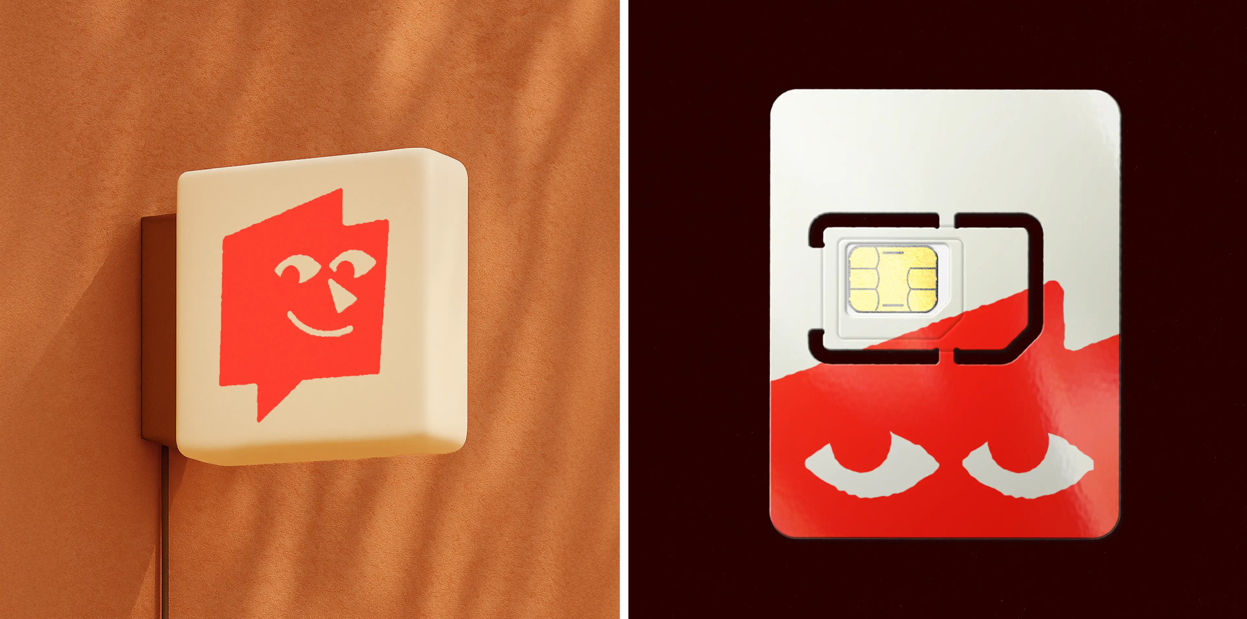
Where the branding is so clever is that it clearly eschews the conventions of the telecom sector but still consistently, subtly nodding to it – the speechmark devices, for instance, not to mention Fello himself, who is always, if nothing else, wedded to the concept of communications.
Sure, there’s been a lot of chatter in the branding sphere about mascots – both positive and negative – but here, it really works. That’s largely thanks to the way that the rest of the identity is kept so straightforward: in true Scandi style, there’s nothing unnecessary, no frills, no nonsense – one font, two colours, one character, copy pared back to the very bare bones of what’s needed. All of which makes this identity feel super robust, but refreshingly playful and charming for a sector usually characterised by bland functionality.
