Tristan Dampies
02 March 2026
If you have ever landed on a website and immediately known where to click, what to read first, or what action to take, color hierarchy was quietly doing its job. It is one of those design elements that works best when users do not even notice it. But behind every intuitive, easy-to-navigate interface is a carefully constructed system of color choices that tells your brain exactly where to look and what matters most.
In this guide, we are going to break down how color hierarchy works in UX design, why it is so influential on user behavior, and how you can use it to create digital experiences that feel effortless.
The Basics of Color Theory in Web Design
Color theory in web design is the practice of using color relationships, contrasts, and combinations to create interfaces that are both visually appealing and functional. It draws from the same principles artists have used for centuries, but applies them to screens, pixels, and user interactions.
Color theory provides designers with a framework for making deliberate color choices rather than relying solely on instinct. Here are the key concepts it covers:
- The color wheel: The foundation for understanding how colors relate to one another and which combinations work well together.
- Complementary and analogous schemes: Methods for pairing colors that either contrast strongly or blend harmoniously.
- Warm versus cool tones: Understanding how temperature affects the mood and energy of a design.
- Emotional associations: The feelings and meanings that different hues naturally carry with them.
When it comes to web design specifically, color theory also has to account for digital considerations like screen rendering, accessibility contrast ratios, and how colors behave across different devices and lighting conditions. A shade of blue that looks stunning on a desktop monitor might wash out completely on a mobile screen in direct sunlight, and strong color theory in web design anticipates such challenges.
The bottom line is this: color is not decoration. In the context of UX, every color choice serves a purpose, and understanding the theory behind those choices is what separates a polished, professional interface from one that just looks like someone picked their favorite colors.
Why Is Color Theory Important in Web Design?
So why is color theory important in web design beyond making things look nice? The answer comes down to psychology, usability, and conversions. Here is what it actually influences:
- First impressions. According to research from Carleton University, users form an opinion about a website within 50 milliseconds of landing on it. Color is one of the biggest drivers of that snap judgment. The right palette signals professionalism, trustworthiness, and relevance. The wrong one creates friction before a user even reads a single word.
- Meaning without words. Red signals urgency or error. Green communicates success or permission. Blue evokes trust and calm. These associations are deeply embedded in how people interpret visual information, and color theory provides designers with the tools to use them intentionally.
- Usability. When colors are applied consistently and with purpose, they reduce cognitive load. Users learn that certain colors indicate “clickable,” “important,” or “informational,” and they can navigate more quickly because the interface teaches them through color.
- Conversions. The color of a call-to-action button, the contrast between a form field and its background, the way a pricing table highlights one option over others: these are choices with measurable impacts on click-through rates, sign-ups, and purchases.
Understanding why color theory matters in web design is not just an academic exercise. It is a business decision that directly affects how users interact with and respond to your product.
Breaking Down Color Hierarchy
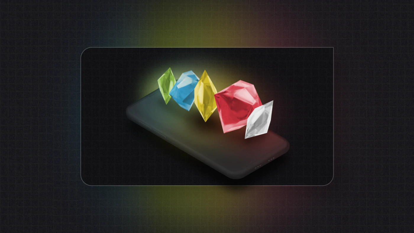
Color hierarchy is the system that determines which colors take visual priority in an interface. Think of it as a pecking order for the colors on your screen. Not every element should compete for attention, and hierarchy makes sure they do not.
Here is how it typically breaks down.
Your primary color is the dominant hue. This is the main color associated with a brand or interface, and it appears most frequently. It anchors the overall visual identity. Think of the Spotify green or the Facebook blue. The primary color sets the tone and creates the strongest association in a user’s mind.
Your secondary colors are the supporting players. These complement the primary hue and are used for secondary actions, background areas, or supporting UI elements. They add visual variety without fighting the primary color for attention.
Your accent colors are the attention-grabbers. These are used sparingly and strategically for elements that need to pop: call-to-action buttons, notifications, alerts, or important links. Because accent colors appear less often, they carry more visual weight when they do.
Your neutral colors are the foundation. Whites, grays, and blacks form the backbone of most interfaces. They provide breathing room, define structure, and make sure the primary, secondary, and accent colors have the space they need to do their jobs effectively.
The beauty of a well-built color hierarchy is that it creates a natural visual flow. Users instinctively know what is most important, what is secondary, and where to take action, all without a single word of instruction.

How to Use a Color Palette in Web Design
Knowing the theory is one thing. Putting it into practice is another. Here is a step-by-step framework for how to use a color palette in web design that supports clear hierarchy and strong UX:
- Start with your brand identity. Your primary color should reflect your brand personality and the emotions you want to evoke. A health and wellness app might lean into calming greens and blues. A fintech platform might use navy and darker tones to convey security and authority.
- Build out with intention. Once your primary color is locked in, choose secondary and accent colors that work well alongside it. Tools like Adobe Color, Coolors, or the HSL color model can help you find combinations that complement rather than clash. Stick with two to three main colors plus your neutrals.
- Assign roles to each color. Decide upfront what each color represents in your interface. For example, primary blue for navigation and headers, secondary light blue for card backgrounds, orange accent for CTAs, and grays for body text and borders. Document these roles in a design system so everyone on the team applies them the same way.
- Apply the 60-30-10 rule. This widely used design principle suggests that roughly 60% of your interface should use your dominant or neutral colors, 30% should use your secondary color, and 10% should use your accent color. This ratio naturally creates hierarchy without overwhelming the user.
- Test for accessibility. Make sure your color combinations meet WCAG contrast guidelines. A gorgeous palette means nothing if users with low vision or color blindness cannot distinguish key elements. Tools like the WebAIM Contrast Checker make this quick to verify.
- Iterate based on data. Once your palette is live, pay attention to how users interact with your interface. Are they clicking the CTAs? Are they getting lost in navigation? A/B testing different color treatments can reveal surprising insights into how your palette actually performs.
Learning to use a color palette effectively in web design is a skill that improves with practice. The key is to be systematic and intentional, rather than treating color as an afterthought.
Color Hierarchy and User Behavior
This is where everything comes together. Color hierarchy is not just a visual design concept. It is a behavioral tool, and here is how it works in practice.
It directs attention. The human eye is naturally drawn to contrast and saturated colors. When a single orange button sits against a sea of neutral tones, it is almost impossible not to look at it. Color hierarchy leverages this tendency to guide users to the most important elements on a page.
It creates visual flow. A thoughtfully designed color hierarchy leads the eye through content in a logical sequence. Users scan from the most prominent color to the next, following a path the designer has deliberately laid out. This is especially critical on landing pages and dashboards, where multiple elements compete for attention at the same time.
It reduces decision fatigue. When everything on a page looks equally important, users feel overwhelmed. Color hierarchy addresses this by making the most important actions visually obvious. The result is a more confident user who spends less time figuring out what to do next.
It builds trust through consistency. When the same colors consistently represent the same types of actions or information, users develop a mental model of how things work. A green button always means “confirm.” A red badge always means “needs attention.” That consistency reduces friction and increases confidence over time.
It influences emotional response. A calming blue-dominant palette with soft accent colors creates a very different emotional experience than a high-contrast, red-heavy interface. The hierarchy of those colors determines which emotional tone takes the lead.
Common Mistakes Designers Make with Color Hierarchy
Even experienced designers can stumble when it comes to color hierarchy. Here are the most common pitfalls to watch out for:
- Using too many colors. When every element has a different color, nothing stands out. More colors mean more noise, and noise kills hierarchy. Restraint is your best friend here.
- Neglecting contrast. A beautiful palette that lacks sufficient contrast between elements undermines usability. If your CTA button blends into its background, it doesn’t matter how good the color looks on a mood board.
- Ignoring accessibility. Roughly 8% of men and 0.5% of women experience some form of color vision deficiency. If you rely solely on color to communicate meaning, you are excluding a significant portion of your users. Always pair color with additional cues, such as icons, labels, or patterns.
- Being inconsistent. If a blue button means “submit” on one page and “cancel” on another, you have broken the user’s mental model. Consistency in how you use color is what allows hierarchy to function across an entire product.
- Forgetting about context. A color that works perfectly on a clean white background might lose all its impact when placed in a dark sidebar or layered over a hero image. Always test your color hierarchy where it will actually live, not just in isolation.

Real-World Examples of Color Hierarchy Done Right
Some brands serve as excellent case studies in effective color hierarchy. Here is what makes each of them work:
- Stripe uses a clean, neutral base with strategic splashes of its signature purple-blue gradient. CTAs are clearly distinguished from surrounding content, and the hierarchy makes complex financial information feel approachable and scannable.
- Duolingo employs its signature green as the dominant brand color, with warm accents like orange and red to highlight streaks, achievements, and calls to action. The hierarchy keeps the playful interface organized despite the many interactive elements on screen at any given time.
- Airbnb relies on a predominantly white and neutral interface, letting its coral-red accent color draw attention precisely where it needs to go: search buttons, booking CTAs, and key navigation elements. The restraint in the rest of the palette is exactly what makes that accent color so effective.
In each of these cases, the color hierarchy is doing the heavy lifting, guiding users through complex interfaces without making them feel cluttered or overwhelmed.
Bringing It All Together
Color hierarchy in UX design sits right at the intersection of art and science. It requires an understanding of color theory in web design, a solid grasp of user psychology, and the discipline to apply colors systematically rather than just decoratively.
The most important thing to remember is that every color in your interface should earn its place. If a color is not serving a clear purpose, whether that is directing attention, communicating meaning, or reinforcing brand identity, it is probably just adding noise.
Here is a quick recap of the essentials:
- Ground your decisions in the fundamentals of color theory.
- Build a palette with clearly defined roles for each color.
- Use the 60-30-10 rule to create a natural hierarchy.
- Apply color consistently across your entire product.
- Test for accessibility and iterate based on real user data.
When you get color hierarchy right, users won’t even think about your colors. They will just know exactly where to look, what to do, and how to feel. That seamless, invisible experience is the ultimate goal of great UX design.
Frequently Asked Questions
Color hierarchy is a system that assigns different levels of visual importance to the colors in an interface. It determines which elements stand out first, which play a supporting role, and which fade into the background. The goal is to guide user attention and create a natural flow through the page without relying on written instructions.
Color theory in web design helps designers make intentional decisions about which colors to use, how to combine them, and where to place them within an interface. It draws on principles like the color wheel, contrast ratios, and emotional associations to create palettes that are both visually harmonious and functional for user experience.
The 60-30-10 rule is a proportion guideline borrowed from interior design. It suggests using your dominant or neutral color for about 60% of the interface, your secondary color for 30%, and your accent color for just 10%. This ratio creates a balanced visual hierarchy that helps users focus on the most important elements without feeling overwhelmed.
Approximately 1 in 12 men and 1 in 200 women have some form of color vision deficiency. If your interface relies solely on color to convey meaning, many users may miss critical information. Testing your palette against WCAG contrast standards and pairing color with icons, labels, or text ensures your design works for everyone.
Tristan Dampies
Tristan is a Content Writer at Moburst with a background in journalism and public relations, bringing a strategic, audience-first approach to content across the digital marketing landscape. She enjoys crafting stories that inform, connect, and drive impact. Outside of work, she loves discovering new restaurants and spending quality time with her daughter, family, and friends.