![]()
Dallas connotes many things: cowboys! (the gun-slingin’, yeehawin’ type ones on horseback); cowboys! (the cheerleading ones of ‘that show on Netflix’ fame); cowboys! (the American football team).
In short, for people like me who’ve never been to Dallas, nor indeed any of Texas, and who know next to nothing about sport, Dallas = cowboys, and perhaps little else. But even those more au fait with the nuances of television ball-kicking probably wouldn’t immediately associate the city with football – or more accurately, soccer. However, that might all be changing.
Last year saw San Francisco based brand design agency Moniker and Dallas-based ModestWorks work together to design the identity for Dallas’ first professional women’s soccer team, Dallas Trinity FC. Now, they’ve teamed up again to create the identity for Atlético Dallas, which describes itself as a “community-focused club” being built “from the ground up to connect with this thriving base of soccer fans and players of all ages”.
Atlético Dallas continues, “Our goal is to cultivate a love for professional soccer by supporting the local sports community, empowering youth, and making the sport accessible to all.”
Launching in 2027, Atlético Dallas will join the USL Championship, “a league reshaping professional soccer in the United States,” according to Moniker.
The agency says that the club and its identity alike were built to “capture the heart of Dallas: diverse, ambitious, and united by a love for the game”.
I’d never really spent much time thinking about the origins of football club identities: they all seem so embedded into culture, historical artifacts so familiar that we don’t even question them – Tottenham’s weird spindly chicken thing, West Ham’s faintly Communist hammer, and so on (huge apologies to all football fans here).
So it’s fascinating to consider the journey of building such a brand – or indeed, a whole team – from the ground up.
![]()
![]()
![]()
It makes sense, then, that Moniker’s process began not with design, but with story. “In researching the origins of Dallas, we discovered traces of myth that predated the city itself, tales of wild creatures that ruled the plains before it was mapped and settled,” Moniker explains.
“Dallas is already defined by its mix of cultures and constant motion. The challenge was to create a club that felt like it had always been part of the city. A club with an identity that belongs to Dallas, but could stand confidently alongside the greats of world football.”
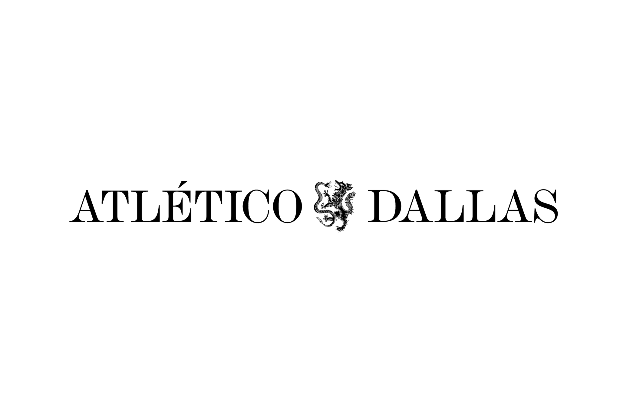
It was those ‘wild creatures’ that directly informed the rather stately, almost Medieval-looking crest-turned logo for Atlético Dallas. Moniker learned of the legend of the wolf and the snake: the former a representation of “courage and command”, the latter a rattlesnake, “quiet but deadly” and representing “patience and precision”.
![]()
In ancient lore, these two formidable creatures were enemies, with a rivalry “as much about domination as it was about respect,” according to Moniker.
“That story became the foundation of the brand,” the agency continues. “Two forces, equal and opposite, locked in perpetual battle. The legend gave Atlético Dallas something few modern clubs have: a myth that connects the past to present, city to symbol.”
The identity overall feels resolutely contemporary – slick, subtle, smart use of things like overlapping type – but that crest at the heart of the brand is thoroughly leaning on all things folkloric. By dint of its style alone, it already feels thoroughly embedded into history – a clever move with a brand like this, built from the ground up in the 21st century, but striving for respect from the get-go.
![]()

Said crest/logo visibly draws on cues from historical heraldry, “where animals are symbolic expressions of pride and lineage,” according to Moniker, and it was created in collaboration with artist Tom Meek. The whole thing is a deliberate rejection of all things digital – indeed, all things made perfect thanks to their digitally driven fabrication – striving for something more “textured and human,” as Moniker puts it. And there’s absolutely no doubt that’s been achieved – it all feels completely embedded in culture, timeless, strident, proud.
The name threw me a wee bit – but again, I know little about Dallas, and certainly wasn’t aware of what Moniker terms the city’s deep connection to Latin culture. As you might assume, “Atlético” translates as “athletic” in Spanish, Portuguese, and Italian – and is already deeply connected to all things ‘soccer’, making the team’s moniker a rather shrewd decision in its instant global ties to the game itself.
While the logomark/crest feels utterly historical in its aesthetic and style, the rest of the identity system stops the whole thing from slumping into a weird pastiche of Ye Olde stuff. Namely, that’s thanks to its simplicity: the colour palette is pared back, as is the use of type.
The main brand typeface, including the deliciously curvy numerals, draws on Old Standard TT designed by Alexey Kryukov – a personality-packed serif font inspired by certain Modern classicist typefaces used largely in the late 19th and early 20th centuries.
This is supported by sans serif Lato designed by Łukasz Dziedzic. It’s a clever choice here: the font is so unassuming as to be barely perceptible – it does exactly what it’s meant to do, slinking into the background while also being legible. It’s also decidedly warm in feel, thanks largely to its classical proportions – particularly evident in its uppercase forms, which create a sense of elegance and harmony without ever being too corporate, bland or boring.
The colour palette for the most part lets black and white do the heavy lifting, with charming little inflections of a nice blue tone and a shiny silver here and there. The blue and silver shades, according to Moniker, draw directly from the Texas landscape: “Blues drawn from topaz, blacks from the rich prairie soil, silvers from the minerals that shaped early settlements.”

![]()
All of which might feel like a bit of a stretch, but however much you invest in that backstory, the long and short of it is: it looks great. Smart, slick, timeless; but totally modern and – crucially – ripe for some very tasty merch.
In terms of building something with seemingly big ambitions from nothing, Moniker has done an extraordinary job here – it’s built a brand that feels both fresh and as though it’s been around forever – no mean feat when you consider being up against challenges like the relative newness of even soccer itself to widespread US audiences.
Indeed, it absolutely encapsulates what Moniker states as the rather lofty goal of Atlético Dallas more broadly – not just a soccer club, but “a reflection of the city that built it, ambitious, hard-working, and unafraid to start from nothing.”
![]()