
5 Lesser-Known Visualization Libraries for Impactful Machine Learning Storytelling
Image by Editor | ChatGPT
Introduction
Data storytelling often extends into machine learning, where we need engaging visuals that support a clear narrative. While popular Python libraries like Matplotlib and its higher-level API, Seaborn, are common choices among developers, data scientists, and storytellers alike, there are other libraries worth exploring. They offer distinctive features — such as less common plot types and rich interactivity — that can strengthen a story.
This article briefly presents five lesser-known libraries for data visualization that can provide added value in machine learning storytelling, along with short demonstration examples.
1. Plotly
Perhaps the most familiar among the “lesser-known” options here, Plotly has gained traction for its straightforward approach to building interactive 2D and 3D visualizations that work in both web and notebook environments. It supports a wide variety of plot types—including some that are unique to Plotly — and can be an excellent choice for showing model results, comparing metrics across models, and visualizing predictions. Performance can be slower with very large datasets, so profiling is recommended.
Example: The parallel coordinates plot represents each feature as a parallel vertical axis and shows how individual instances move across features; it can also reveal relationships with a target label.
|
import pandas as pd import plotly.express as px
# Iris dataset included in Plotly Express df = px.data.iris()
# Parallel coordinates plot fig = px.parallel_coordinates( df, dimensions=[‘sepal_length’, ‘sepal_width’, ‘petal_length’, ‘petal_width’], color=‘species_id’, color_continuous_scale=px.colors.diverging.Tealrose, labels={‘species_id’: ‘Species’}, title=“Plotly-exclusive visualization: Parallel coordinates” ) fig.show() |
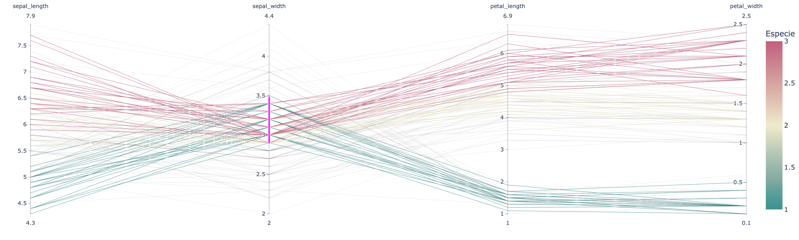
Plotly example
2. HyperNetX
HyperNetX specializes in visualizing hypergraphs — structures that capture relationships among multiple entities (multi-node relationships). Its niche is narrower than that of general-purpose plotting libraries, but it can be a compelling option for certain contexts, particularly when explaining complex relationships in graphs or in unstructured data such as text.
Example: A simple hypergraph with multi-node relationships indicating co-authorship of papers (each cyclic edge is a paper) might look like:
|
pip install hypernetx networkx |
|
import hypernetx as hnx import networkx as nx
# Example: small dataset of paper co-authors # Nodes = authors, hyper-edges = papers H = hnx.Hypergraph({ “Paper1”: [“Alice”, “Bob”, “Carol”], “Paper2”: [“Alice”, “Dan”], “Paper3”: [“Carol”, “Eve”, “Frank”] })
hnx.draw(H, with_node_labels=True, with_edge_labels=True) |
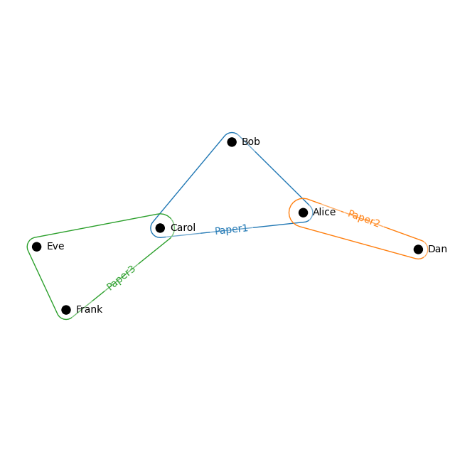
HyperNetX example
3. HoloViews
HoloViews works with backends such as Bokeh and Plotly to make declarative, interactive visualizations concise and composable. It’s well-suited for rapid exploration with minimal code and can be useful in machine learning storytelling for showing temporal dynamics, distributional changes, and model behavior.
Example: The following snippet displays an interactive heatmap with hover readouts over a 20×20 array of random values, akin to a low-resolution image.
|
pip install holoviews bokeh |
|
import holoviews as hv import numpy as np hv.extension(‘bokeh’)
# Example data: 20 x 20 matrix data = np.random.rand(20, 20)
# Creating an interactive heatmap heatmap = hv.HeatMap([(i, j, data[i,j]) for i in range(20) for j in range(20)]) heatmap.opts( width=400, height=400, tools=[‘hover’], colorbar=True, cmap=‘Viridis’, title=“Interactive Heatmap with Holoviews” ) |
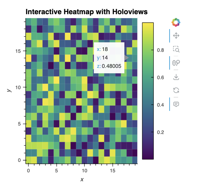
HoloViews example
4. Altair
Similar to Plotly, Altair offers clean, interactive 2D plots with an elegant syntax and first-class export to semi-structured formats (JSON and Vega) for reuse and downstream formatting. Its 3D support is limited and large datasets may require downsampling, but it’s a great option for exploratory storytelling and sharing artifacts in reusable formats.
Example: A 2D interactive scatter plot for the Iris dataset using Altair.
|
pip install altair vega_datasets |
|
import altair as alt from vega_datasets import data
# Iris dataset iris = data.iris()
# Interactive scatter plot: petalLength vs petalWidth, colored by species chart = alt.Chart(iris).mark_circle(size=60).encode( x=‘petalLength’, y=‘petalWidth’, color=‘species’, tooltip=[‘species’, ‘petalLength’, ‘petalWidth’] ).interactive() # enable zoom and pan
chart |
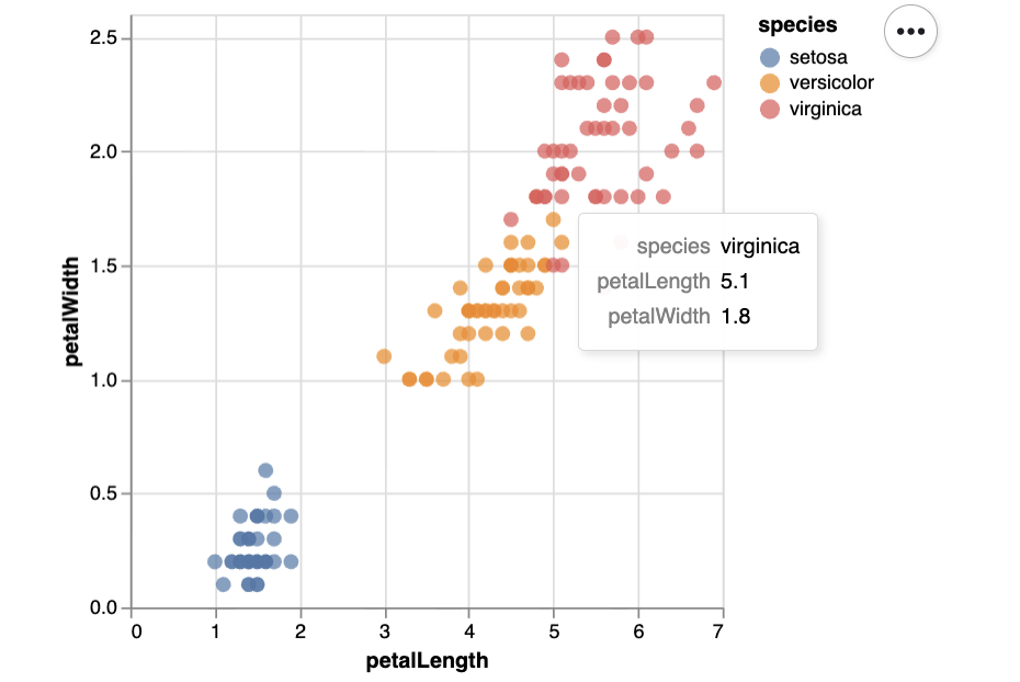
Altair example
5. PyDeck
pydeck excels at immersive, interactive 3D visualizations — especially maps and geospatial data at scale. It’s well suited to storytelling scenarios such as plotting ground-truth house prices or model predictions across regions (a not-so-subtle nod to a classic public dataset). It’s not intended for simple statistical charts, but plenty of other libraries cover those needs.
Example: This code builds an aerial, interactive 3D view of the San Francisco area with randomly generated points rendered as extruded columns at varying elevations.
|
1 2 3 4 5 6 7 8 9 10 11 12 13 14 15 16 17 18 19 20 21 22 23 24 25 26 27 28 29 |
import pydeck as pdk import pandas as pd import numpy as np
# Synthetically generated data: 1000 3D points around San Francisco n = 1000 lat = 37.76 + np.random.randn(n) * 0.01 lon = –122.4 + np.random.randn(n) * 0.01 elev = np.random.rand(n) * 100 # height for 3D effect data = pd.DataFrame({“lat”: lat, “lon”: lon, “elev”: elev})
# ColumnLayer for extruded columns (supports elevation) layer = pdk.Layer( “ColumnLayer”, data, get_position=‘[lon, lat]’, get_elevation=‘elev’, elevation_scale=1, radius=50, get_fill_color=‘[200, 30, 0, 160]’, pickable=True, )
# Initial view view_state = pdk.ViewState(latitude=37.76, longitude=–122.4, zoom=12, pitch=50)
# Full Deck r = pdk.Deck(layers=[layer], initial_view_state=view_state, tooltip={“text”: “Elevation: {elev}”}) r.show() |
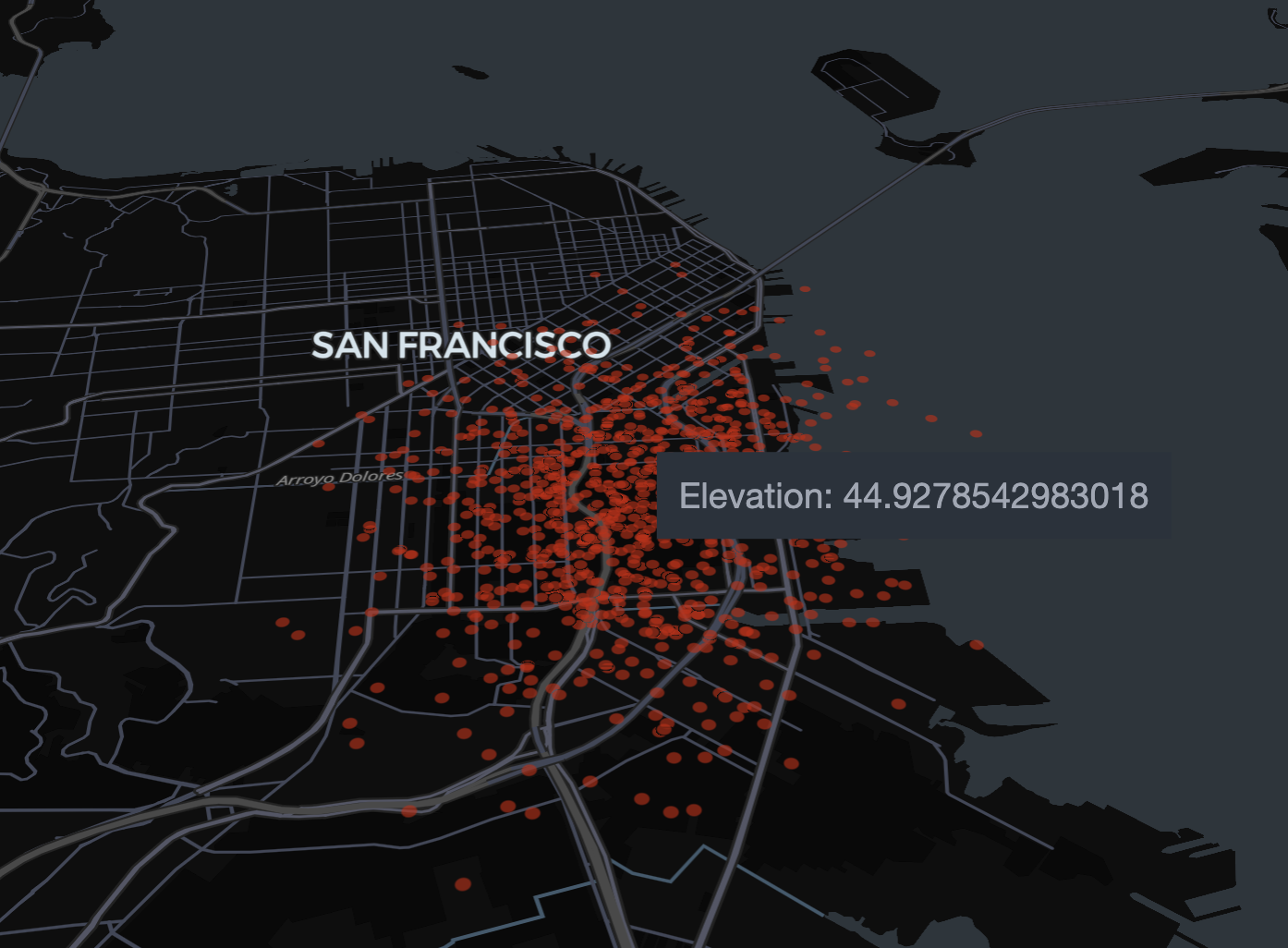
PyDeck example
Wrapping Up
We explored five interesting, under-the-radar Python visualization libraries and highlighted how their features can enhance machine learning storytelling — from hypergraph structure and parallel coordinates to interactive heatmaps, reusable Vega specifications, and immersive 3D maps.