📌 THE GIST
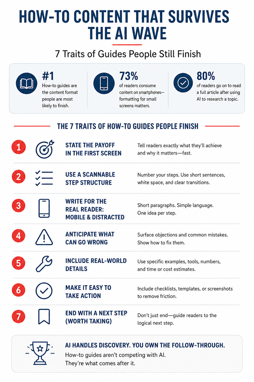
- Knowing how to write a how-to guide people finish is the most valuable content skill you have right now — because how-tos are the only format people are most likely to read all the way through, in both personal and work contexts, even as AI replaces every other content type.
- 73% of readers consume content on smartphones — where comprehension drops when sentences run long and paragraphs stack up. The way you format a guide on a small screen matters as much as what you say.
- After this, you’ll know exactly what separates a how-to guide people bookmark and share from one they abandon after the second paragraph — and you can audit your own content against all 7 traits today.
When you learn how to write a how-to guide that people finish, you own the one content format that survived AI, short-form video, and the death of organic reach. A 2026 Clutch consumer attention study explains why. Among people reading content for both personal and work reasons, how-to and step-by-step guides are the format they’re most likely to finish. Not skim. Not screenshot. Finish.
That surprised me, too. I expected video to win everything. But the research tells a different story. People use video to find ideas. They use how-tos to do. That’s a meaningful distinction if you’re a small business owner trying to build content that drives results, not impressions.
The problem? Most small business how-to guides fail a basic test. They’re written for a desktop reader with 20 minutes and full attention. Your actual reader is on a phone at 8 pm, half-watching Netflix, with a browser tab open and two kids arguing in the background. Writing for the reader you wish you had is the fastest way to get abandoned.
Here’s how to write a how-to guide that the real reader finishes. Distracted. On mobile. Time-poor.
Why how-to guides still win when everything else is losing
When someone watches a 60-second Reel about a marketing tactic, they get the idea. When they search ChatGPT for how to set up an email sequence, they get the outline. What they don’t get is the part where things go sideways. That’s the gap a good how-to fills.
That’s the gap a good how-to fills. It doesn’t stop at explaining what to do. It gets specific enough that the reader can execute without Googling every third step.
According to the Clutch study, 35% of people prefer long-form articles when they want to deeply understand a topic, and topic relevance is the main factor determining whether they stick with a 1,000+ word piece. The implication is clear. Generic how-tos get abandoned. Specific, relevant, actionable ones get read.
The other reason how-to content holds up: trust. The same study found 66% of readers say they’d trust an article less or read it with more skepticism if they knew it was written entirely by AI. How-tos that include real examples, named tools, specific dollar amounts, and “here’s what can go wrong” sections signal human experience in a way AI overviews don’t.
Trait 1: State the payoff in the first screen
Your reader decides in the first three seconds whether to keep reading. On mobile, that’s roughly the first 150 words. Everything visible before they scroll. If the payoff isn’t visible in that window, most readers leave.
The payoff isn’t a promise. It’s a specific outcome stated without hedging. Compare these two openers:
Weak: “In this guide, we’ll share some tips for improving your email open rates.”
Strong: “Your email open rate is under 20%. This guide shows you three specific fixes (one you can do in under 10 minutes) that typically push open rates above 30%.”
The second version tells the reader exactly what they’ll know and approximately what it’ll cost them in time. That’s a commitment from you. It also filters out readers who aren’t the right fit, which is fine. A how-to guide read by 500 qualified people outperforms one skimmed by 5,000 browsers.
Trait 2: Write for a small screen
This is the trait most small business content gets wrong, and the research backs it up hard. A UX Magazine analysis of Nielsen’s mobile usability research found that comprehension on mobile can drop to 19% (compared to 39% on desktop) when content is written for a full screen.
The culprit is cognitive load. A complex sentence on a large monitor is readable. The same sentence on a 375-pixel wide phone screen forces your reader to hold multiple clauses in working memory while scrolling. Working memory on mobile is already taxed by the environment: notifications, ambient noise, split attention.
Nielsen Norman Group’s own research on mobile content confirmed that difficult articles (defined by long word counts and complex language) caused reading speed to slow significantly on mobile. Readers either gave up or had to read sections twice to maintain comprehension. Easy articles, written with short sentences and clear structure, showed no meaningful comprehension difference between mobile and desktop.
The fix is specific:
- Max 20 words per sentence. When you hit 25, break it in two.
- Max 3 sentences per paragraph. Two is better.
- One idea per paragraph. Not two ideas that feel related.
- Sub-headlines every 250–300 words so the reader can re-orient after scrolling.
💡 STRATEGY ALERT
Read your how-to out loud on your phone. If you stumble through a sentence, your reader will too. They won’t re-read it. They’ll scroll past it. Stumbling is the signal to rewrite.
Trait 3: Show the destination before the journey
One of the fastest ways to lose a mobile reader is making them scroll through five paragraphs of context before they see what the guide covers. Good how-to guides show the structure upfront. Not a table of contents. A plain-English summary of what the reader will do.
Something like: “By the end of this, you’ll have written and scheduled three email sequences, set up your first automation trigger, and know exactly which metrics to watch.”
That one sentence does three things. It gives the reader a mental model for what’s coming. It signals the guide goes deep enough to be worth their time. And it sets a clear “done” marker. That matters more than most guides realize.
Trait 4: Number your steps
When you write a how-to guide, you’re asking the reader to follow a sequence. Numbered steps make that sequence impossible to lose. They also give readers a progress signal. “I’m on step 4 of 7” is motivating. Scrolling through unmarked paragraphs is not.
This isn’t a UX instinct. Nielsen Norman Group’s F-pattern research documented how web readers scan vertically down the left side of a page after the initial horizontal pass. Numbered steps and bullet points that start with a clear, distinct word give that vertical scan something to land on. Paragraphs that all start with “Then you should…” give the eye nowhere to grip.
Number every action step. Use bullets only for lists of options or tools. Don’t mix them. Readers mentally re-sort their reading behavior based on which type of list they’re scanning, and switching mid-guide breaks that rhythm.
Trait 5: Put screenshots and images next to the step they support
A screenshot placed at the bottom of a guide section is decorative. A screenshot placed directly below the step it illustrates is functional. That distinction determines whether your reader stays with you or loses the thread.
The Orbit Media annual blogging survey consistently shows that bloggers who include images report stronger results. But the placement matters as much as the presence. When a reader sees a step and then immediately sees what that step looks like completed, they don’t have to imagine it or keep the mental model alive while they scroll down. That cognitive relief keeps them reading.
For small business how-tos in particular, screenshots of software interfaces annotated with arrows or outlines showing where to click reduce the “I can’t find that button” abandonment that kills completion rates. If you’re writing about a tool someone has never used, assume they need to see the screen, not hear the instructions.
⚠️ REALITY CHECK
The Clutch consumer attention research found 52% of readers skim headlines before deciding whether to read at all — and 73% are doing it on a smartphone. Your guide doesn’t compete with other guides. It competes with TikTok. Format accordingly.
Trait 6: Name what “done” looks like
Most how-to guides end with a call to action. The good ones end with a “you’re done when…” statement first.
This matters because your reader needs a clear signal that they’ve completed the guide successfully, not an open-ended invitation to keep improving forever. Solopreneurs especially fall into the “I should do more” paralysis trap. A concrete done marker closes the loop and delivers the satisfaction that drives sharing and return visits.
Write it plainly: “You’re done when you have a welcome sequence of at least three emails set up, a confirmed automation trigger, and a baseline open rate to measure against.” That’s a checklist in sentence form. It respects the reader’s time and signals that you understand what “done” means in their reality, not in a perfect-world scenario.
You can also include a literal checklist at the end. Checklists increase completion signals and are among the most-shared content formats in the small business space. A checklist also gives AI systems a clean, structured block to extract and cite. That serves your GEO visibility.
Trait 7: Include the “what can go wrong” section
AI overviews give clean, frictionless instructions. They skip the part where things break.
Real how-to guides, the ones that build trust and get bookmarked, include a specific section on common failure points. Not generic warnings. Specific, named failure modes: “If you don’t see the ‘verify domain’ option, it’s because you’re on the free plan. You’ll need to upgrade before step 4 works.”
This detail signals lived experience. It also dramatically reduces reader abandonment. When someone hits a snag and your guide already named it and explained the fix, they feel taken care of. When your guide doesn’t mention it, they Google the error. Most don’t come back.
The Clutch research noted that trust is driven primarily by specific cited data and studies (30%) and recognizable bylines (38%), not by appearing at the top of Google. A “what can go wrong” section delivers that trust signal better than almost any other structural element. It shows you’ve done the thing you’re describing.
The trait underneath all the traits
Everything above comes down to a single principle: write for the reader who is trying to finish, not for a reader who is casually browsing.
When you know how to write a how-to guide for someone who genuinely wants to complete a task (on a small screen, in a limited window of attention, after already trying AI and finding it too thin), you stop writing guides that inform and start writing guides that enable. That’s a different output. It’s also the only kind that survives the current content environment.
The Clutch data puts it directly: 80% of people who use AI for research still go on to read a full article at least sometimes. Your how-to guide is what they’re looking for. Give them one worth finding.
How to write a how-to guide your readers will finish: the 10-minute audit
Pull up your highest-traffic how-to guide. Run it against this checklist:
- Does the payoff appear in the first 150 words?
- Are all sentences under 20 words?
- Does the guide show the structure upfront?
- Are steps numbered?
- Do screenshots sit directly below the step they illustrate?
- Is there a “you’re done when…” statement or checklist?
- Is there a named “what can go wrong” section?
If any of these are missing, you’re leaving completion rates and AI citation potential on the table. Fix the worst gap first. The whole guide doesn’t need a rewrite. One structural repair at a time moves the needle.
For more on building content systems that work for a small business budget, see Simple Marketing Process for Small Business and Marketing Strategy vs. Tactics. If you want to understand why most small business content underperforms before you write more of it, Why Marketing Strategies Fail for Small Businesses is the right place to start. For the research behind what content formats work best and why, Small Business Marketing Trends 2026 covers the full picture.
Frequently asked questions about writing how-to guides
How long should a how-to guide be?
Length should match the complexity of the task, not a word count target. A how-to guide for setting up a Google Business Profile listing can be thorough at 800 words. A guide on building a full email nurture sequence earns 2,500 words. The real question is: does every section help the reader complete the task? If a section answers that test, keep it. If it exists to round out a word count, cut it. Orbit Media’s blogging research shows that bloggers who write 2,000+ words report stronger results, but only when that length is earned by the topic, not padded out.
How do I make my how-to guide rank in AI search as well as Google?
Write in self-contained paragraphs where each section answers a specific question directly. AI systems extract passages, not whole articles, so every H2 section should open with a direct answer to the question implied by that heading. Use specific named frameworks, tools, or terminology. AI search rewards content that introduces distinct concepts rather than restating common knowledge. Include a numbered checklist or “you’re done when…” section, since structured lists are among the most frequently cited formats in AI overviews. Use a recognizable byline with your name and credentials visible. Trust signals affect AI retrieval eligibility as well as human reader trust.
What’s the biggest mistake small businesses make in how-to guides?
Writing for a hypothetical reader with full attention on a desktop screen. The Clutch 2025 consumer attention study found 73% of online content is consumed on smartphones, with the peak reading window between 5 and 10 pm, when readers are tired and competing against Netflix and social media. How-to guides written with long sentences, dense paragraphs, and no clear progress signals get abandoned at the same rate as poorly produced video. Short sentences, visible step numbers, and a clear “done” marker are the three minimum requirements for a mobile-first how-to guide.
How often should I include images or screenshots?
At minimum, include one image per major step when that step involves a software interface or a visual output. For text-based steps, a screenshot is optional. If a reader would need to navigate to a specific screen or recognize a specific UI element to complete the step, the screenshot is mandatory. Orbit Media’s research shows that bloggers who include images report stronger results across their content. Placement matters: put the image immediately below the step it illustrates, not at the end of the section. An image your reader has already passed when they need it doesn’t reduce confusion. It adds a scroll-back cost.
Should I include a “what can go wrong” section in every how-to guide?
Include it whenever the task has more than two meaningful failure points. For simple guides with a single path (install this plugin, click this button), a brief troubleshooting note at the end of the relevant step is enough. For guides covering multi-step processes, especially ones involving third-party software, integrations, or settings that vary by account level, a dedicated section titled something like “If This Doesn’t Work” or “Common Snags” reduces reader abandonment significantly. The Clutch research identifies specific cited data and recognizable expertise as the two primary trust drivers for readers. A “what can go wrong” section built from real experience delivers both.