If we wanted to be poetic about it, we could describe QR codes as the inhabitants of the pixel-thin gap between our physical and digital realities; the conduit between IRL and URL. Once a novelty, perennially often a bit of a pain in the arse, they really came into their own during the pandemic when suddenly things like handling paper menus became potential sources of terror and/or disease.
Since those heady days, it’s safe to say QR codes have stuck around, because it turns out they’re quite useful. However, looks-wise, they’re not built for beauty, but for purpose – utilitarian, clunky, and, frankly, forgettable.
That might all be about to change though thanks to London-based studio Koto’s (Fluz, Kikin & De-Extinction) rebrand of Uniqode, a QR code platform that helps businesses including the likes of Amazon, Hilton, and Nestlé to link their physical products or services to digital experiences.
The company’s mission – and brace yourself for this one, it’s pretty wild – is to ‘enable digital connections with every physical object and place on the planet’. That’s right, every last one. Each and every Puppy in my Pocket figurine; that candle you bought in Alicante ’08 because it says ‘KEEP RELAX AND ENJOY OCEAN’ on the front; a three-foot-tall replica of a bottle of Blue WKD, which is actually a receptacle for loose change; a JML TouchLight; every remaining Mr Frosty in the ENTIRE WORLD; a lenticular souvenir fridge magnet of a Scotsman, sometimes in kilt, sometimes showing his bum.
It’s likely I’m overthinking the mission statement, so we’ll return to Uniqodes rather lovely new branding. It’s no mean feat to make fairly complex digital platform-based businesses both look good and actually make sense; communicating what they do in a way that’s succinct, clear, and engaging. It must be harder still to rethink janky looking QR codes and all they sail in, and execute a branding system that truly works, but Koto has done wonders here both visually and strategically thanks to a singular conceptual approach, more on which shortly.
Koto worked closely with Ravi Pratap Maddimsetty and Sharat Potharaju, Uniqode’s cofounders and childhood friends-turned-techpreneurs, to create the new brand strategy that would take the artist formerly known as Beaconstac into the future, as Uniqode.
The name change was certainly wise. Beaconstac does very little in the way of either being memorable nor suggestive of what the business actually is and does – if anything, it sounds like some sort of road maintenance operation, perhaps fixing potholes or pelican crossings or something to do with concrete and rubble. Uniqode, however, sounds a hell of a lot more like a QR code platform – we also know that it must be a thoroughly contemporary, possibly even category-leading brand, because Uniqode doesn’t have a ‘u’ where you’d expect to find one.
According to Arthur Foliard, Koto’s executive creative director, the new identity had to embody the idea of a ‘seamless fusion of the physical and digital worlds’. He continues, ‘The idea of “stitching” became a powerful metaphor for connection, reflecting not only how Uniqode bridges these two realms but also how it helps businesses craft more meaningful and secure interactions with their customers.’
Sure, the whole ‘meaningful interactions’ thing is slightly cheesy, but the stitching idea is not: it’s a very smart, very elegant and supremely flexible concept for a brand like this which feels like a breath of fresh air in the frequently excruciating tech space.
This stitching motif is woven throughout every element of the identity, both metaphorically and very nearly literally, depending on how you interpret the words ‘woven’ and ‘literally’. Grid systems draw direct inspiration from cross-stitching: modular, flexible, but never rigid. Layouts are built to scale across platforms, with stitched elements (lines, crosses, dots) serving as dividers, motion paths, or narrative cues.
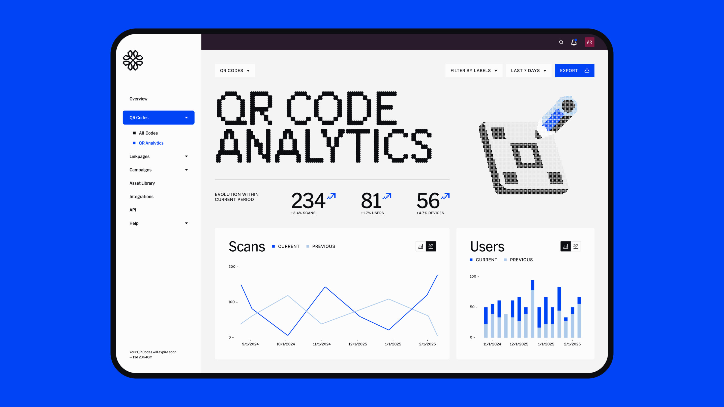
The thread aspect really comes to life in motion applications, for which Koto developed custom After Effects animations where lines form and reform across screens, reinforcing Uniqode’s role as a connector. It’s visible in onboarding sequences, demo videos, and even hover states – always subtle, always systematised. Illustrations and icons follow the same stitched logic: dots represent user touchpoints; lines represent flows of data or paths of interaction.
As with so many tech brands, blue is the main brand colour here. It’s a nice blue though – a bright, saturated shade which pops in headlines and other key snippets of text. It’s a shade that conveys authority but without being too serious or austere. The supporting palette consists of a deep navy, warm lavender for supporting graphics; while muted greys and off-white tones to soften interfaces and backgrounds. Overall, the palette creates a calming yet confident vibe; trustworthy, but not too sterile; clarity without slipping into the territory of dull.
The wordmark is unambiguous and legible but with a nice little twist on the quirky ‘Q’, treading the tricky-to-navigate line between approachable and professional. The brand mark, meanwhile, uses a straightforward, single-colour, deliberately pixellated flower-like shape.
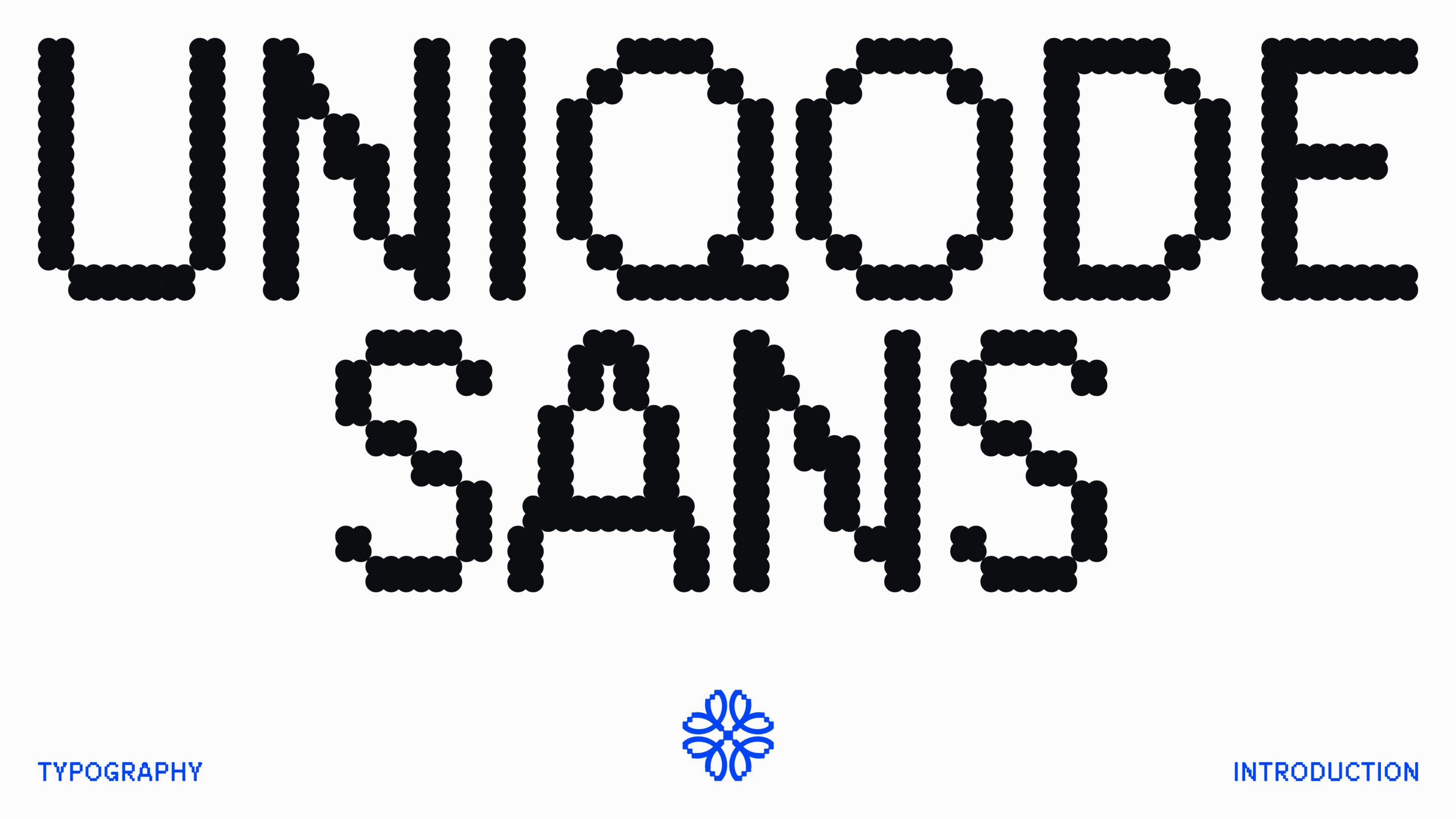
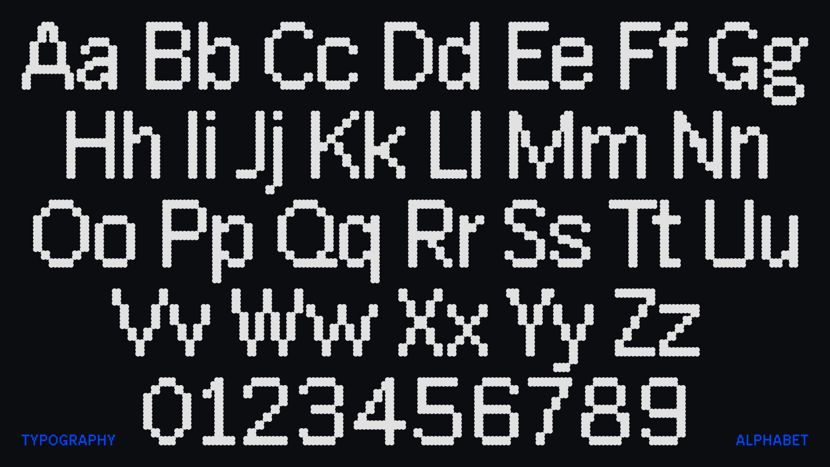
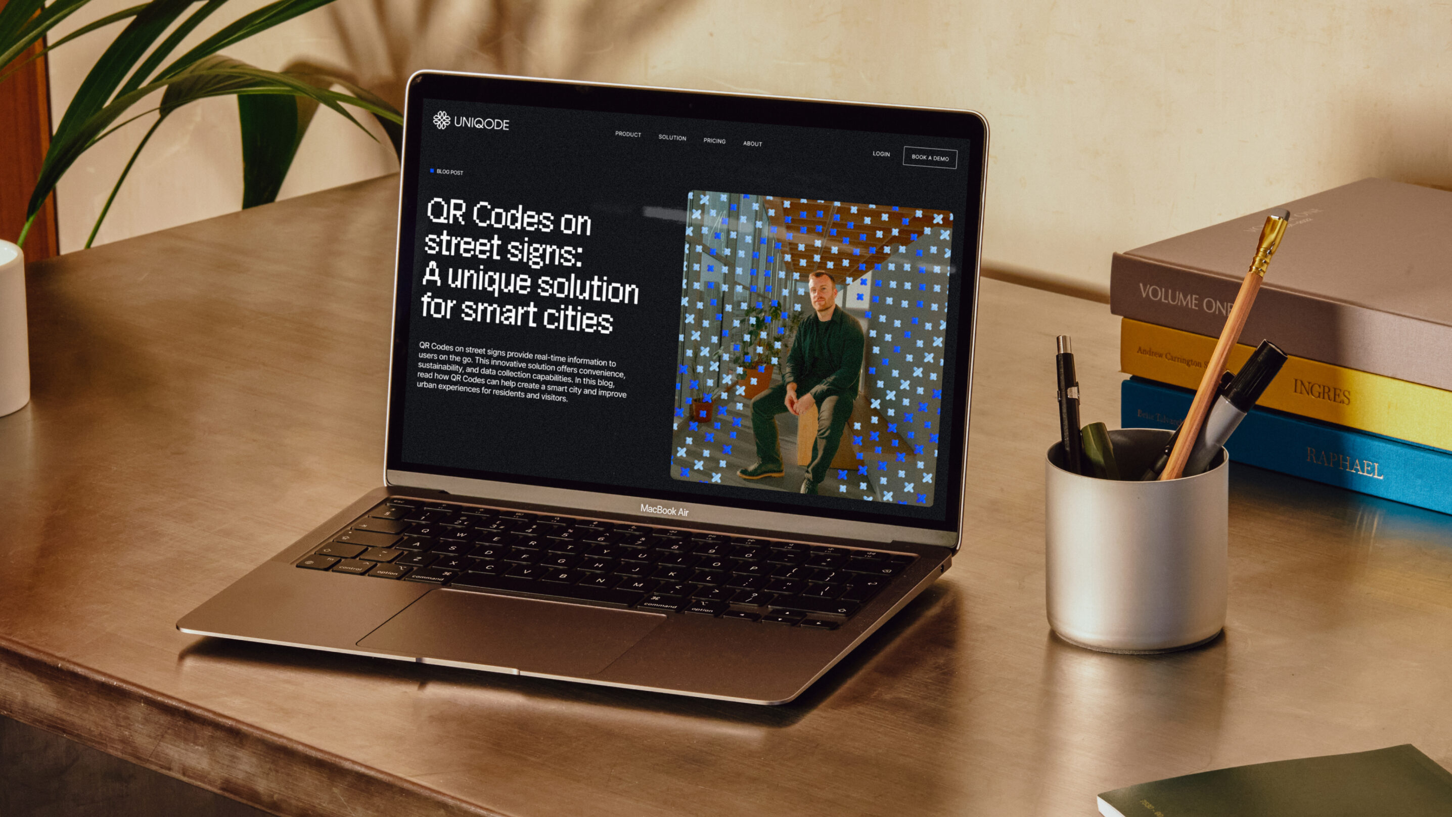
The use of typography is, to me, the standout element of the new identity. The main brand font is a custom-made, charmingly retro-gamer-leaning geometric sans-serif called Uniqode Sans. Almost comically digital in its appearance, it echoes QR codes themselves – and its forms are also a canny continuation of the whole stitching idea.
For the supporting typefaces Koto opted for HEX Franklin by for subheadings and Inter by for body copy, thanks to its legibility across varying screen sizes.
I’d never really made the connection between computer pixels – the tiny windows through which we view pretty much everything in the modern world – and the thoroughly artisanal, human-hand-wrought, ancient craft of embroidery. But it all makes total sense, and Koto’s work in using this simple but beautifully effective metaphor is a masterclass in brand-building with a singular conceptual standpoint. Good old pedestrian stitching has really worked wonders, underpinning a brand identity in a way that’s strategically rigorous, visually robust, consistent and – crucially – never feels forced. Maybe, one day, Uniqode really will conquer every single object on the entire planet after all.
